Color has an influential effect on painting. Frequently, artists look for the best color that conveys the idea or feeling they want to express.
Color is one of the 7 elements of art and is a powerful way for an artist to convey their message and emotion. There are no universal rules as to what color conveys what emotion, so it is up to the individual artist to decide how they want their painting to express their feelings or ideas.
As a beginning artist, you probably don’t have a wide variety of colors in your paint box, so you try to mix the color you need from what you have.
For most beginners, myself included, you end up with a lovely shade of “after-the-rain – mud.” Don’t let it bother you; it’s part of the learning process.
The more you paint, the more comfortable you will become with your color choice and how the colors interact with each other.
The way colors are mixed together can also change the tone of a painting and how it is received by those viewing it.
The use of color in your artwork works the same way as marketing a product. It takes a few seconds for people to decide if they like a product; that decision is mostly based on color.
In a painting, people are attracted to the overall colors, how they work together, and how they express the emotion or mood of the piece.
Here are some of the basics of color theory.
This post may contain affiliate links. If you click a link and buy, I may receive a small commission. Please see my full privacy policy for details.
Color Theory Terms
There are a few basic color theory terms that would be helpful to understand before continuing with learning about color theory.
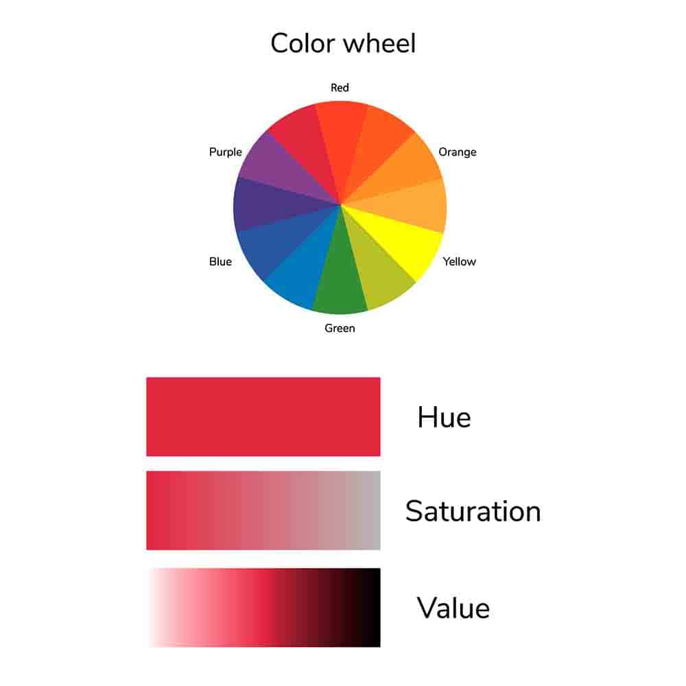
Hue
Hue refers to pure color or base color. It is generally the first color the human eye sees when looking at an object. The primary and secondary colors, red, yellow, blue, green, violet, and orange, are usually called hues. For example, raspberry would have a red hue since its base color is red.
Saturation or Chroma
Color saturation or chroma is the intensity of a color relative to its own brightness. It describes how vivid or bright a color is. You can tone down the saturation of a color by adding a little grey or a complementary color. For example, you can tone down or desaturate a bright green by adding a little red, which is its complement. I explain more about complementary colors below.
Tonal Value
Tonal value refers to how light or dark a color is. The value scale, sometimes referred to as a greyscale, ranges from white to black, with various strengths of grey in between. If you take a color, say red, and add various amounts of black or white to it, you can create a red value scale. It should be noted that black and white are not always the best choices to lighten or darken a color. Sometimes yellow works better to lighten, and sometimes blue, purple, or raw umber works better to darken a color.
Tint
In art, tint is a color mixed with white to lighten it. A tint will always be lighter than the original color.
Shade
A shade is a color mixed with black to darken it.
For more information on tonal value as well as tints and shades, see my post on Tints, Tones, and Shades.
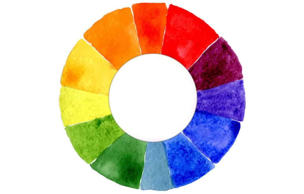
Color Mixing and The Color Wheel
The color wheel was designed by Sir Isaac Newton in 1666 and is still used today.
A color wheel is basically a wheel divided into the primary colors, red, yellow, and blue, and their secondary and tertiary colors. It is used to show the relationship between colors. The color wheel is a useful tool for understanding color theory.
Studying the color wheel and understanding how different colors mix is a must for an artist. Color wheels are relatively inexpensive to buy and are a great tool to help with color mixing. I use this one.
Don’t be afraid of color. As an artist, you paint what you see or feel, not necessarily what others see. Learning to mix the right shade will give you much more freedom and flow in your artwork.
Below, I have outlined the basics of color theory. You will learn more about technical theory as you progress, but this should give you a good start to expand your color pallet without creating mud.
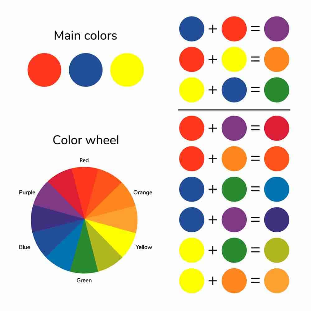
Primary Colors
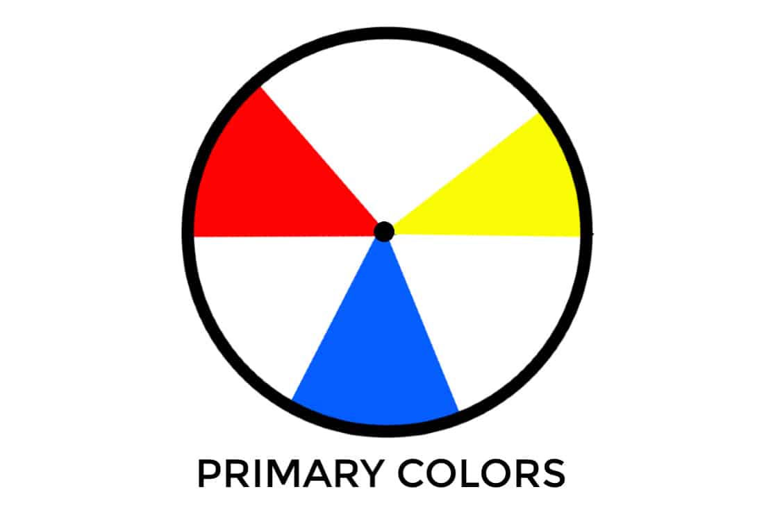
The primary colors are blue, red, and yellow. They cannot be made by mixing other colors, hence the term primary. From these three colors, all other colors are made.
Primary colors can be mixed to create secondary colors that can then be mixed again to make tertiary colors.
Primary colors are the original hues that make up all other colors in the world. These primary colors cannot be created by any other color or combination of colors and cannot be a mixture of two other colors.
Secondary Colors
Mixing any two of the primary colors together will give you a secondary color. Mixing all three primary colors together will give you a muddy, murky grey. The chart below explains the primary color mixes.
red + blue = violet red + yellow = orange
blue + yellow = green
So now you have six colors: red, blue, yellow, green, orange and violet.

Tertiary Colors
If you mix a primary color with an equal amount of a secondary color, you get a tertiary color. There are six tertiary colors.
For example:
red + violet = red violet yellow + green = yellow green
blue + green = blue green red + orange = red orange

Color Schemes
Color schemes are groups of colors or color combinations that work well together. A color scheme is typically composed of two or three colors, and their various tints and shades give an overall feel to a painting.
Using a particular color scheme can provide color harmony if you are not sure how to best combine your colors in a painting. The most popular color schemes are listed below.
Complementary Colors

Complementary colors are opposite on the color wheel and work well together. The three pairs of primary and secondary colors are called complementary because they produce a very strong contrast. They also have a high contrast when placed next to each other.
In art class, artists often combine these complementary pairs of colors to create different shades of the same secondary color. In this way, an artist can create many different hues of a certain color by using only two primaries and one secondary color palette.
For a more in-depth look at complementary colors, read my post on Understanding Complementary Colors.
Analogous or Similar Colors
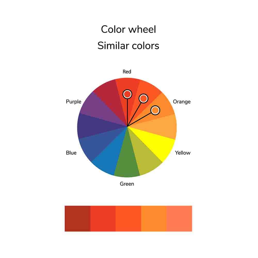
Analogous colors are similar colors that are next to each other on the wheel. This color scheme produces a harmonious effect when used in a painting.
Monochromatic Color Scheme

A monochromatic color scheme uses variations of just one color. A black-and-white drawing or painting is a monochromatic color scheme. Using tints and shades of just red, or just blue, or any other color would also be a monochromatic color scheme.
Triadic Color Scheme
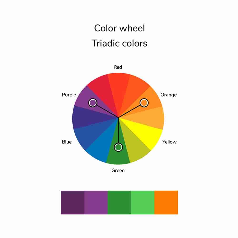
The triadic color scheme uses three colors that are evenly spaced around the color wheel. This combination of colors provides deep contrast in a painting and is a good combination to use for a vibrant effect.
Split-Complementary Color Scheme

A split complementary color scheme is a type of color scheme that uses one main color and two colors next to its complement. This color combination will give you the same contrast as a complementary color scheme but with additional color options.
Warm and Cool Colors

Color temperature is the quality of a color based on its relationship to cool and warm colors. A color can be described as “warm,” “cool,” or “neutral” based on which side of a particular point on the color wheel it appears.
A warm color is an amber, peach, or any other analogous color that is located near the “warm” side of the spectrum.
A cool color is one that is bluish, purple, or any other analogous color that is located near the “cool” side of the spectrum.
When you think of colors, what comes to mind? Many people may associate warm colors with summertime, the sun, and heat. Cool colors often invoke feelings of winter and coldness.
Warm colors include yellows, oranges, and reds. Cool colors include blues, purples, and greens.
The different variations of these two types of color are often used in artwork to create different moods or feelings.
If you draw a line through the center of the color wheel, you will separate the warm colors from the cool colors.
Learn more about warm and cool colors in this post: Warm and Cool Colors.
Neutral Colors
Neutral colors are any tones created by mixing two complementary colors.
Neutral colors serve as the bridge between warm and cool colors, offering a balanced visual effect. In color theory, neutral colors include shades of black, white, gray, and sometimes brown and beige. These colors are considered ‘neutral’ because they lack the distinct characteristics of being either warm (like red, orange, and yellow) or cool (like blue, green, and purple).
Neutral colors can be created by mixing complementary colors (opposite each other on the color wheel) together and adding some white to adjust the value. For example, mixing red and green or blue and orange in equal amounts often results in a brown or gray hue. The resulting shade’s warmth or coolness will depend on the ratio of the original colors.
How to Mix Specific Colors
Below are links to in-depth posts about how to mix specific colors. I will update it whenever I write about another color.
How to Mix Different Shades of Blue Paint Color
The Essential Guide To Mixing Shades Of Red Paint
Color Mixing: How to Mix Brown Acrylic Paint
How to Mix Purple Acrylic Paint
How to Mix Orange Acrylic Paint
Final Notes
Since the color tints and pigment concentrations can vary by brand and medium, you may get slightly different colors when mixing them.
The best way to be certain of the color you will get is to make yourself a basic color wheel using your own paints and experiment with the colors you have.
Make note of the colors you used and the ratio of paint. Keep the sheet for reference and add to it as you learn more about color.
Making color swatches of the paint you have is also a good idea. Acrylic paint usually dries slightly darker and does not always match the color on the tube.
Having a color chart that shows what the color looks like when dry can help you decide what colors to use. You can add to the sheet whenever you buy a new tube of paint.
I like using acrylic paper to make swatches since it holds the paint better.
If you have questions, you can leave them in the comments below. You can also join our free Facebook group, Trembeling Art Creative Corner, where you can ask questions, post your work and get to know some fantastic artists from all genres and skill levels. 😊
Thanks for reading.

I really enjoyed this post! The explanations of color theory are so clear and easy to understand. I especially loved the examples you provided. Can’t wait to apply these concepts to my artwork! Thank you for sharing!
Thank you for your advice. You are very painstaking. God bless you
Hi Marlyn. This has been the best article I have read regarding colour mixing. I understood everything you said, and you clarified many questions I had. But, I got lost with the neutral colours definition. What did you mean by “on either side of the spectrum”?
p.s. I have been quietly following you for over a year now, and love your articles. 🙂
Hi Marie: Thank you for your comment and question. I looked at the post and realized I did a very poor job of explaining neutral colors. I have edited the post and given neutral colors its own section. I hope that explains it better. Thank you for being a loyal reader and for your kind comments. It means a lot to me. 😊
If i look at a colour on a piece of art i want o paint, i have difficulty getting the correct colour when mixing, plus I never seem to have enough or too much on my brush🙄
Hi Suzanne. Getting the right color comes with practice and learning about color theory. Sometimes it helps to isolate the color in your reference photo. I use an index card with a hole punched in the center and then hold it over the area I am concentrating on. this helps me to see the color, shape, and value without the influence of the other elements in the picture. Remember too, value is more important than the actual color. 😊
I absolutely love how clear you make the cool Bs warm colors, but I get confused with landscapes where you are trying to demonstrate depth and perspective. The trees and grasses are green. The greens in the distance will be less saturated and lighter in color due to atmosphere. The greens in the front are bolder and brighter.. it’s the cool and warm that messes me up. Yellow and red are warm. Blue and purple are cool, but I end up with a mess when I try to make greens cooler or warmer without changing saturation or tint.
Wonderful article and tips!
Thank you. 😊
thank you so much, very interesting .
I purchased Barn Red premixed paint. It’s a bit too orange for me. How can I turn it a little more burgundy?
Hi Linda: You can try adding a deeper red to the color to move the bias away from yellow and make it more red. If that doesn’t give you the color you want try adding a very tiny amount of Dioxazine Purple to tone down the color slightly and give it that earthier burgundy color. If you don’t have purple, try using a blue that has a purple bias such as Ultramarine Blue. Experiment on some scrap paper until you get the color you are looking for. Hope this helps. 🙂
Good advice for this beginner. Thank you. Can’t wait for more.