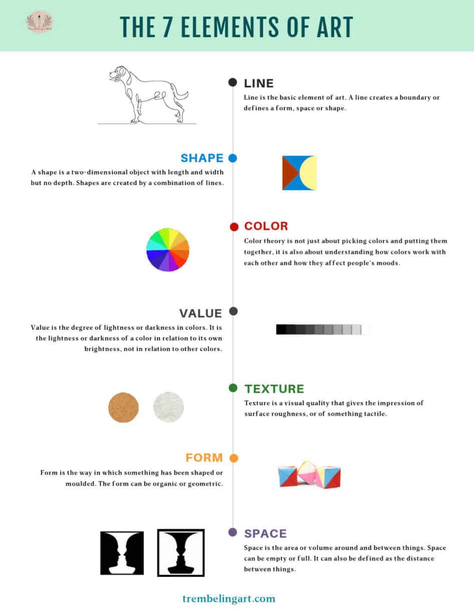
The 7 elements of art are line, shape, value, color, texture, space, and form.
The seven elements of art are always taught to art students and are the foundation of any piece of artwork.
Artists combine two or more of these elements to create works of art.
Even if you have never heard of the 7 elements of art, you have probably been using them in your painting without knowing it.
Understanding these visual elements and how they all work with each other will greatly improve your painting and allow you to produce a more cohesive work of art.
This post may contain affiliate links. If you click a link and buy, I may receive a small commission. Please see my full privacy policy for details.
What are the 7 Elements of Art?
Line
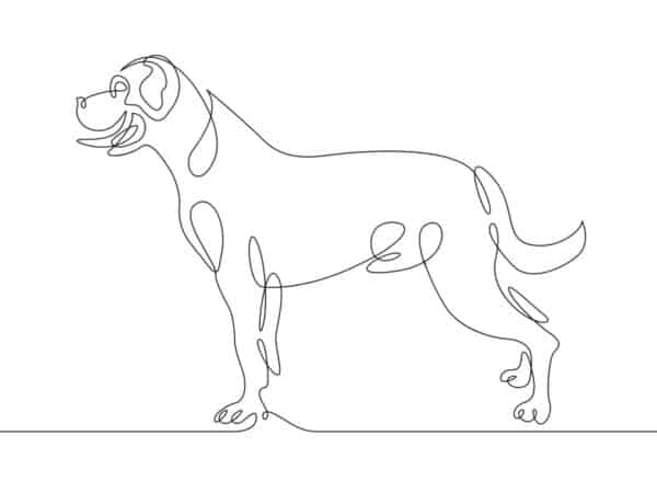
Line is the basic element of art. It is the foundation and arguably the most important element of art. A line is more than just a mark drawn or painted from point A to point B. A line creates a boundary or defines a form, space, or shape.
Lines can be straight or curved, thick or thin. The artist can use vertical, horizontal, or diagonal lines to imply direction.
Different types of lines can be used to make shapes, imply direction, and lead the viewer’s eye around a painting.
Lines show size and height, convey perspective, and create patterns. They can also be used to create texture and shading in a work using cross-hatching.

Shape
A shape is a two-dimensional object with length and width but no depth. The shape may be simple or complex, regular or irregular. Shapes are created by a combination of lines.
There are geometric shapes such as circles, squares, or triangles, and organic shapes appear in nature and are usually more abstract.
A shape or shapes can be used to create visual interest, balance, rhythm, and hierarchy in a painting composition. They also help guide the viewer’s eye around the artwork. Artists often use shapes to create a focal point in their artwork.
Remember, everything you see is just basically a composition of shapes. If you are struggling to get your subject onto paper, print off your reference photo and trace over any obvious shapes you see.
Transfer these triangles, squares, circles, and organic shapes to your canvas or paper.
Start with these basic shapes and build on them, adding color, detail, and shading until you have transformed the shape into the object you are attempting to paint or draw.
It takes a bit of practice, but it is a really good place to start for a beginner and gives you an understanding of what you are seeing and how all of these shapes work together to form a picture.

Color
Colors are a big part of any design and one of the basic components of a painting. The colors you use should have a purpose and be appropriate for the audience you are designing for.
Color theory is not just about picking colors and putting them together; it is also about understanding how colors work with each other and how they affect people’s moods.
Color can set the mood and feel of a painting. A landscape painted in greys or muted tones would have a different feel than the same landscape painted with bright, vibrant colors.
All colors have certain characteristics that would be helpful to know when designing a painting.
Hue – the colors themselves: red, blue, green, etc.
Value – how light or dark a color is.
Chroma – the brightness or dullness of a color, in other words, how saturated it is.
Temperature – colors can be warm or cool.
For a deeper understanding of colors and their characteristics, see my series of posts on Color Theory, Warm and Cool Colors and Complimentary Colors.
Using a color wheel can help you choose colors for your art piece. A color wheel is a tool that artists use to pick out the color scheme for their work. It helps artists understand what colors will work together well or clash with each other when used in an artwork.
A color wheel is usually divided into primary colors, secondary colors, and tertiary colors to help visualize the color scheme of your artwork.
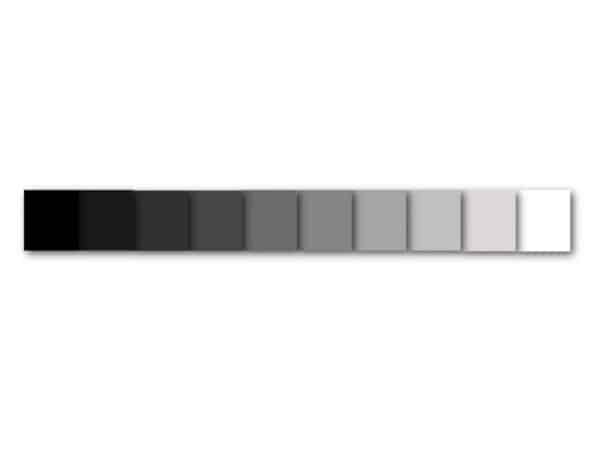
Value
Value is the degree of lightness or darkness in colors. It is the lightness or darkness of a color in relation to its own brightness, not in relation to other colors.
The higher the value, the more light reflects off an object and vice versa.
Lighter values are referred to as tints. Darker values are referred to as shades.
It is easier to visualize the values of a color if you use a value scale. A value scale is a strip of squares or blocks ranging from the darkest dark, gradually progressing to the lightest light. The lightest value usually being white, and the darkest value is usually black.
Value is important because it helps create a sense of depth and contrast in paintings and drawings.
A successful composition will have a range of tonal values to give the piece more life and visual interest. If there is not enough range in values, the painting can look flat.
For more information, see my post on Value.
Texture
Texture is what we see when we look at an object closely; it includes things like smoothness or roughness on the surface of an object.
Texture is a visual quality that gives the impression of surface roughness or of something tactile.
When we think of texture in art, we often think of sculptures or pottery, but texture or the illusion of texture can also be achieved in a painting or drawing.
Texture is an important aspect of art. It can be achieved through a variety of materials and techniques, such as paint strokes and the use of sandpaper. Texture makes an object more three-dimensional and helps to convey a sense of realism to the viewer.
In drawing, texture is created by adding parallel lines or dots to create the impression that the surface has been roughened by some process, such as sanding or scraping.
In a painting, texture can be implied by using value and brushstrokes to give a 3D feeling to the artwork. The right amount of shading and highlighting can make a tree trunk or a dewdrop appear real enough to reach out and touch.
There are different ways of adding texture to a painting. There are many texturing compounds available on the market that can be added to your paint to produce texture.
These texture mediums can incorporate glass beads, sand, fibers, or resins to add texture. You can also use texture pastes or heavy applications of gesso.
Liquitex has an excellent article on creating texture in your painting. You can read the article here.
Using a palette knife and thick paint can also achieve a lot of texture in a painting. This is especially useful for mountain tops or abstract paintings.
You can also use unusual items to create texture with thick paint or gesso. Try using a fork, an old credit card, bubble wrap, or purchase specially designed paint “shapers” to create texture.

Form
Form is the way in which something has been shaped or molded. The form can be organic or geometric.
Form is the shape, structure, or configuration of an object. A form is a three-dimensional object with length, width, and depth.
The two main types of form found in art are:
– Geometric forms (circle, square, triangle) One of the most common types of form is geometric form.
Geometric forms are shapes that can be divided into two or more equal parts by straight lines. These shapes can also be symmetrical, meaning they have a line of symmetry that divides the shape in half and are made up of straight lines and angles.
Geometric forms are most often found in architecture and sculpture but can be seen in paintings and drawings as well.
– Organic forms (animal, plant): Organic form is a natural shape with no specific pattern or symmetry. They are free-flowing and have little or no pattern to them.
These are forms are usually found in nature and occur naturally.
The shape of a plant or rock or the silhouette of an animal are all organic forms.
Many artists use form to create a sense of movement and the illusion of space.

Space
Space is the area or volume around and between things. Space can be empty or full. It can also be defined as the distance between things.
The use of space in art is important to show visual interest, depth, and distance and create contrast between elements in a painting.
Space can also be used to define perspective, imply the size of the elements in the artwork, and define shapes and forms.
Negative space is the area or volume around and between objects, while positive space is the object itself.
Negative space can be used to create a focal point or bring more attention to an object by isolating it. Negative space can also be used to create a mood or a feeling of openness or isolation in a painting.
The elements of art are the basic building blocks of art required for any visual artwork. These basic elements of art can be used individually or combined to create a variety of styles and interpretations.
The elements of art are important because they help the artist create a piece that is both aesthetically pleasing and tells a story. They also allow the artist to convey their message in a way that is unique to them.
If you have questions, you can leave them in the comments below. You can also join our free Facebook group, Trembeling Art Creative Corner, where you can ask questions, post your work and get to know some fantastic artists from all genres and skill levels. 😊

Excellent article. It opened up my eyes to further appreciate the depth of the elements of art. From reading this I believe you are a dedicated and talented artist, and I’m looking forward to exploring your website further.
Thank you Chloe. 😊
The elements of art are not the same as the principles of art. The elements are what we use to CREATE the principles.
Very informative! I’ve been in the art business for many years. It was even good to refresh myself as an artist. The elements will be my first lesson for my student. Then I’ll follow up the next week with a quiz. After that we can start doing some lessons. Thanks.
Well tabulated notes
Beautiful Article
Everyone tells me to make a color chart and it will help went paint in watercolor. I am reading all kind of books, old and new and now your website. I have learned a lot with one of my teachers (I have 3.) and one in particular makes us mix all our colors before we paint. I have really learned so much from this teacher about color theory. I have really enjoined your website. Thank you so much.
I am 74 and just have been painting for 6 years. Love learning and watching my pictures improve. Thank you so much for your information.