

Complementary colors are colors that are opposite each other on the color wheel. If you look at a color wheel, the opposite of yellow is purple so purple is the complement to yellow.
The same is true for other colors. The opposite or complement of blue is orange and the opposite or complement of red is green.
That is the basics of complementary colors but there is so much more learn about them and this knowledge will help you choose the colors for your artwork and understand how colors work with and enhance each other.
If you haven’t yet read my post on basic color theory you might want to check it out before reading about complementary colors to give you a head start. If you are already a little familiar with color theory, then lets dive in to complementary colors.
This post may contain affiliate links. If you click a link and buy, I may receive a small commission. Please see my full privacy policy for details.
Basic Complementary Colors
If you look at the color wheel below you will see that the opposite of the primary colors, yellow, blue and red are secondary colors made from the other primary colors.
The opposite of yellow is violet ( or purple if you prefer that name) which is a combination of red and blue. The opposite of blue is orange which is a combination of yellow and red. The opposite of red is green which is a combination of blue and yellow.
These combined primary colors are known as secondary colors.
So the compliment of each primary color is a secondary color combination of the other two primary colors.
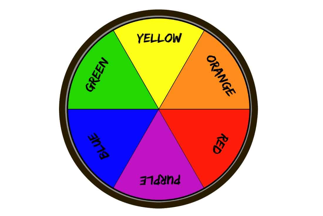
It’s a little confusing I know. This chart may help you see it more clearly.

Tertiary Colors
Along with secondary colors, we also have tertiary colors. These colors are a combination of one primary and one secondary color. There are six tertiary colors.
For example:
A combination of blue (primary) and violet or purple (secondary) will give you blue-violet (tertiary).
A combination of blue (primary) and green (secondary) will give you blue-green (tertiary).
A combination of yellow (primary) and orange (secondary) will give you yellow-orange (tertiary).
A combination of yellow (primary) and green ( secondary) will give you yellow-green (tertiary).
A combination of red (primary) and violet (secondary) will give you red-violet (tertiary).
A combination of red ( primary) and orange ( secondary) will give your red-orange (tertiary).
It is easier to understand if you have your own color wheel to refer to. I use this color wheel and find it helpful.
If you don’t have a color wheel handy, you can print off the one below or take a screenshot so you have something to refer to while going through this article.
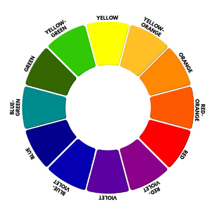
Of course, there are various tints, tones, and shades of all of these colors. There are thousands of colors, and it wouldn’t be practical to put them all on a color wheel. This basic color wheel is the easiest way to understand and see that complementary colors are opposite each other on a color wheel.
If you are interested in learning more about tints and shades, you can read my post on Tints, Tones, and Shades.
Using Complementary Colors
Now that you have some understanding of what complementary colors are let’s see how you can use complementary colors in your painting.
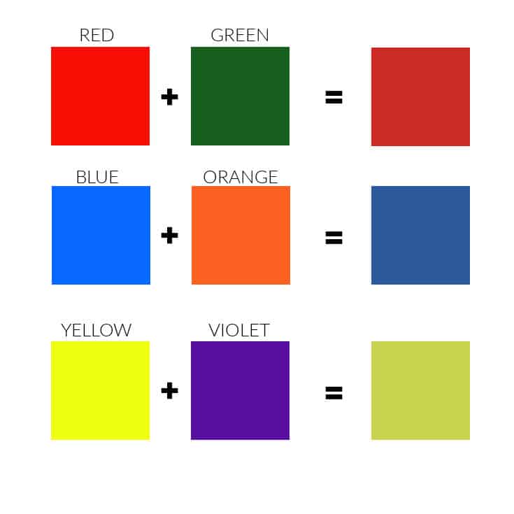
Toning Down a Color with Its Complement
To begin with, mixing a color with a tiny amount of its complement will tone down that color.
For example, if you are using a red that is too vibrant, you can add a tiny amount of green to tone it down. The more green you add, the duller the red will become. See the chart below.
Enhance the Vibrancy and Contrast
Complementary colors can also be used to enhance the vibrancy of the opposite color in your painting.
If you paint blue or yellow flowers on a field of green grass, the blues and yellows tend to blend into the grass. This is because green is a combination of blue and yellow, so the green field seems to absorb the flowers.

If, however, you paint red flowers on a sea of green, both colors become more vibrant because of the natural contrast. They “complement” each other.

Use Complementary Colors for Shading
Use complementary colors for shading in your painting. Mix a little of the complement into your base paint to get a natural, earthy shade. The more of the complementary color you mix in, the darker the shade will be.

Go slowly when mixing these colors. Remember, when you mix all three primary colors (red, yellow, and blue) together in equal amounts, you will get brown ( or, as I like to call it, “artistic mud”).
When you mix a color and its complement, you are essentially mixing all three primaries, so start with a little of the complementary color and build up to the color you want.

The Color Wheel
A color wheel is a valuable tool for an artist. Get yourself a color wheel and practice mixing the complementary colors.
Make swatches to keep for reference and make notes of which colors you mixed and in what ratios. This will help you if you are ever stuck on how to add vibrancy or shadows to your paintings.
Remember too, there are slight variations in colors between brands, so you may get a slightly different result depending on what brand of paint you use. I hope you enjoy experimenting.
If you have questions, you can leave them in the comments below. You can also join our free Facebook group, Trembeling Art Creative Corner, where you can ask questions, post your work and get to know some fantastic artists from all genres and skill levels. 😊
Thanks for reading.

Thank you Marilyno for your explanation and examples.
I am a beginning painter, and this will be invaluable going forward. Thank you for the enlightenment!
It’s been really a unique piece of content and I like the way you elaborate all the possible color combinations so simple and easy to understand. Thanks! for sharing with us.
Thank you Michael. 😊
I find your explanation of colors very through and helpful . Thank you for this
Nice explanation and examples
Please add me to your email list.
Hi. Please add me to your email list.
I love the way you explain color theory!
Thank you Phyllis! I am glad it was helpful. 😊