


Most of us know what colors make purple paint, but mixing red and blue doesn’t always give us the desired result. Getting a bright, vibrant purple can be a little complicated.
Purple is a color that is frequently on my painting palette. I love the color and all of its various tints and shades, from deep, dark purple to lavender and lilac. But it is also a very useful paint color, even if you are not a fan of purple.
Purple can be used to darken blues and reds without using black. It also lends depth and richness to black paint, which tends to be flat and dull on its own.
A tiny bit of purple can also be used to mute or tone down yellows and oranges when you find they are too bright.
In my opinion, Dioxazine Purple is a must-have in your paint box.
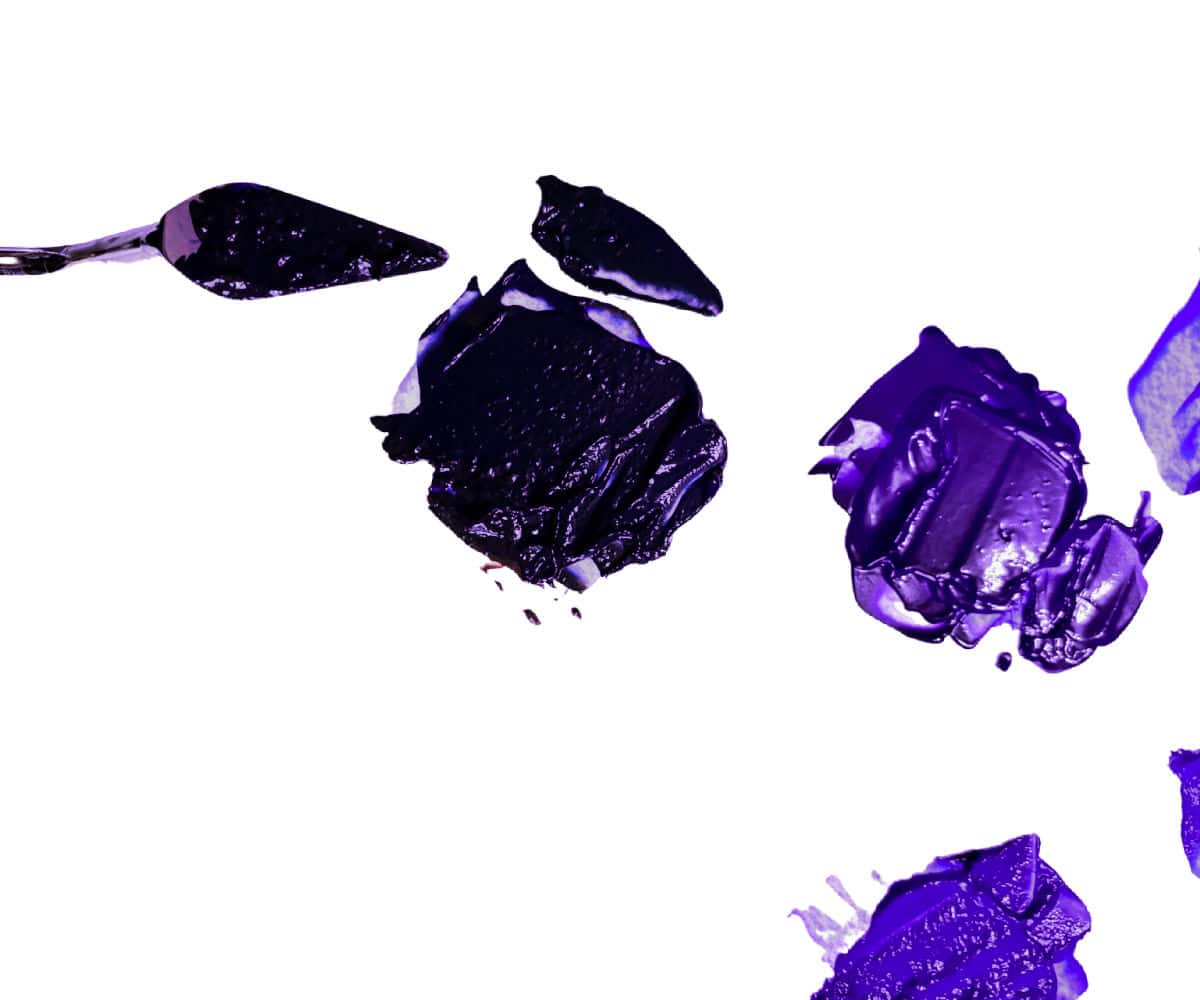
But what if Dioxazine Purple is not the right purple for your painting? How do you mix various tints and shades of purple if you don’t have Dioxazine? And why does your mix of blue and red give you a dull, muddy color instead of the vibrant purple you want?
All of these questions are answered below and I give you a range of purples. I work mostly in acrylics, but these mixes will work for any medium.
At the end of this post, I have also included a printable color mixing chart for purples to help you find the perfect purple for your project.
This post may contain affiliate links. If you click a link and buy, I may receive a small commission. Please see my full privacy policy for details.
Why Red and Blue Don’t Always Make Purple
Purple is a secondary color. When you mix two primary colors together, you get a secondary color. We all learned at a young age that blue and red make purple. Primary Blue and Primary Red mixed in equal amounts will make purple.
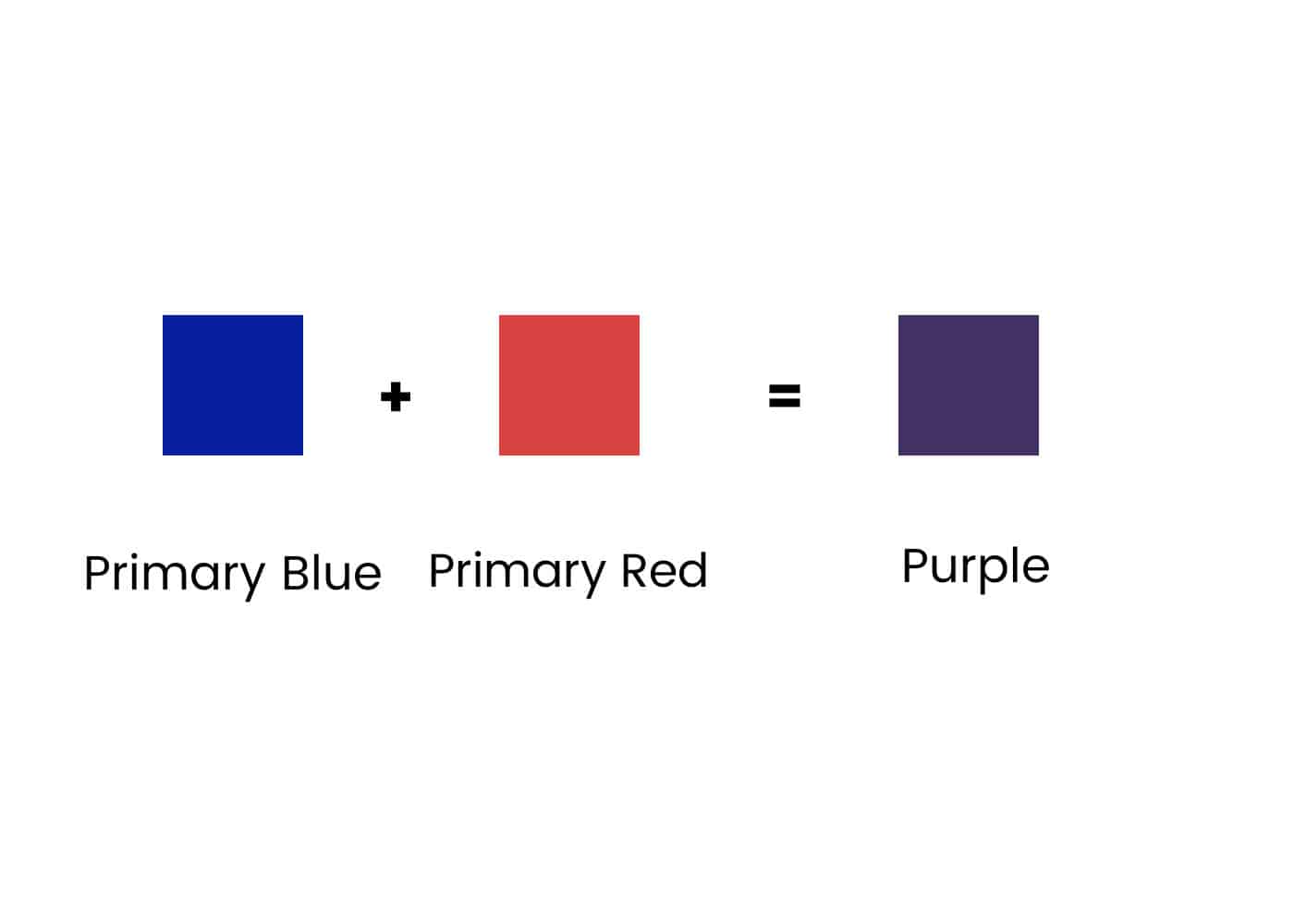
But what about all of those other blues and reds in your paint box that don’t quite give you the purple you imagined when mixed together?
The answer is color bias. Color bias means that some colors also have hints of other colors.
So, for example, some blues have hints of red and some blues have hints of yellow.
Some reds have hints of blue, and some reds have hints of yellow.
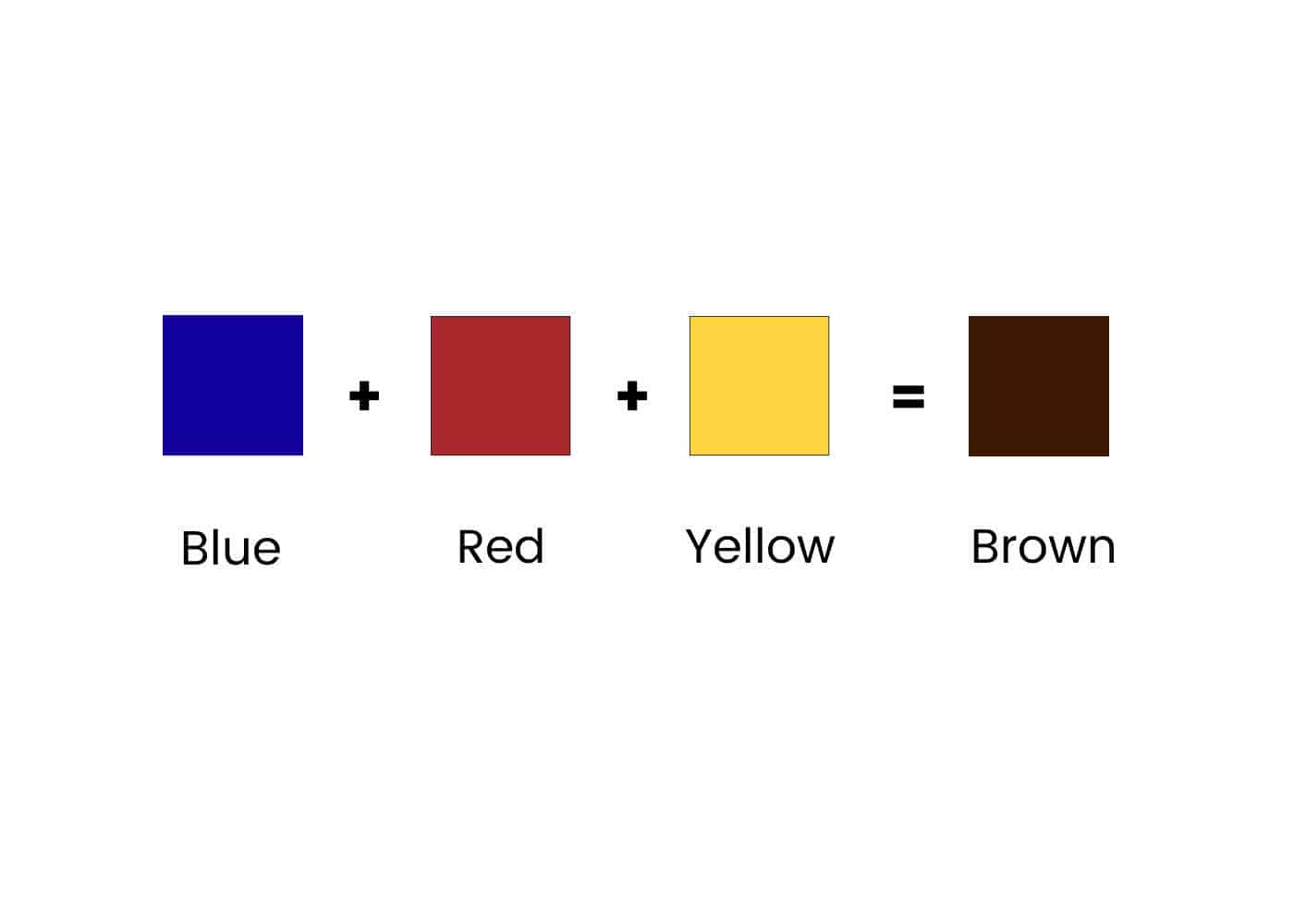
Primary color theory tells us that if we mix the three primary colors—red, blue, and yellow—we get brown.
If you mix a blue with a red that has hints of yellow, you are actually mixing all three primary colors, so you get a muddy, brownish purple.
Blue + Red + Yellow = Brown
Here is a list of the more common blues and reds and their color bias.
Blues with Red: Ultramarine Blue Cobalt Blue
Blues with Yellow: Phthalo Blue Cerulean Blue
Reds with Blue: Permanent Rose Quinacridone Magenta
Reds with Yellow: Cadmium Red Vermillion
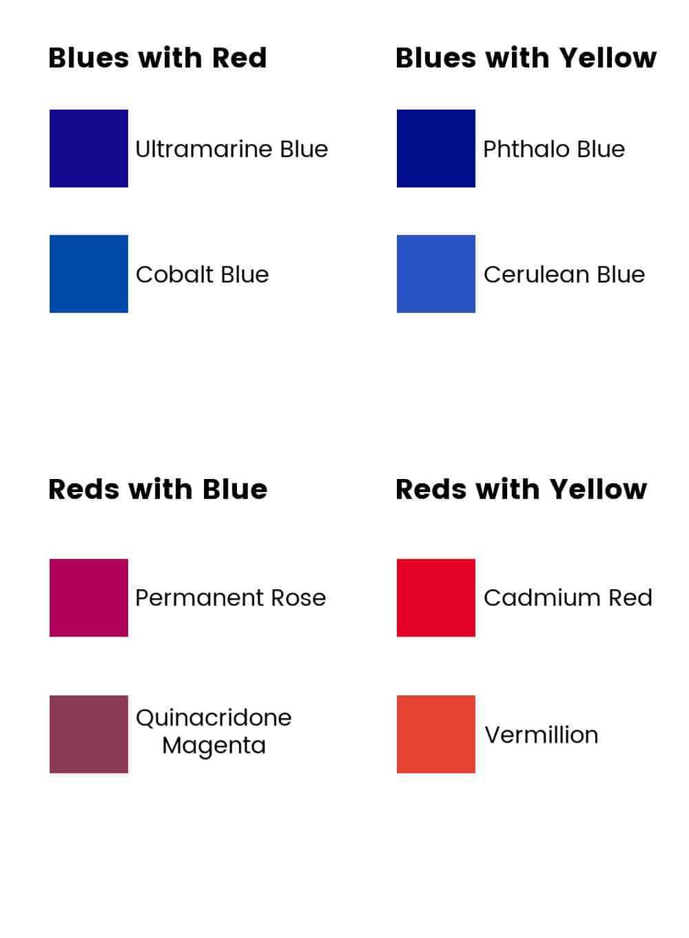
So, your tubes of blues and reds must not have yellow (or green since blue + yellow = green) to make a true purple. For more information on color theory, check out my post on the basics of color theory for beginners.

How to Check for Color Bias
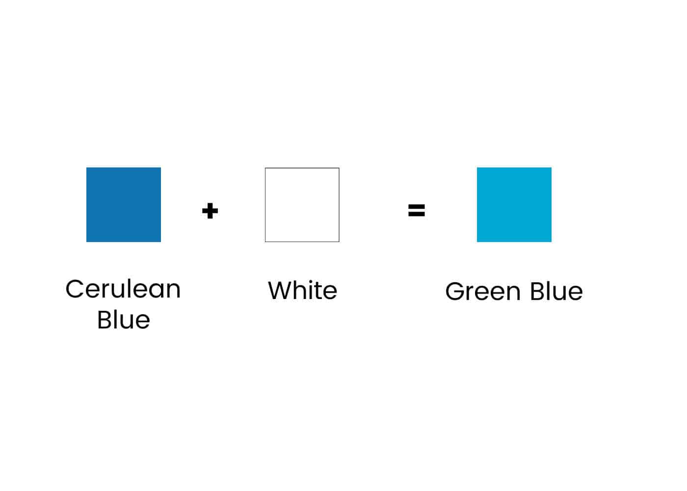
You can check the color bias of your paint by mixing it with a little white.
Red paint mixed with white should turn pink. If you get a peachy color, then there is a yellow bias.


Blue paint mixed with white should turn light sky blue. If you get a greenish-blue or a turquoise blue, there is a yellow bias.

Now that you understand color bias let’s make purple!
How to Make Bright Purple Paint
To get a bright, vibrant purple the best colors to mix are a warm blue color and a cool red color.
Ultramarine Blue (warm) and Quinacridone Magenta (cool) is my favorite mix for a bright purple. You can also use Alizarin Crimson (cool) and Ultramarine Blue or Permanent Rose (cool) and Ultramarine Blue, but the Quinacridone Magenta will give you the brightest purple. (see chart below)
Mix these paints in equal parts to get a beautiful color of purple. ( Note: colors on the computer screen are not always accurate)


How to Mix Dark Purple Acrylic Paint
You can use the same mixes as above but use more blue than red to make a dark purple color. The more blue you use, the darker your purple will be.
You can also add a very small amount of black paint to the bright purple mixes to darken them. Black can quickly overwhelm your purple paint, so start with tiny amounts and keep adding it until you get the color you want.
Alternatively, you can start with a premixed tube of purple, such as Dioxazine purple and add blue or black paint to get a darker shade. Add to it gradually until you achieve the dark colors you want.

Mixing Light Purple Paint
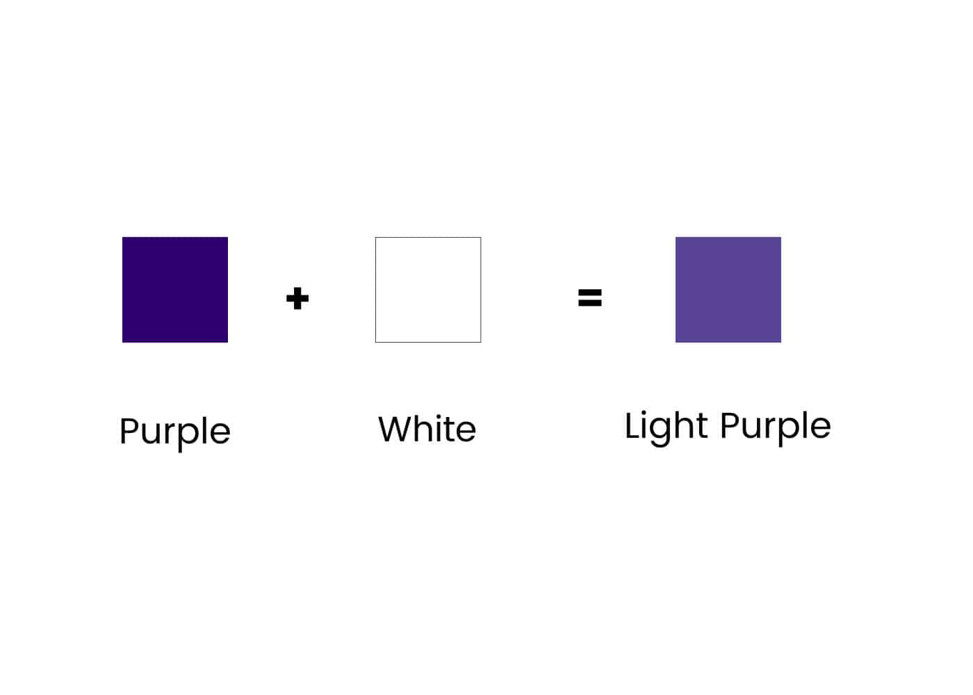
Again, take your bright purple mix and add a little titanium white paint this time. The more white you add, the more pastel the color will be.
You can also try adding a tiny amount of Cadmium Lemon Yellow to lighten the purple paint. This will give you a less pastel look. Use the Lemon Yellow as other yellows will give you a dull, muted greyish purple.
Adding white to Dioxazine Purple will also work to give you a light purple paint.
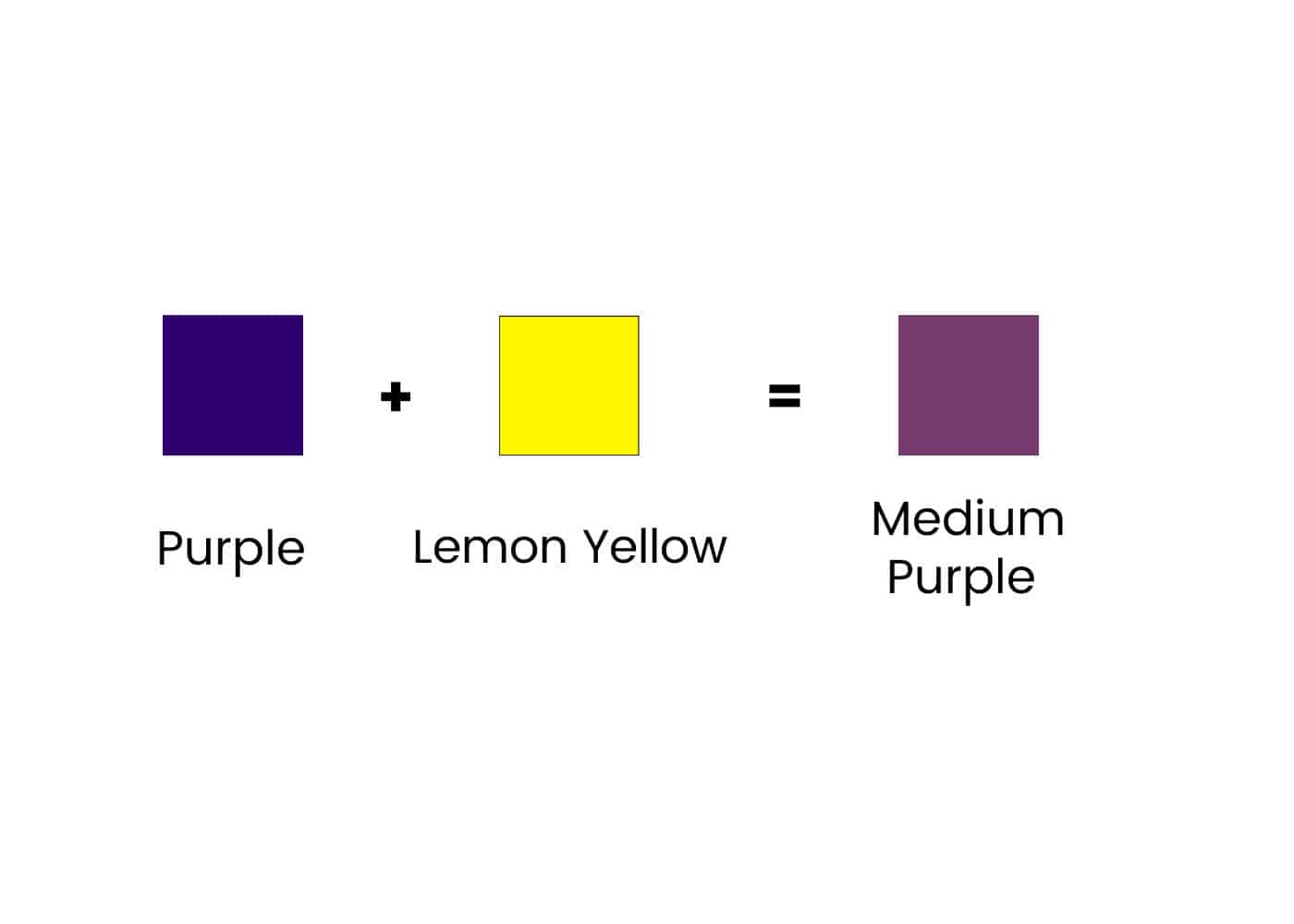
Muted Purple
To get muted purples, you need to mix the complementary color of purple, opposite on the color wheel, which is yellow. For more information on this, see my post on complementary colors.

Adding a little Cadmium Yellow, Hansa Yellow, Yellow Ochre, or any yellow in your paint box will give you a muted shade of purple.
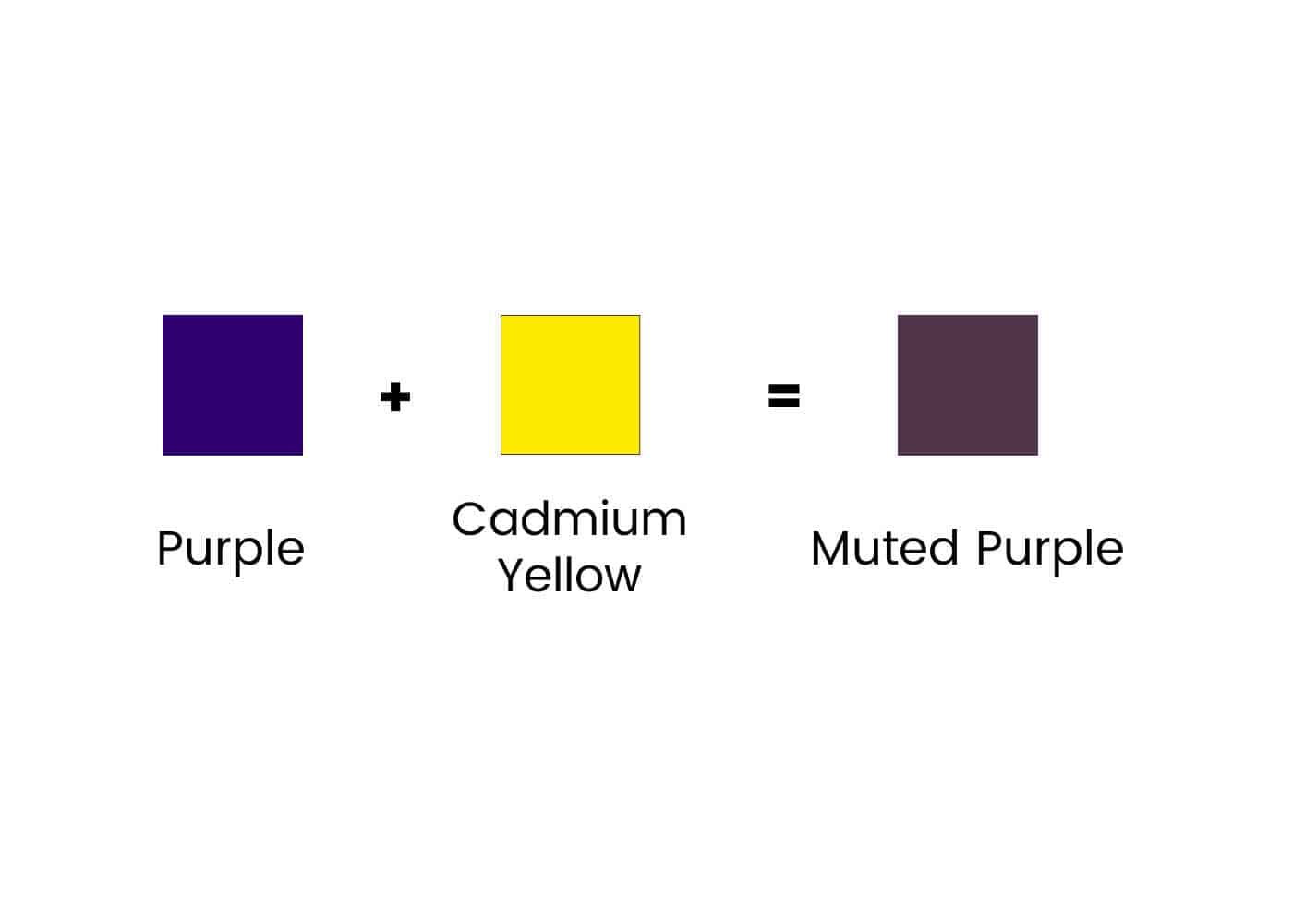
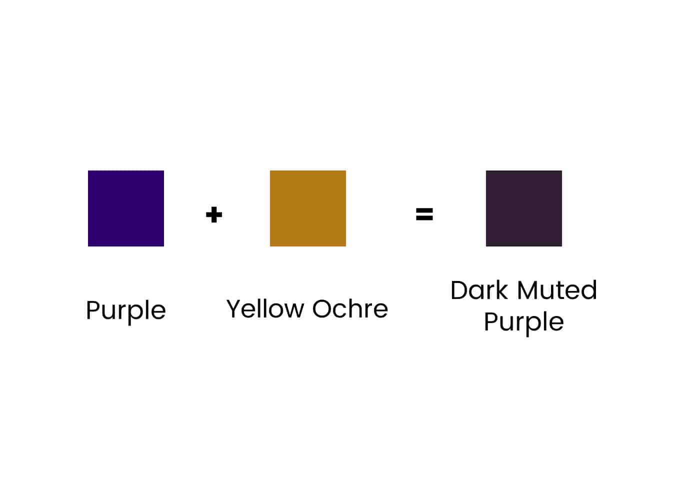

You can also add a yellow to any premixed tube of purple that you have to get a muted shade of purple.
If the result is too dark, you can add a little white to lighten it or more yellow, depending on how deep the purple was to start with.
Again, add a bit of black or blue to darken the muted purple to get the darker muted shade.
Color Temperature
Color has a temperature. There are warm colors and cool colors. The choice of color temperature can set the tone of a painting and influence the viewer’s overall perception of your painting.
Within the blues and reds you use to mix purple, there are warm blues, cool blues, and warm reds, and cool reds.
Warm reds tend toward orange or yellow; when mixed with blue, they give you a dull brownish purple.
Cadmium red is a warm red. It is useful to tone down your purple color when necessary.
Cool reds, such as Alizarin Crimson and Quinacridone Magenta, give you a much brighter and deeper purple when mixed with your blue colors.
Ultramarine blue is a warm blue with a slight red bias, so it makes a good base for a purple shade.
Primary blue is a cool blue, so when mixed with primary red, it makes a duller purple color.
I know this seems very confusing, but the best way to understand it is to sit down and mix the colors. It will be easier to understand once you see how the various colors interact.
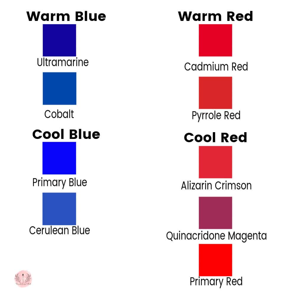
Purple Color Mixing Chart
Click on the chart to download and save it to your computer or print it for future reference.
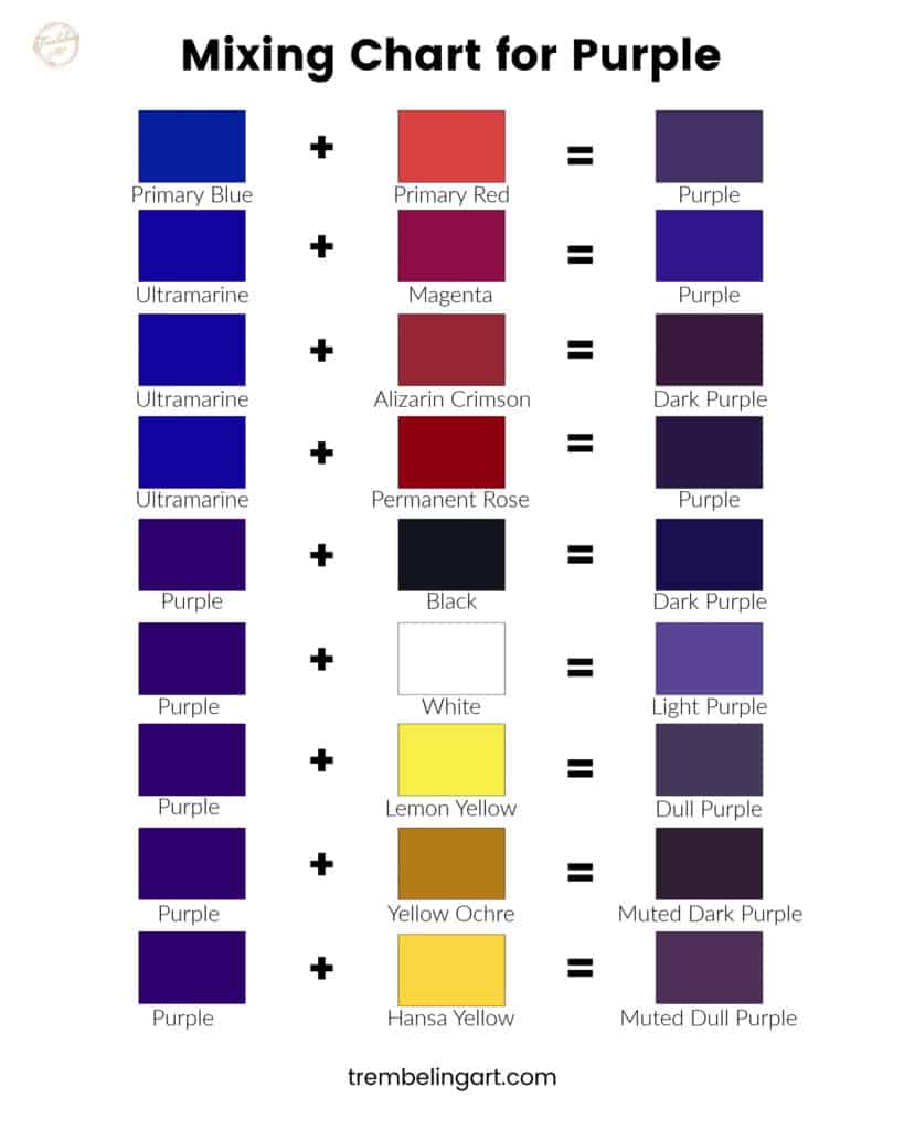
You need to play around with the colors you have to see what you can come up with. Many combinations of paint colors give you many variations of purple. Each manufacturer has a slightly different formula for their paint, so you may get slightly different results depending on which brand you use.
Making Purple “Pop“
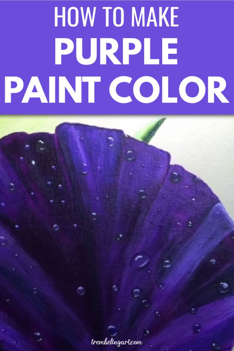
If your purple doesn’t “pop” on your painting, try surrounding it with a dull color like I have done in this painting. The duller greenish/yellow makes the purple of the flower look more vibrant.

Surrounding your purple with a vibrant blue, for example, will make it seem to fade back into the picture. Contrast is the key to making your subject stand out in any painting.
Points to Remember
Red (with a blue bias) + Blue (with a red bias) will give you purple.
Yellow (opposite on the color wheel) will tone down or grey out the purple color.
Colors are influenced by their surroundings. To make your purple look more intense, surround it with dull colors.
Key Takeaways
Understanding Color Bias is Important: Color bias plays an important role in mixing paints to achieve vibrant purples. Recognizing that some blues and reds have hints of yellow can prevent muddy results.
Mixing for Vibrancy: For a bright, vibrant purple, combining a warm blue like Ultramarine Blue with a cool red such as Quinacridone Magenta yields the best results. This mix avoids the dullness that can come from incorrect color biases.
Creating Depth and Tones: To darken purple, use more blue than red or add tiny amounts of black paint carefully to maintain vibrancy. Lighten purple by adding white for pastel shades or a tiny amount of Cadmium Lemon Yellow for a less pastel but still lighter color.
Muted Shades: Effectively muting purple requires adding its complementary color, yellow, in various forms (e.g., Cadmium Yellow, Hansa Yellow, Yellow Ochre). This technique allows for a range of muted purples.
Make Your Purple Stand Out: Contrast is key to making purple “pop” in your artwork. Surrounding purple with duller colors can enhance its vibrancy, while pairing it with similar or vibrant colors may cause it to recede or look dull.
Color Mixing Chart: The included color mixing chart is a good resource for reference. It gives you a visual guide to mixing various shades of purple and encourages experimentation with different color combinations.
Practical Application: Remember, each manufacturer will have a slightly different combination of pigments, and the color chart may look different on your computer screen and when printed. That’s why it is important to make your own swatches with the paints you have.
I hope these tips work for you and you enjoy playing with color mixes. Remember to save swatches of the colors you mixed so you will remember how you mixed them when you need to use them.

I would love to see what you have painted with your color mixes and how you used the various tints and tones of purple. Join my private Facebook group, Trembeling Art Creative Corner where you can post your paintings and other artwork. It is a great place to get feedback, ask questions, and connect with other artists.

I really like everything your doing. You’ve explained in depth . Thank-you Eugene Eldridge
Not sure if you can open this photo but I cant seem to get this rich and vibrant purple. It seems it has more blue Do you have any suggestions?
file:///var/mobile/Library/SMS/Attachments/dd/13/A19BF7A4-67BF-4F13-8207-03F16676FD0E/IMG_9374.jpg
Hi Jenny, I can’t open the picture but if the color is more blue try adding a bit more red. The best colors to use to mix a vibrant purple are Ultramarine Blue and Quinacridone Magenta. Start with the blue and add in small amounts of red until you get the desired color. I hope this helps.😊
Hi,
Love your detailed information on color theory and the color bias.
But can you tell me how do you determine the bias of yellow, I only saw red and blue to add a little white you could see the bias on those colors.
But didn’t see it for yellow? Thanks for the clarification, new to this and love to learn
Hi: Yellow is a bit harder to determine the color bias using white since whit tends to just lighten the color. As a general rule (but not always) darker yellows such as yellow ochre tend to lean towards red giving you a warm earthy yellow. Lighter yellows, such as lemon yellow, tend to lean toward blue, giving you a slight green undertone. You can also try painting a swatch or red and blue next to your yellow; sometimes you can see the color bias that way. You can also check out the website of the paint manufacturer. They usually have information about their paint including color bias and/or pigment numbers. Hope this was helpful 😊
Awesome article about color combinations. As a local house painter myself, I often do this especially if we get special requests from clients who wish to achieve a certain shade of color.
Is their any way to lighten it more?