
Blue is often one of the first colours artists buy, usually Ultramarine Blue. While there are many beautiful blue paint colours available, artist-grade paint can be expensive. Learning how to mix blue paint colours allows you to create dozens of shades of blue using just a few tubes of paint.
Since blue is one of the three primary colours, you cannot mix true blue, but you can mix various tints, tones, and shades of blue to expand your palette without having to buy dozens of tubes of paint.
Mixing shades of blue can be done by combining different paint colours to achieve the desired hue.
In this guide, you’ll learn how to mix blue paint to create lighter blues, darker blues, muted blues, and vibrant turquoise shades—using basic colour theory and simple mixing techniques.
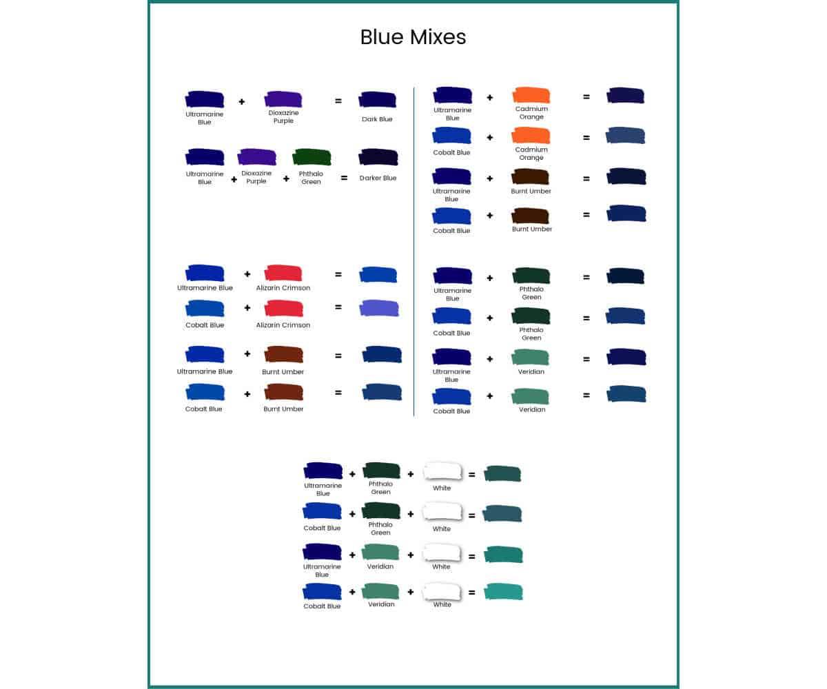
At the end of this post, I have included a printable blue colour mixing chart you can use as a guide. The colours won’t be exact due to monitor and printer variations, but it will give you something to go by as you mix your blues. 😊
Start With a Primary Blue Paint (Ultramarine vs Cobalt)
A good starting point is a primary blue paint such as Ultramarine Blue, which is a dark colour close to navy blue, as your base colour. Cobalt blue is a lighter shade of blue and a good colour to help you achieve cooler shades of blue.
When you start colour mixing, go slow. To begin with, add a small amount of your mixing colour to your blue hue. You can always add more, but it is harder to fix the colour if you have added too much.
Once you have the colour mix you want, you can mix a larger amount using that formula.
- Ultramarine → landscapes, skies, shadows
- Cobalt → water, distance, airy atmospheres
How to Make Light or Dark Blue Paint
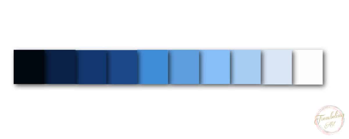
The most basic mix for any colour is to add white paint to make it lighter or black paint to make it darker. With these colours, you can achieve various blue shades ranging from very dark to very light.
However, if you stick to just black and white, you will have a very limited palette of blue hues. What about the purplish blue of a night sky, the tranquil blue/green of a tropical ocean, or the muted blue/grey of distant mountains?
For these colours, we have to dig a little deeper into colour theory and the colour wheel, using secondary and complementary colours to expand our blue palette.
👩🎨Tip: Many artists avoid using black to darken blue because it can dull the colour. Mixing blue with complementary or adjacent colours often produces richer dark blues.
Making Blue Paint with Secondary Colours
Secondary colours are created by mixing two primary colours in equal proportions. There are three secondary colours: green, orange, and violet. Green is created by mixing blue and yellow, orange is made by mixing red and yellow, and violet is created by mixing red and blue.
Secondary colours are positioned between the primary colours they are made from on the traditional colour wheel.
Mixing secondary colours with your primary blue can create different shades of blue.
For example, mixing violet or purple with ultramarine blue will produce a beautiful, darker shade of blue, perfect for a night sky.
Add a little phthalo green to this mixture, and you will get an even deeper dark blue colour.
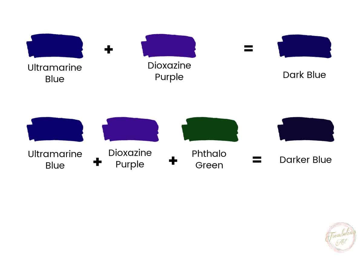
- Blue + violet → night skies, shadows
- Blue + green → oceans, foliage reflections
Use Complementary Colours to Tone Down Bright Colours
Complementary colours are pairs of colours that are opposite each other on the traditional colour wheel. The three main pairs of complementary colours are red and green, blue and orange, and yellow and violet. They are said to complement each other.
For more information on complementary colours, refer to my post on Complementary Colours.
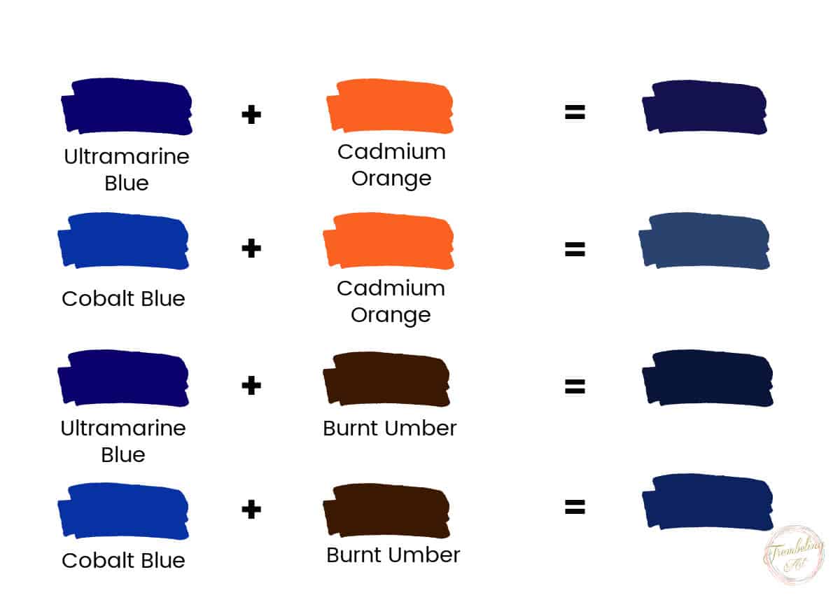
A quick way to mute a bright, saturated colour is to use its complement. When you combine a colour with its complement, you tone down or desaturate that colour. Since the complement of blue is orange, we can use orange colours to mute our blues.
Ultramarine blue plus cadmium orange will give you a dull, muted blue. Cobalt blue plus orange will result in a less vibrant blue-gray, which is a great muted blue.
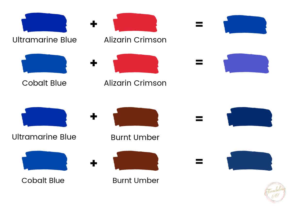
You can also use brown to mute your blues. Ultramarine blue plus burnt umber will give you a dark, muted blue. Cobalt blue plus burnt umber will give you a brownish blue.
Always add complementary colours in very small amounts. A tiny touch of orange can dramatically change a blue mixture.
Color Temperature
Colours have a temperature. They can be either warm or cool, but sometimes we need to adjust a colour’s temperature by adding another colour to warm it or cool it.
If your blue feels too harsh or artificial, warming it slightly can make it feel more natural in a painting.
For a deeper understanding of colour temperature, see my post on Warm and Cool Colours.
Warm Shades of Blue
We can add a little bit of red to increase the warmth of a blue colour. In this case, we will add a little bit of Alizarin Crimson to the Ultramarine Blue.
Ultramarine Blue is already a warm blue, but Crimson will warm it further. Only add a little at a time since ultramarine has a purple bias, and adding too much red will make it even more purple.
Adding Burnt Umber will deepen your blue, as mentioned above, but it will also warm it and give it a more earthy tone.
Cobalt Blue is a more neutral blue, neither truly warm nor cool. Adding Alizarin Crimson or Burnt Umber will warm Cobalt Blue up to some degree.
Cool Shades of Blue
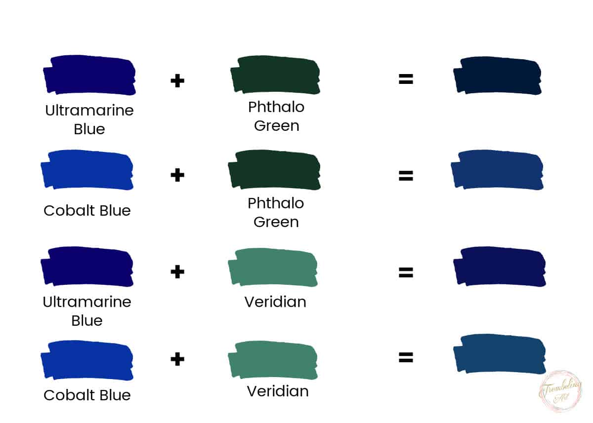
Cool blues can be made by adding a cool green, such as Phthalo Green or Veridian, to Ultramarine or cobalt blue.
Ultramarine mixed with green will produce a cool, darker blue.
Cobalt blue mixed with green will give you a lighter shade of cool blue.
How to Mix Turquoise and Teal Blue Paint
Turquoise blue is a beautiful colour often seen in paintings of tropical oceans. It is probably my favorite color and is prominently featured in my office.
But is it blue or is it green? The answer is yes!
Turquoise is a mixture of blue and green, with white added. You can get various shades and tints of turquoise depending on which blues and greens you use and how much of all three colours you add.
The chart below shows some of the mixes from the colours we have used, but there are many more combinations that will give you beautiful turquoise and teal colours. Experiment with the greens and blues you have to see what colours you can make.
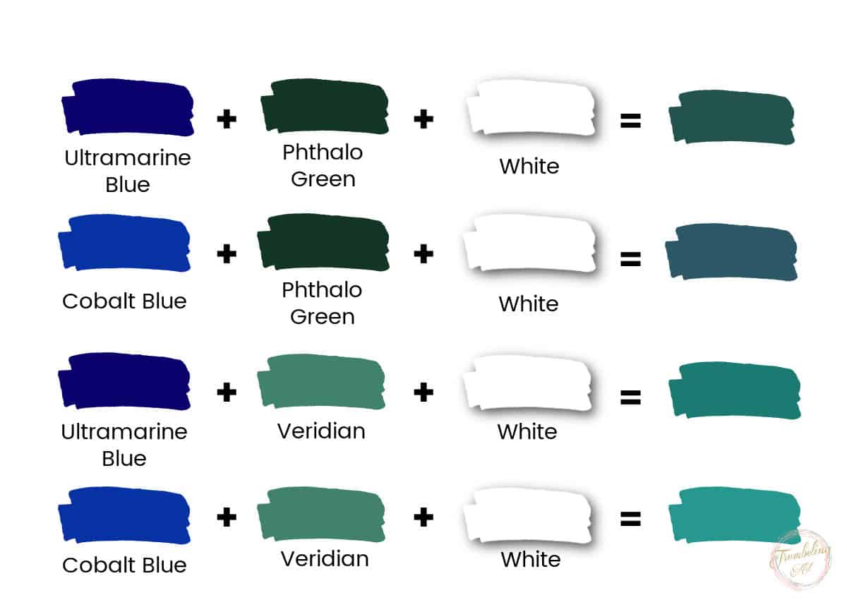
- Ultramarine + Phthalo Green + White → deep teal
- Cobalt +Phthalo Green + White → muted teal
- Ultramarine + Veridian + White → bright turquoise
- Cobalt + Viridian + White → light tropical turquoise
Adjust the Intensity
You can adjust the intensity of the blue mix by adding a small amount of white or black. Adding white will lighten the shade, while adding black will darken it. Be very careful when adding black, as it is a very intense pigment and can easily overwhelm your mix. Use tiny amounts at a time.
Dioxizine purple is a better choice for darkening blue paint, but sometimes it is necessary to use black if you don’t have purple or it just isn’t giving you the shade you want.

Keep Track of Your Ratios
Make sure to keep track of the ratios of each colour you add to the mix so you can recreate the same shade if needed. Keeping a painting journal to track your colour mixes is a good idea.
Common Mistakes When Mixing Blue Paint (and How to Avoid Them)
Even though blue is a primary colour, it can be surprisingly tricky to work with. Small mixing mistakes can quickly lead to dull, muddy, or overly dark blues. Being aware of these common issues will help you achieve cleaner, more vibrant blue paint mixes.
Adding Too Much Black
One of the most common mistakes when mixing blue paint is using black to darken it. Black paint is extremely strong and can overpower blue very quickly, resulting in a flat, lifeless colour.
How to avoid it:
Instead of black, try darkening blue with colours that naturally deepen it, such as violet, burnt umber, or a touch of phthalo green. If you do need to use black, add it in the smallest possible amount—just the tip of your brush—and mix gradually.
Overmixing and Losing Vibrancy
Overmixing blue paint, especially when several colours are involved, can cause the colour to lose its clarity and intensity. This often happens when complementary colours are mixed too thoroughly.
How to avoid it:
Mix just enough to combine the colours while still allowing some variation. Slight shifts in colour can add life and interest to a painting. When working on the canvas, you can also let colours blend optically rather than fully mixing them on the palette.
Not Testing Paint Mixes Before Applying Them
Applying a newly mixed blue directly to a painting without testing it first can lead to unpleasant surprises once it dries. Blue paint often dries darker, especially in acrylics.
How to avoid it:
Always test your blue mixes on scrap paper, a palette sheet, or the edge of your canvas. Let the test area dry before committing to the colour. This extra step can save time and prevent frustration.
Using the Wrong White to Make Blue Lighter
Not all white paints behave the same way. Titanium White is very opaque and can quickly make blue paint look chalky, while Transparent Mixing White is more transparent but weaker.
How to avoid it:
Use Titanium White sparingly when lightening blue. If you want a softer, more luminous light blue, consider mixing in a small amount of Transparent Mixing White or adding a touch of a lighter blue instead of relying solely on white.
Ignoring Colour Temperature
Mixing blue without considering temperature can result in a colour that feels out of place in your painting. A blue that is too warm or too cool can clash with surrounding colours.
How to avoid it:
Step back and assess whether your blue needs to feel warmer or cooler. Warm it slightly with a touch of red or burnt umber, or cool it with a green or cooler blue. Making small adjustments can dramatically improve harmony in your painting.
The best way to become proficient in mixing shades of blue paint is to practice and experiment with different combinations of colours until you find the shade you desire.
Blue Colour Mixing Chart. Click the Chart to Download
Marilyn, Your posts are very educational. By any chance do you have a book that includes all your posts? How do I make a color scale? Thank you.
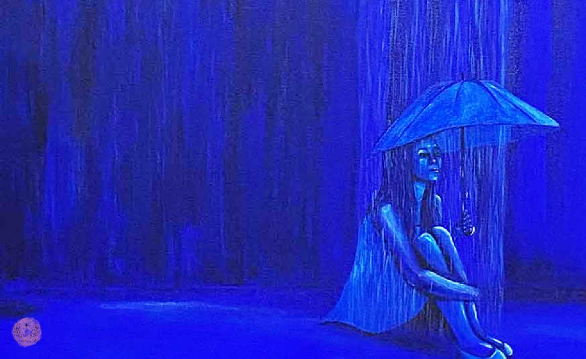
Hi! I was wondering if you could share the specific color pallete you used in your beautiful painting of the woman in the rain? I want to paint in shades of blue but I’m struggling with pairing colors that look gold together.
Alizarin crimson is not a warm color
Hi Martha; You are, of course, absolutely right! I didn’t realize how I worded the sentence! I have fixed it now. Thank you for pointing it out. 😊
Perfectly sharing your experience
Thanks Marilyn for sharing. I am a retired lady and would love to do art work. I’m from South Africa. I’m very nervous as I have never paint before. Mixing colours makes me very nervous. So happy I came across your site it does inspire me so much, especially which colours to mix.
Thanking you and highly apreciated.
Thank you!😊 Don’t be afraid of colors. The more you play around with them the more comfortable you will be. It can be fun to see what new color you can come up with. Happy painting!😊
Thankyou for these simple, interesting articles which give so much information in a way that is easy to follow.
Thank you! 😊
Thank you for the list of color mixes. I do my own, mostly with burnt sienna, and ultramarine blue to make shades of gray. Sometimes I add dark brown to ultramarine to make black. I do not like black paint in a tube and white in a tube, I use BLEED PROOF WHITE for almost everything.
Thanks for the information.
Thank you 😊