


Mixing green might seem simple at first. It’s just blue and yellow, right? But if you’ve ever ended up with a muddy, dull, or overly bright green, you already know there’s more to it than that.
We probably learned how to mix green colours in preschool. But what we probably didn’t learn from making a mess with the non-toxic, washable primary colours we used was how to mix the perfect green paint for our artwork.
Whether you’re working on landscapes, florals, or abstract pieces, understanding how to control your greens will make your paintings look more natural, balanced, and professional.
In this guide, I’ll walk you through a simple system for mixing greens, explain why greens sometimes go wrong, and show you how to create a range of beautiful shades, from bright spring greens to deep forest tones.
I work primarily with acrylic paint, but these paint mixes should work for any medium. I have also included a downloadable colour chart at the end of the post. You can print it off and keep it for reference.
This post may contain affiliate links. If you click a link and buy, I may receive a small commission. Please see my full privacy policy for details.

Why Your Green Paint Isn’t Turning Out Right
If your greens are looking off, you’re not alone. This is one of the most common struggles for beginners.
The issue usually comes down to colour bias. I know, boorring, but it is important and will make your colour mixing easier and far less frustrating.
Colour bias simply means that your paint colour tends to lean towards another colour. Each primary colour tends to lean toward another primary colour to varying degrees.
For example, Prussian Blue is a cool blue with more yellow pigment. Therefore, it leans towards green. (Blue + Yellow = Green)
Ultramarine is a warm blue with more red pigment, so it leans towards purple. (Blue + Red = Purple)
If you aren’t sure what your paint’s colour bias is, you can look it up online. In most cases, a quick way to tell for yourself is to mix a tiny amount of titanium white paint with your pigment. You should be able to see the undertone.
For example, if you mix a small amount of white into Payne’s Gray, you can easily see the blue undertone. So, Payne’s Gray is gray with a blue bias.

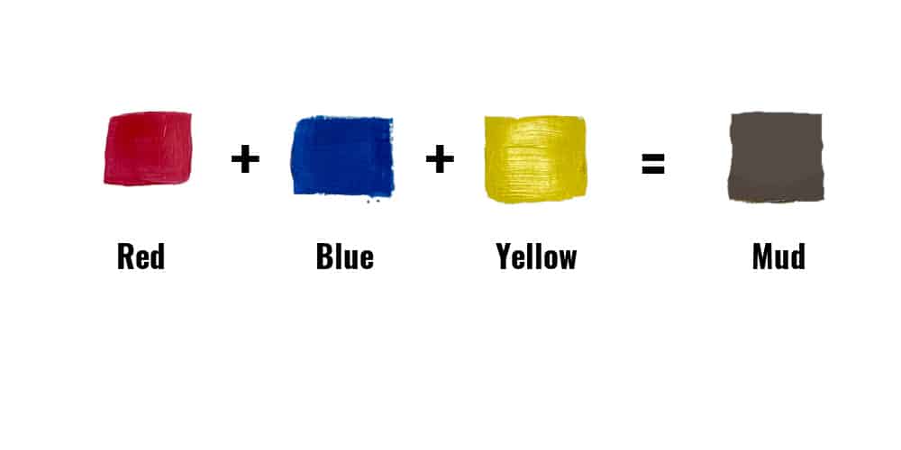
Why is all of this important to understand? Well, if you mix a warm yellow (red bias) with a warm blue (red bias), you would be mixing all three primary colours together in close to equal amounts.
What happens when you mix all three primary colours together? Instead of getting the lovely green grass you wanted, you end up with a muddy field.
To get an actual green you can use, mix two cool colours or mix a warm colour with a cool colour, depending on how bright or dull you want your green. For more information on colour temperature, please see my Warm and Cool Colours post.
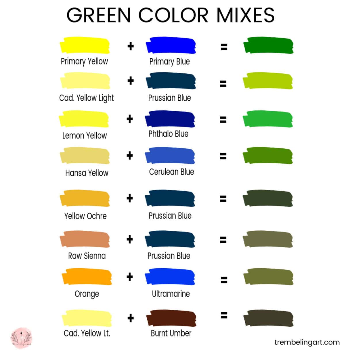
How to Mix a Bright Green Paint
For example, if you need to mix a bright green for a bright patch of grass, you need to mix a cool yellow with a cool blue. Neither of these colors contains any red to dull down the brightness of the green.
Some examples of bright green mixes:
Cadmium Yellow Light + Prussian Blue
Lemon Yellow + Phthalo Blue
Hansa Yellow Light + Cerulean Blue
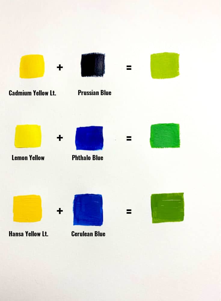
Since blues tend to be deep pigments, it is best to start with a lot of yellow and just a touch of blue. You can keep adding a little blue until you get the colour you want.
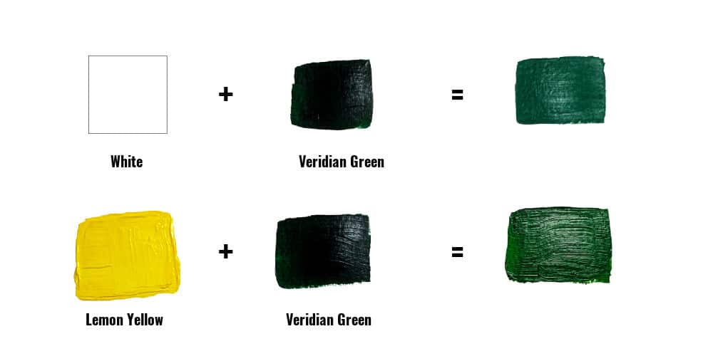
If you want to use a premixed tube green you already have to make a bright green, you can add a touch of white or lemon yellow. I prefer yellow because white tends to give a slightly murky result.
The results you get with the tube colours will vary depending on the combination of pigments the manufacturer uses, so you may need to experiment until you get the right colour.
How to Mix a Muted Green Paint
To get a muted green shade, you will need to use a warm colour and a cool colour. The red bias in the warm color will tone down the green somewhat.
So, a good mix for a muted green would be:
Prussian Blue + Yellow Ochre
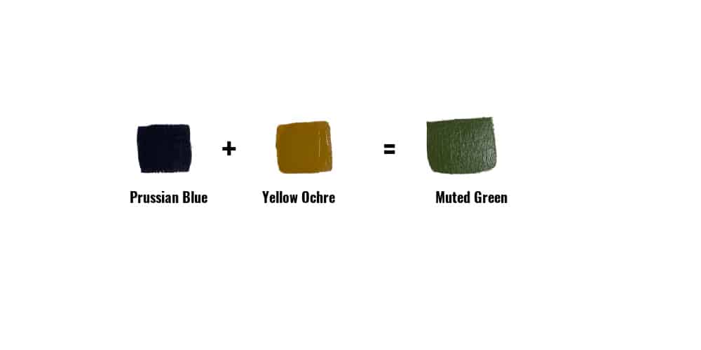
Prussian Blue is a cool blue, and Yellow Ochre is a warm yellow with a red bias. Since red is a complementary color to green on the color wheel, it tones down the green, giving you a dark, muted green.
How to Tone Down Green Paint
Complementary colours tone down the brightness of the paint.
If you have already mixed your green paint but would like to tone it down a little, the best way to do this is to add a little of its complement…red.
Many beginning artists attempt to tone down a colour using black, but this only darkens and deepens the colour. A tiny amount of red is enough to mute the green without deepening the colour.

Be careful about the amount of red you use. Start with a very tiny amount. Too much red will give you a muddy colour instead of the muted green you are looking for.
You can also use red to mute premixed bottled greens if they are too vibrant for your needs.
Glazing with Green
If you want to subtly change the tone of your green paint, you can paint over your work with a green glaze. Use your original mix with a glazing medium or water to make a thin wash to lighten or darken the colour.
Glazing medium can be purchased at most art supply stores and is helpful for thinning paint without changing the hue. The general mix is 5 or 6 parts glazing medium to one part paint. The mix varies by manufacturer, so read the instructions on the bottle before using it.
For more information on acrylic mediums, see my post on How to Use Acrylic Mediums.
Glazes can also be used to add subtle shadows. Mix the glazing medium with a deep blue, purple, or Payne’s Gray, depending on the surrounding colors.
The nice thing about glazes is that you can build multiple layers until you get the desired colour.
How to Make Green Without Yellow
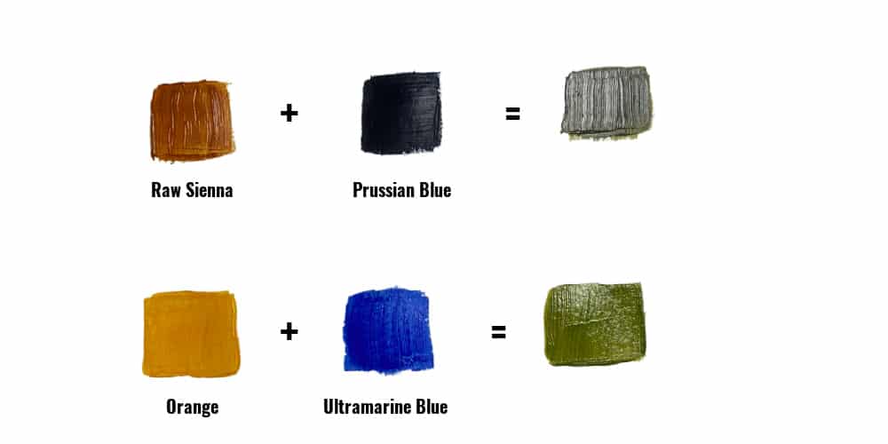
Yes, it is possible to make green without using yellow paint. You can substitute another colour with a slight yellow bias, such as cadmium orange or raw sienna. The greens will be muted, but they could be the perfect colour for distant hills or foliage.
Possible colour combinations for green without yellow:
Raw Sienna + Prussian Blue
Orange + Ultramarine Blue
There are many other combinations possible. Play around with what you have to see what kind of greens you can produce.
How to Make Green Without Blue
You can also mix green without using blue. Again, this will produce a more muted green but can make some lovely olive hues.
Possible colour combinations for green without blue:
Cadmium Yellow Light + Burnt Umber
Cadmium Yellow Light + Payne’s Grey
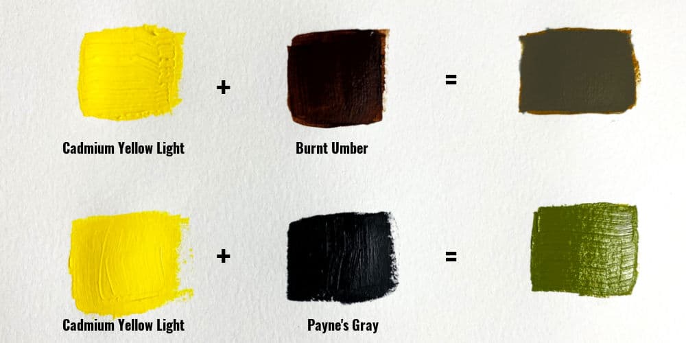
Start with the yellow and add very small amounts of brown or grey since the yellow can easily become overwhelmed with the darker colors.
Continue adding the darker colour in small amounts until you achieve the colour you want.
Quick Green Mixing Recipes
Here are a few simple mixes you can try right away:
- Bright Grass Green
Phthalo Blue + Hansa Yellow - Olive Green
Yellow + blue + a small amount of red or burnt sienna - Forest Green
Ultramarine Blue + Cadmium Yellow + a touch of black or burnt umber - Lime Green
Yellow + a small amount of blue + white - Sage Green
Green + white + a touch of red or grey
These are great starting points. From here, you can adjust each mix to suit your painting.
Final Tips on Mixing Greens
There are hundreds of combinations you can use to make green. You never have to use a green you aren’t happy with.
Since colours can vary between manufacturers, it is a good idea to experiment with the paints you have to see what hues of green you get.
A good idea is to purchase an inexpensive watercolour book, such as this Canson one from Amazon, or a notebook with paper that can handle paint. Use it as a paint diary and make swatches of your paint mixes.
Remember to write down your paint combinations so you will know how to replicate them in the future.
If you are starting on your painting journey and wondering what paints to purchase for landscape painting, a good rule of thumb is to buy 2 blues and 2 yellows:
A cool yellow – Lemon Yellow or Cadmium Yellow Light
A warm yellow – Cadmium Yellow Deep or Hansa Yellow Deep
A cool blue – Prussian Blue or Phthalo Blue, for example.
A warm blue – Ultramarine Blue or Cerulean*
*There is much debate over which blues are warm and which are cool. While researching this article, I encountered many artists who argued back and forth over whether Ultramarine, in particular, was warm or cool.
It is a hot topic (sorry 😏), apparently, with many technical arguments about its placement on the colour wheel. It’s enough to make your head spin. (Sorry again 😏)
Ultimately, I decided that since Ultramarine blue has a slight reddish/purple/violet bias, it would fit the warm blue definition for the purposes of mixing greens.
Ultimately, it doesn’t matter how you classify any colour as long as it fits into your colour palette and you get the mix you want.
A Simple Practice Exercise (10 Minutes)
If you want to improve quickly, try this:
- Mix 3 different greens using different blues and yellows
- Add a small amount of red to each
- Add white to one, and darken another
Lay them side by side and compare.
This simple exercise will teach you more than just reading about colour mixing.

I hope these tips and explanations are helpful to you. Have fun mixing the various colours and creating your favourite mixes.
If you have any questions or ideas, please leave them in the comments below. Don’t forget to check out my Facebook page and our Trembeling Art Creative Corner Facebook group. 😊

Found your article by accident – I often have an issue with too dominant greens and your straightforward approach is very helpful, without, I must add, the use of YouTube. There is one other colour combination that I feel is worth noting, that is, black and lemon yellow which gives a fairly soft muted green. Many thanks for your article and advice. Mike
Marilyn, thank you for your terrific information. I have a hard plastic (acrylic) palette and have unfortunately let the acrylic paint dry on it. I have used odorless paint thinner, scraped with my palette knives, all to no avail. Any help or suggestions, please. Marie
Hi Marie; Usually dried acrylic paint will peel right off the palette but sometimes they do get stuck. When this happens I soak the palette for a few minutes in hot water. This usually softens the paint enough to wipe it off. Keep repeating until you get all of the paint off. Some paint colors will stain the palette and you can’t generally get this stain out. It is fine to use the palette with this staining. Hope this helps. 😊
Use isopropyl alcohol, works just fine and is not expensive.
Very, very helpful Thankyou..
Hi, thank you for such a brilliant post. I have been reading some blogs that gives me more knowledge about how to mix the perfect green paint. I must say this is one of the best among them. You have done a great research for I feel, thanks for sharing.
Great information for a not-terribly-experienced painter!
Thenk you for this Marilyn, I didn’t know you could get so many different green shades with mixing together different other colours. Also the section on Highlighting and Shading is very helpfull. Thank you again.
It can be such fun to come up with your own unique shades of paint. 🎨
Thanks for the helpful advice. I’m a beginner and your advice means a lot. 👍🌹
Thank you, I had no idea one can get green without blue. Learned something new, thanks for sharing. I do a lot of landscapes and green has been difficult to get just right -so many choices!
Thank you for the colour mixing lesson, it does take the frustration levels down a lot! I’m new to the process.
Awesome information, I will have to reread this when I get to finish a painting I started in October. Yay I know…