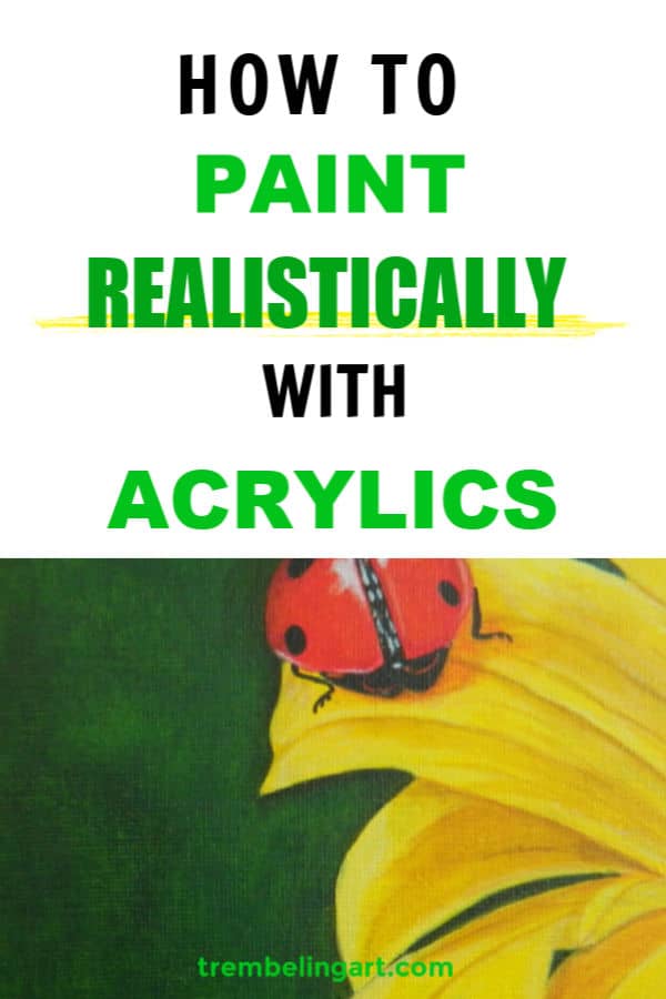
Painting photorealism is the process of painting a highly detailed picture from a photograph. Doing a photorealistic painting is not a quick process. In this article I will give you some tips on how to paint photorealism with acrylics.
Attention to detail, contrast, value, and the proper perspective all contribute to a photorealistic look, but it takes time and patience to paint in this style.
Photorealism is a great learning tool for beginning artists. Below are some guidelines to get you started painting photorealism.

**This page may contain affiliate links to products I have used or recommend. If you purchase something from this page, I may receive a small percentage of the sale at no extra cost to you. For more information click here.**
Preparing Your Canvas For Painting
Start with a smooth canvas, panel, or board. A smooth surface makes it easier to blend and get clean lines.
Give your surface a few coats of gesso and lightly sand to achieve the degree of smoothness you want. For more information and tips, check out my post on how to gesso a canvas.
Once the gesso has dried and you have wiped it clean, add a ground or base coat of thinned-out paint. This will give you an evenly pigmented surface to start on, and you won’t have to fight the white of the canvas.
What color ground you use will depend on the subject of your painting. A dull, moody landscape would benefit from a mid-gray ground, while a bright sunset would be better with a light earth tone.
Composition of a Photo Realistic Painting
Decide on the composition of your painting. Don’t have your main focal point smack in the middle of your work.
Following the rule of thirds will make your composition more interesting in most cases (but not all).
The rule of thirds is a guide to arranging the focal points in your painting or photograph in a more pleasing and eye-catching way.
It divides your scene into two horizontal lines and two vertical lines, forming a grid. The main subject or subjects of your painting should sit either on the lines or on the intersections.
Arranging the elements within your work in this way will guide the viewer’s eye across your painting and give it a more pleasing and interesting composition.
If you want a more in-depth discussion about the rule of thirds, My Modern Met has a great article. https://mymodernmet.com/rule-of-thirds-definition/

Start Simple
Don’t make your painting too busy, especially if you are a beginner. Adding too many elements into a realistic composition can overwhelm you.
Start with one focal point, such as an apple on a table. Do another painting with two apples and observe how they interact, how their shadows overlap, how their shapes and tones are different, etc.
From there, you can add a bowl or other items. As you paint, you will learn how each element within a painting affects the others, making it easier to achieve photorealism.
If you are drawing from a photo, take the time to really look at it. Observe where the darkest shadows are and where the lightest highlights occur. See where the light source is coming from and where it hits the objects in your photo.
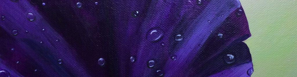
Notice the subtle variations of color within the objects in the photo. For example, a lake is never one shade of blue. There could be subtle purples, pinks, greens, and browns within the various shades of blue.
These color variations will give your painting more depth and realism.
Painting realistically is a lot about observing details that a viewer doesn't even realize they are seeing.
Drawing the Subject
Accurately draw your subject. Whether you are using a reference photo or painting from sight, it is important to start with an accurate drawing.
I use a watercolor pencil to draw my subjects onto the canvas. It will easily wash off or be covered by paint.
If you are not comfortable with freehand drawing, there are several methods you can use to transfer the scene onto your canvas. See my post on how to transfer a reference photo to a canvas.
Color Chart
Decide on the colors you want to use in your painting. Making a color chart with the colors you want to use and the mixes you need to get accurate colors is helpful. This is not absolutely necessary but it is helpful.
It can be confusing to pick out the right colors for a subject since the eye is influenced by the colors surrounding it. I use a trick to cut a small hole in an index card and hold it over the reference photo.
This helps to isolate the color without the influence of the surroundings. I find the index card makes it easier to judge the color accurately.

Lights and Darks
Paint in your darkest values first. Don’t use straight black! Instead, use browns such as burnt umber, dark grays, or other colors such as deep blues, depending upon the overall tone of your painting.
If the painting needs a very dark shadow, use black mixed with another color from the object, casting the shadow to give it more life. Straight black tends to be dull and flat.
Use correct values and contrast. Using lights and darks in the right places will create depth in your painting. Using the wrong values can make your painting look flat and lifeless.
Objects in the distance will have a lighter value than objects in the foreground. They are less defined and detailed and will appear smaller.
Don’t outline to give contrast or separate objects from the surroundings. There are no outlines in nature. Blend edges where necessary and use different values to separate elements.
Shadows
Shadows are soft and gradual. They don’t abruptly end in a hard edge.
As I said above, shadows are also rarely black. They are grayed down or darkened in color. The darkest area of the shadow is closest to the object. Blend the shadows out to nothing.
Pay attention to the time of day and season when adding your shading. A summer sunrise will have warm shadows, which are reds, pinks, and oranges, while a cold winter evening will have cool shadows, which are blues, greens, and purples.
Highlights are rarely pure white. They are usually a lighter shade of the base color. Pure white is saved for the brightest highlight, such as the “twinkle” in an eye. See my post on highlighting and shading.
Perspective
Proper perspective is important in a photorealistic painting. Objects in the distance are generally smaller than those closer to the viewer.
So, in a landscape painting of a mountain and trees, the mountains appear much smaller, and the trees get larger and more defined the closer they get to the viewer. Paint the background first and work your way forward from there.

Details
Once you have finished blocking in the main areas of your painting, it is time to work on the smaller details that will make it pop. Use a detail brush or other small brush to add the finer lines and tiny details.
While details are essential for painting photorealism, they are not the most important thing. More important is doing an accurate underpainting with proper value placement.
Perfect eyelashes on a face with no contour or shading will not look realistic. All of the elements I talked about above come together to make a photorealistic painting.
And of course, practice, practice, practice!
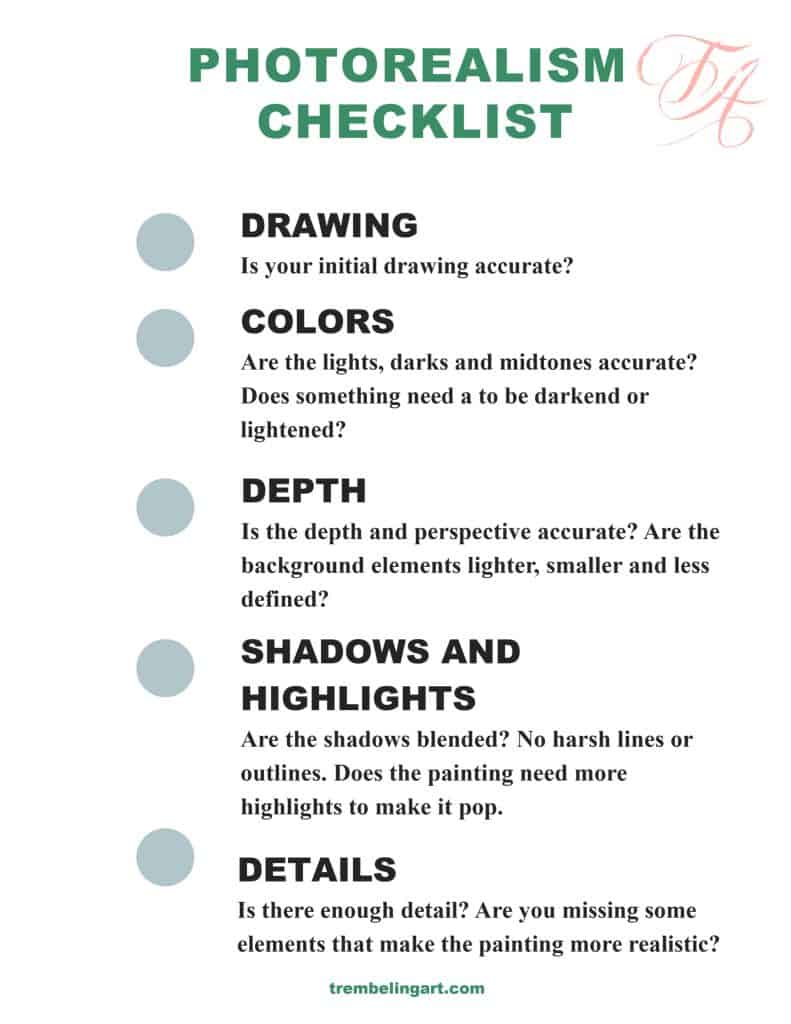
Once you have finished your painting, step back and look at it. If it doesn’t look quite right, go through the checklist below and see what needs adjusting. Feel free to print off the checklist for your own reference.
The Controversy Over Photorealistic Painting
There is some controversy in the art world about whether photorealism is actually art. Some say photorealism is just copying a photograph.
I believe everything we do with our hands is art, from painting and drawing to woodworking to cooking and beyond. Photorealism is just another expression of ourselves.
The painting below is taken from a picture of a boxcar my father made many years ago. The original picture contained other equipment and items from everyday life, but I wanted to focus on something my father made with his own hands.

I could have photoshopped the other items out of the picture, but actually putting the brush on the canvas and recreating something that he had created if only in paint, gave me a sense of peace and connection with him.
Not all photorealistic paintings have such meaning. I enjoy painting photorealism because of the challenge it represents to someone with Parkinson’s.
Most photorealistic artists get a sense of accomplishment from seeing their painting progress to the point where you cannot tell the difference between the photo and the painting.
There is so much more involved than just copying a photo. Doing an accurate drawing, getting the values right, having the proper contrast and perspective, shading, and highlighting correctly are all necessary elements in a photo-realistic piece of art.
I hope these tips are helpful to you and encourage you to try some photorealistic artwork. Painting is an ongoing learning process, even for master painters. The more you paint, the better you get.
If you have questions, you can leave them in the comments below. You can also join our free Facebook group, Trembeling Art Creative Corner, where you can ask questions, post your work and get to know some fantastic artists from all genres and skill levels. 😊
Thanks for reading.

I’m so happy that I found your website. I love painting, but have never known how to really shade or show shadows in my paintings. I’m 77 going on 80 :-), and seem to be developing a little shaking in my hands while painting. I just started your class/workshop today, and I have learned so much already! Thank you, thank you, thank you for your site.
Thank you Shirley. 😊
This is some of the very best instructions on painting that I have ever read. Some I already knew and some I am so thankful to now know. Thank you!
Thank you so much Jayne, that means a lot 😊. I am glad the instructions were helpful.
Marilyn, you are a Godsend. This is exactly what I needed and wanted. I am a retired RN but also have a degree in fine art. About 26 years ago, I was in a near fatal car wreck. Since then I’ve had years of PT and many operations. I have not really painted or drawn since then, but your article has given me the courage to pick up the brush and try. Thank you so much!
Hi Edie; I am so sorry for your troubles. I am glad you have found art again. It is wonderful therapy. Happy painting!😊
Dank je wel voor deze fantastische uitleg !
Marilyn,
I am a amateur painter and found this article an excellent source of information.
Your explanation is very easy to understand. I am retired and have loved Art through music and find acrylic painting a nice change and something new to challenge my learning at this stage in life.
Thank you for sharing your artistic knowledge!
This was so helpful! I want to try painting and was drawn to your pin because of the name tremblingart. I had a stroke recently and have a lot of trembling in my hands I thought painting might be a good way to gain control. Then I read you have Parkinson’s, you inspire me!
Hi Susan: Thank you. I am sorry you have to deal with this. It can be frustrating dealing with the tremors but so rewarding too. Be patient with yourself and you will find ways to work around your tremors. Painting is great therapy and I hope you enjoy it. 🙂
Marilyn, I truly enjoyed this article.
I have learned a lot.
Thank you so much Bessie! I am glad the article was helpful. Happy painting!😊
The best artiicle i have ever came across
Thank you. 🙂
Very nice and helpful article. I’ve learnt a lot from you including understanding about the misconception of not including realism as an art. I am happy as I am also a fan of realism.