


Color temperature refers to how warm or cool a color is. It can be a powerful tool when used in art.
Color temperature can create a mood, evoke an emotion, and attract the eye.
Warm colors are those that evoke feelings of warmth, such as reds and oranges. Cool colors are those that evoke feelings of coolness, such as blues and greens.
Very few of the paint colors you have will be pure primary colors (red, yellow, blue). Most of them will have a warm or cool bias.
Color temperature can be a bit confusing. You can have a warm red-yellow and a cool green-yellow.
Knowing the difference between warm tones and cool tones and how to mix them with other colors without getting the dreaded mud can save you time, money, and frustration.
**This page may contain affiliate links to products I have used or recommend. If you purchase something from this page, I may receive a small percentage of the sale at no extra cost to you. For more information **click here.**
Warm colors are those that evoke feelings of warmth, such as reds and oranges. Cool colors are those that evoke feelings of coolness, such as blues and greens.
See my warm and cool colors web story.
Splitting the Color Wheel
A color wheel is a great tool for understanding the difference between warm and cool colors.
The color wheel consists of:
Primary colors, red, yellow and blue. They are called the three primary colors because they cannot be created by mixing any other colors together.
Secondary colors, green orange and purple. They are colors created by mixing two primary colors together.
Tertiary colors which are made by mixing a primary color and a secondary color.
As you can see from the diagram below, warm and cool colors split the color wheel, with the warmer colors of red, yellow and orange on the top and the cooler colors of green, blue and purple on the bottom.
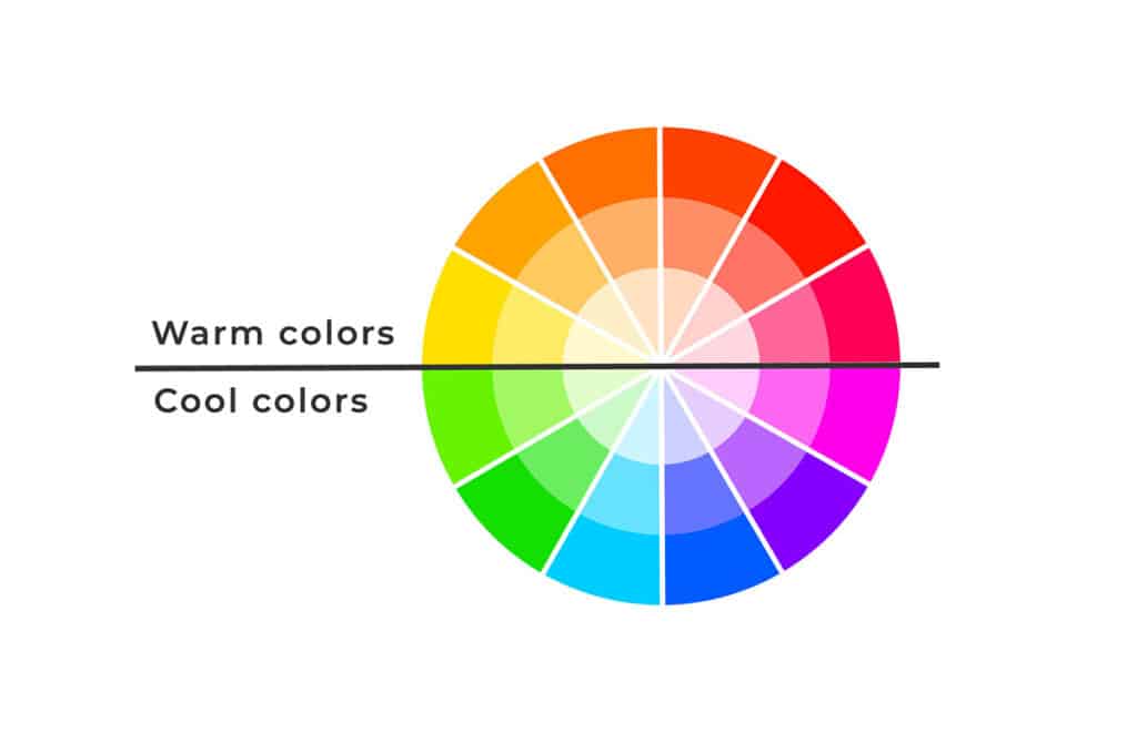
So, to recap:
Warm Colors ⇒ red, yellow, orange
Cool Colors ⇒ blue, green, purple
If you aren’t familiar with the color wheel I have posts on Color Theory and Complementary Colors you can check out.
Warm and cool colors split the color wheel.
Warms and Cools in Each Color
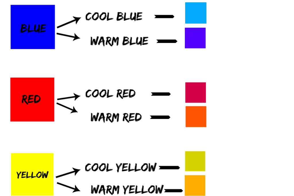
Color temperature is not absolute. Not all reds are warm and not all blues are cool.
Within each color family, there can be warms and cools depending on the bias in each color. For example, there can be warm blues and cool blues, warm reds and cool reds, and warm yellows and cool yellows.
Bias refers to the undertone in a color or when one color leans towards another color on the color wheel.
A warm blue would have a red bias (reddish blue) since red is a warm color.
A cool blue would have a green bias ( greenish blue) since green is a cool color.
How Can You Tell If a Color is Warm or Cool?
The best way to learn to distinguish the biases of each color you have is to do color swatches. Actually seeing the colors on a sheet of paper can, in most cases, make the color bias a little more obvious and easier to tell which is warm and which is cool.
If you are still unsure about the color bias, you can try adding a little white to your paint. In most cases, you will be able to see which color your swatch leans toward.
In the example below, I mixed a little white with Payne’s grey. Once the white is mixed in, you can clearly see the blue bias of Payne’s grey.

Being able to tell the difference makes using warm and cool colors in your artwork easier.
Neutral Colors
Some hues are not typically seen on a color wheel. These are black, white, grey, brown, and beige. These are generally considered to be neutral colors, that is they are neither warm nor cool.
However, since a color’s temperature can be determined by its undertones, you can warm it up or cool it down by adding a touch of a warm or cool color.
For example, adding a little warm yellow to neutral brown will give you a warm brown, and adding a little cool blue to neutral grey will give you a cool grey.
Neutrals are just as important in your artwork as the bright, saturated colors from the color wheel.
Neutral colors provide contrast and depth in a painting and help tone down an overly bright scene. They can also set a mood for a piece, or you can make the main subject “pop” by surrounding it with neutral colors.
Changing the Color Temperature
The temperature of a color can be changed by mixing it with a warmer or cooler color. For example, a cool blue can be made warmer by adding a warm red. A warm yellow can be made cooler by adding a cool green.
You can also create the illusion of warmth or coolness. For example, if you paint a cool green leaf and want to warm it up a bit, paint an even cooler green next to it. That will make the first leaf look warmer.
Why Is Understanding Warm and Cool Important
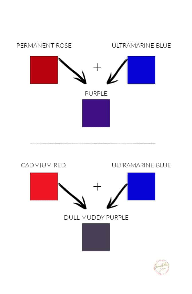
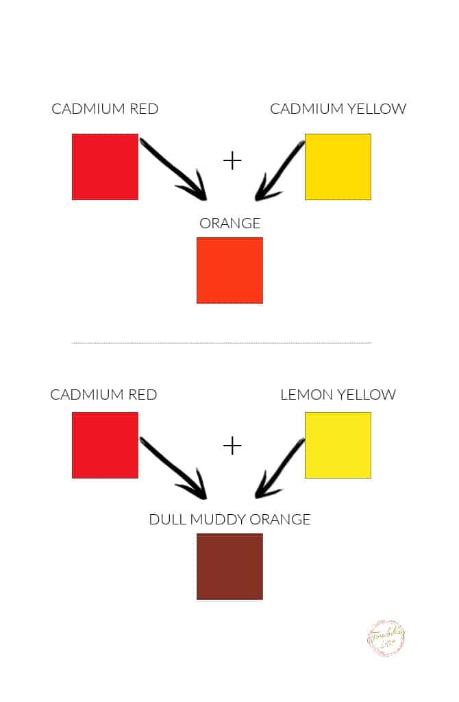
Try a little experiment. Take some purple and add a tiny bit of yellow to it. Chances are you will end up with a dull brown, grey, or other earthy color…. not a brighter purple. Why?
Well, yellow is the complement of purple (they are opposite each other on the color wheel). Complementary colors tone down or desaturate each other.
Purple is a combination of red and blue. So, by mixing purple and yellow, you are actually mixing red, blue, and yellow, primary colors that will give you gray. A tiny bit of yellow in the purple will, therefore, dull down your base purple.
So, if you wanted to mix your own purple, you would have to be careful to use a red and a blue that doesn’t have any yellow bias.
Since manufacturers make many different hues of the same color, it can be difficult to determine which colors to mix to get the result you want.
The best way to get satisfactory results is to make a color swatch. Take notes of which colors you mixed to get purples, oranges, and greens, and keep them for future reference.
Each time you buy a new color, make new swatches. Get to know your tubes of paint and how they play with other tubes.
Golden Artist Colors has a great article about warm and cool colors and how they relate to each other. You can read the article here.
Using Warm and Cool Colors in Your Artwork
Knowing which colors are cool and which are warm is also important for the visual perception of your painting.
Cool shades make things appear further away, while warm shades make things appear closer. This is very important in landscape painting, where you want to give the illusion of depth and distance.
So distant mountains would be painted in cool blues or grays, and a nearby stream and grass would be painted in warmer blues and warm greens.
Cool shades make things appear further away, while warm shades make things appear closer.

Balance of Warm and Cool Colors
It seems like a lot of information to absorb but playing around with mixing the various shades will help you grasp the concepts of warm and cool.
Understanding this is necessary if you are going to mix your own shades of paint and give your painting more balance and cohesiveness.
You will be able to mix the exact color you want for any painting and bring more harmony and depth to your pieces by using the right balance of warm and cool colors.
If you have questions, you can leave them in the comments below. You can also join our free Facebook group, Trembeling Art Creative Corner, where you can ask questions, post your work and get to know some fantastic artists from all genres and skill levels. 😊
Thanks for reading.

Hello ..I am a student ..I don’t know which color is make the space deeper ..which color is use for depth ..Wich color make the things nearest…how I make illusions in water color painting ….I hope you understand and you help me..I hope you answer me quickly
Hello ..I am a student ..I don’t know which color is make the space deeper ..which color is use for depth ..Wich color make the things nearest…how I make illusions in water color painting ….I hope you understand and you help me
Look up atmospheric perspective. To get depth your colors need to get lighter and grayer. Your brightest, purest colors are in the foreground. If you look at a distance with several tree covered hills in the distance it is very easy to see. If you put a pure bright colored area in your background it really throws the perspective. Once you understand atmospheric perspective you can spot artwork that fails and leaves them looking flat. Good luck and have fun!
dark brown red
who to make mixed paint
Great teaching. Keep it going. You helped me a lot. God bless you.
I enjoyed reading on the difference of warm and cool colors , very informative.
Could you do an article on the color value, how to tell the difference in the value between colors.
Thank you.
Helpful easy to understand information. Thanks
Thank you. Pretty much my introduction to beginning to understand warm and cool colors.
Especially the advice on mixing to get the pure color you want, and not the muddy version.
I never leave comments but I really appreciate this article and I find it puts really magical artsy concepts into easy, simple terms — the sign of a wonderful teacher. Thank you for writing this!
thanks for this easy to understand format – I have very limited experience with color theory and found your piece easy to apply to my practice