


Have you ever tried to mix your own paint colours and ended up with a muddy, disappointing result? If so, understanding colour bias may be one way to get more vibrant colours.
Colour bias is one of the most important concepts in colour theory, yet many beginner artists have never heard of it. Once you understand how colour bias works, you’ll find it much easier to mix bright, vibrant colours and avoid the frustration of muddy mixtures.
Below, I’ll explain what colour bias is, how it affects colour mixing, and how you can use it to improve your paintings.
What Is Colour Bias?
Colour bias refers to the hidden tendency of a colour to lean toward another colour on the colour wheel.
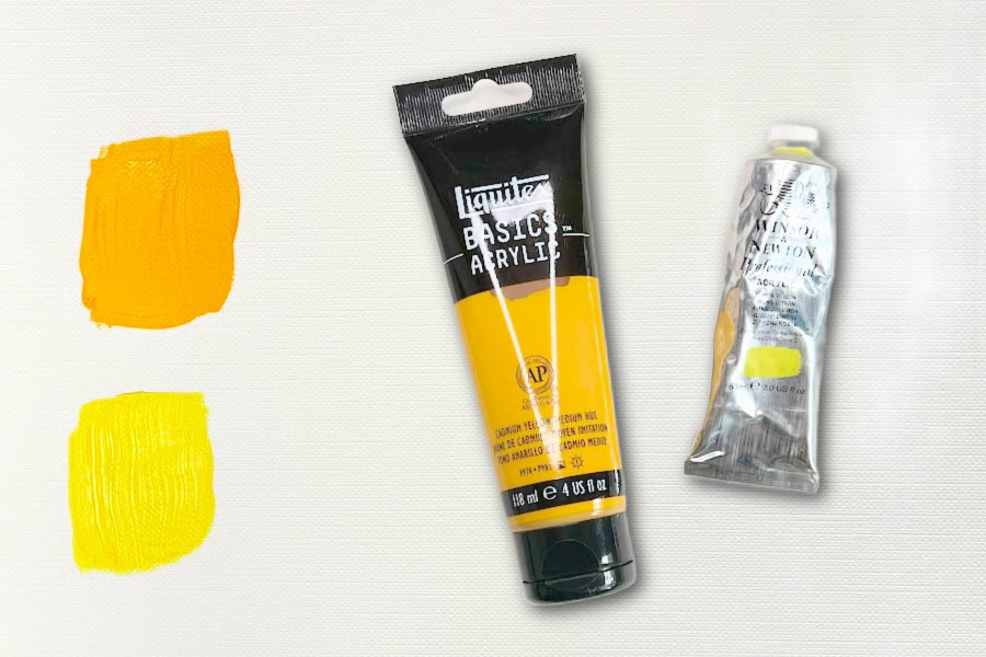
For example, not all yellows are the same. Some yellows have a slight orange influence, while others lean more toward green. These subtle differences can have a huge impact on your colour mixing results.
Even though two paints may both be labelled “yellow,” they can behave very differently when mixed with other colours.
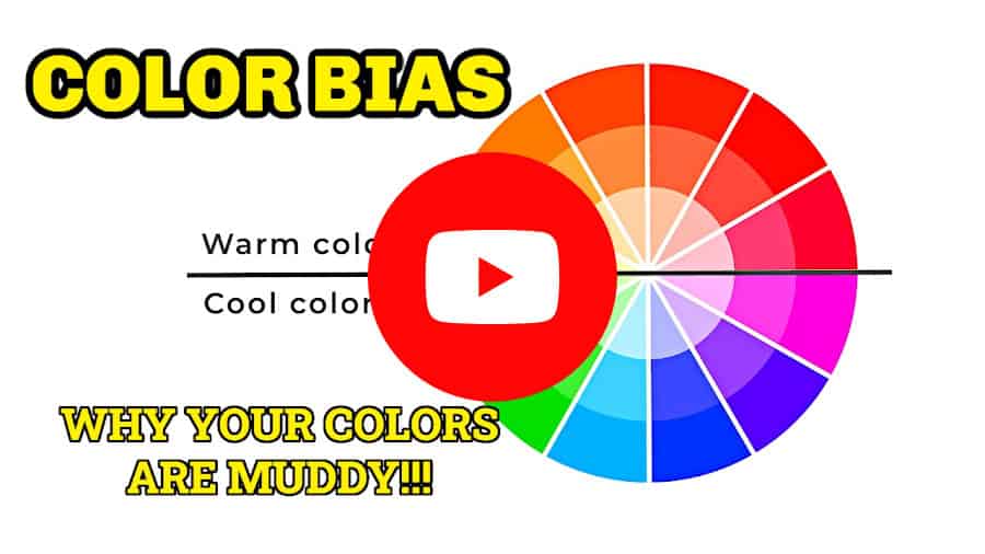
Think of colour bias as a paint’s personality. Some are warm, and some are cool. Every colour has a tendency to lean toward one of its neighbouring colours.
Why Colour Bias Matters
Understanding colour bias helps you predict how colours will mix before you even pick up your brush.
When colours share a similar bias, they tend to create bright, clean mixtures. When colours contain traces of all three primary colours, the mixture often becomes dull or muddy.
This is especially important when mixing secondary colours:
Blue + Yellow = Green
Red + Yellow = Orange
Red + Blue = Purple
The brightness of the resulting colour depends largely on the colour biases of the paints you choose.
Warm and Cool Versions of Primary Colours
Most artists keep both warm and cool versions of each primary colour on their palettes.
Warm and Cool Yellows

A warm yellow leans toward orange.
Examples include:
Cadmium Yellow Medium
Cadmium Yellow Deep
A cool yellow leans toward green.
Examples include:
Lemon Yellow
Hansa Yellow Light
Warm and Cool Reds
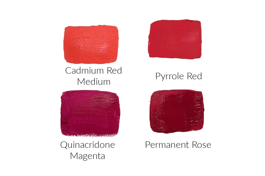
A warm red leans toward orange.
Examples include:
Cadmium Red
Pyrrole Red
A cool red leans toward purple.
Examples include:
Quinacridone Magenta
Permanent Rose
Warm and Cool Blues
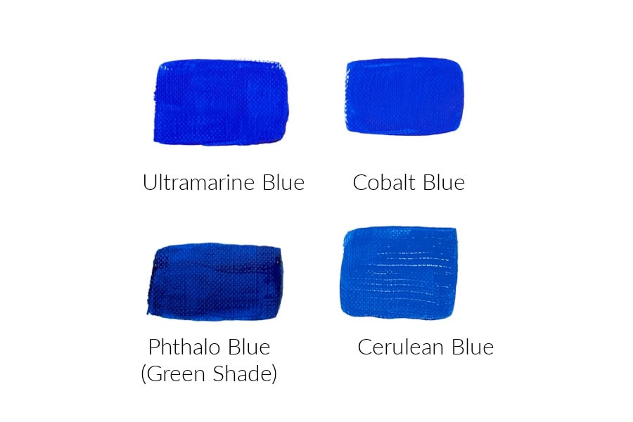
A warm blue leans toward purple.
Examples include:
Ultramarine Blue
Cobalt Blue*
* Cobalt blue is not technically a warm or cool colour. It is considered a true-blue or balanced blue.
A cool blue leans toward green.
Examples include:
Phthalo Blue (Green Shade)
Cerulean Blue
For a deeper dive into colour temperature, see my post about Warm and Cool colours.

How Colour Bias Affects Colour Mixing
Let’s look at a few practical examples of how colour bias can affect the colours you are mixing.
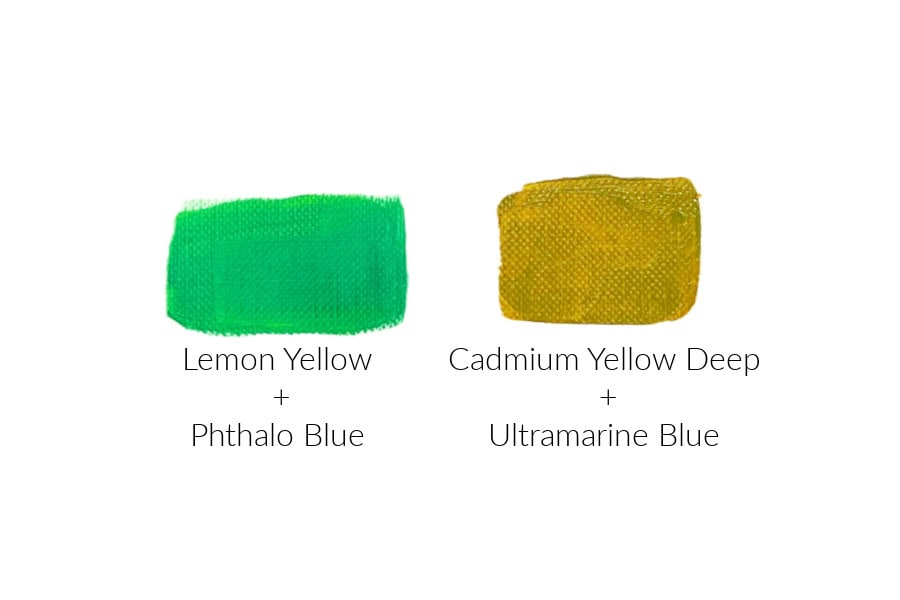
Mixing Bright Green
If you mix a cool yellow with a cool blue, you’ll usually get a vibrant green.
For example:
Lemon Yellow
Phthalo Blue
Both colours lean toward green, so they work well together to create a brighter green.
Mixing Dull Green
Now try mixing a warm yellow with a warm blue.
For example:
Cadmium Yellow Deep
Ultramarine Blue
The yellow contains an orange influence, while the blue contains a purple influence. Together, they introduce hints of all three primary colours, which can mute the mixture and create a more earthy green.
It really depends on the effect you’re trying to achieve and what your painting needs.
Using Colour Bias to Mix Better Purple
Many beginners struggle to mix a bright purple. The problem often comes down to colour bias.
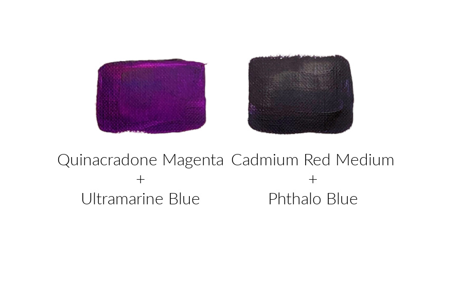
If you mix a warm red, such as Cadmium Red, with a cool blue, such as Phthalo Blue, the yellow undertone in the red can make the mixture dull.
For brighter purples, try combining:
Quinacridone Magenta
Ultramarine Blue
Both colours lean toward purple, making it easier to create rich violets and vibrant purples.
Using Colour Bias to Mix Better Orange
Orange is usually easier to mix because many reds and yellows naturally lean toward orange.
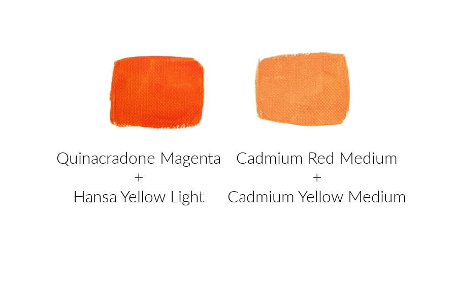
For a bright orange, try:
Cadmium Red
Cadmium Yellow Medium
Because both colours share an orange bias, the resulting mixture is often clean and vibrant.
Colour Bias and the Split Primary Palette
Many artists use a split primary palette.
This simply means having:
One warm yellow (example: Cadmium Yellow Medium)
One cool yellow (example: Lemon Yellow)
One warm red ( example: Cadmium Red)
One cool red (example: Quinacridone Magenta)
One warm blue (example: Ultramarine Blue)
One cool blue (example: Phthalo Blue – Green Shade)
A split primary palette gives you the flexibility to mix a much wider range of colours while maintaining control over colour temperature and colour bias.
It’s one of the easiest ways to improve your colour mixing skills.
A Simple Colour Bias Exercise
One of the best ways to understand colour bias is through experimentation.
Choose:
Two yellows
Two reds
Two blues
Create a colour mixing chart by combining every yellow with every blue, every yellow with every red, and every red with every blue.
As you compare the results, you’ll begin to see how colour bias affects brightness, saturation, and colour temperature.
This simple exercise can teach you more about colour mixing than hours of reading.

How to Identify Colour Bias
So how do you know whether a paint is warm or cool?
There are several methods.
Method 1: Compare Similar Colours
Place two yellows side by side.
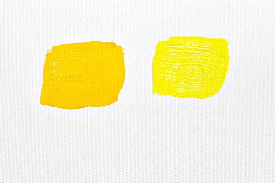
One will usually appear slightly greener, while the other appears slightly more orange.
The greener yellow is cooler. The more orange the yellow, the warmer it is.
You can do the same thing with reds and blues.
Comparing colours side by side makes the bias much easier to see.
Method 2: Look at the Colour Wheel
Ask yourself which neighbouring colour the paint most closely resembles.
Does your red seem closer to orange or closer to violet?
Does your blue seem closer to green or violet?
Does your yellow seem closer to green or orange?
The answer tells you the colour’s bias.
Method 3: Create Mixing Charts
This is my favourite method.
As I explained above, create a simple colour chart using all of your primary colours.
Mix every yellow with every blue.
Mix every red with every blue.
Mix every red with every yellow.
The brightest mixtures usually come from colours that share a common direction on the colour wheel. The dullest mixtures often contain traces of all three primary colours.
Making colour charts teaches you more about your paints than reading any label ever will.
Method 4: Read the Pigment Information
Many professional artists’ paint tubes list the pigment numbers on them.
Over time, you’ll notice that certain pigments consistently behave in similar ways.
For example, PB29 Ultramarine Blue tends to lean toward violet, while PB15 Phthalo Blue Green Shade leans toward green.
Learning pigment numbers can be very helpful, but don’t worry if you’re not there yet.
Most beginners can identify colour bias simply by comparing colours and creating mixing charts.
To see what other information you can find on the paint tubes, see my post on How to Read Paint Tube Labels.
Method 5: Add a Little White
This is quick and easy and will work with most paint colours. Add a little white to your paint colour, and you should see what other colour the paint leans towards.
For example, if you add white to a red, you can quickly see whether it leans toward an orangy pink (warm) or a purple pink (cool). The white helps to dilute the underlying pigment so you can see the colour bias.

Colour bias may seem like a small detail, but it has a huge impact on how satisfied you are with the colours you mix.
Once you learn to recognize whether a colour leans warm or cool, you’ll be able to predict your mixing results with much greater confidence. You’ll create cleaner greens, brighter purples, richer oranges, and far fewer muddy colours.
If you have questions, you can leave them in the comments below. You can also join our free Facebook group, Trembeling Art Creative Corner, where you can ask questions, post your work and get to know some fantastic artists from all genres and skill levels. 😊