

If you’re new to acrylic painting, you’ve probably discovered that it doesn’t always behave the way you expect. Your colour mixes turn muddy, your paint dries before you’re finished using it, or your carefully painted highlights seem to disappear.
The good news is that these are all common beginner problems, and they’re surprisingly easy to fix once you understand what’s happening.
In this article, I’ll share my top three acrylic painting tips that every beginner should know. These simple techniques will help you mix cleaner colours, work more comfortably with fast-drying acrylics, and choose the right paints for the effect you’re trying to achieve.
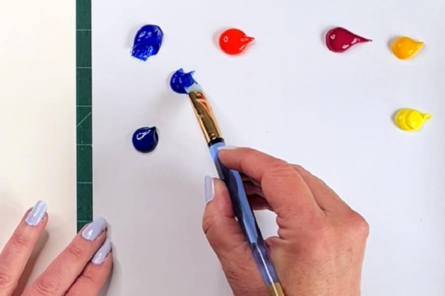
1. Understand Colour Bias Before Mixing Paint
One of the biggest reasons beginners struggle with colour mixing is something called colour bias.
Although we often think of red, blue, and yellow as the three primary colours, every paint has a slight “lean” toward another colour on the colour wheel.
For example:
- Some reds lean toward orange (warm reds)
- Some reds lean toward violet (cool reds)
- Some blues lean toward green
- Other blues lean toward violet
- Some yellows lean toward orange
- Others lean toward green
These subtle differences have a huge impact on the colours you mix.
Why Your Purple Looks Muddy
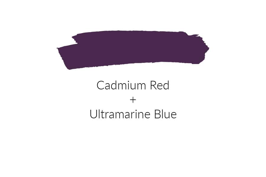
Suppose you mix:
- Ultramarine Blue
- Cadmium Red
At first glance, it seems like you should get a beautiful purple.
Instead, you’ll probably end up with a dull, muted purple.
Why?
Ultramarine Blue naturally leans toward red, while Cadmium Red leans toward yellow (orange). Together they introduce all three primary colours into the mix:
- Blue
- Red
- Yellow
Whenever all three primaries are present, the mixture shifts toward brown or grey rather than a bright secondary colour.
How to Mix a Bright Purple
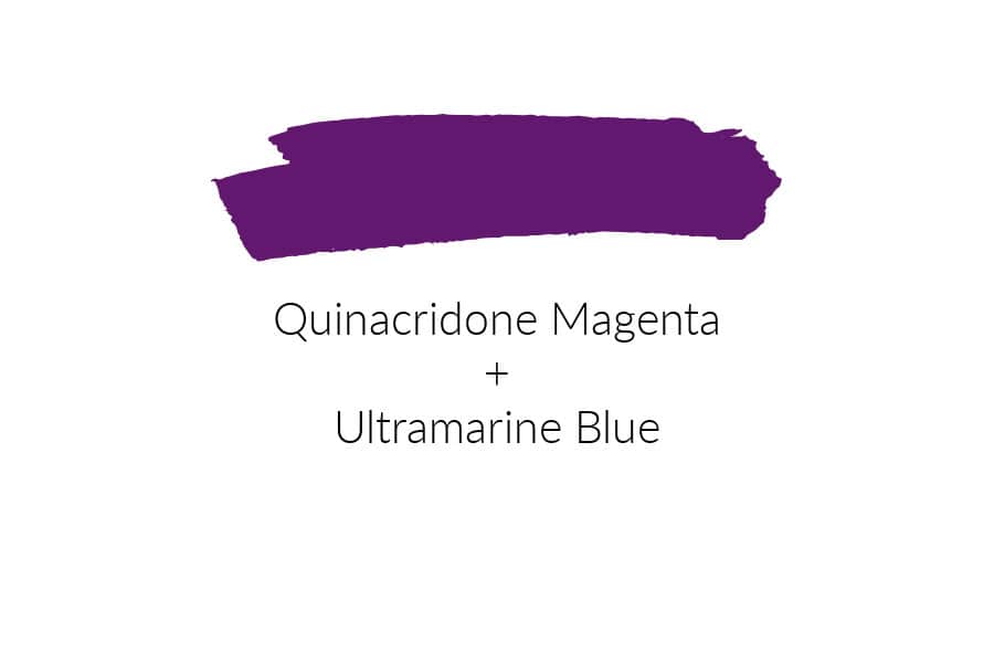
Instead, try mixing:
- Ultramarine Blue
- Magenta
Magenta leans toward blue instead of yellow.
Now you’re only mixing two primary colours, red and blue, allowing you to create a much cleaner, brighter purple.
The same principle applies to every colour you mix.
Mixing Brighter Greens
The same rule works for green.

If you mix:
- Ultramarine Blue
- Cadmium Yellow
you’ll get a useful but fairly muted green because both paints contain a little red bias.
If you want a bright spring or grass green, try:
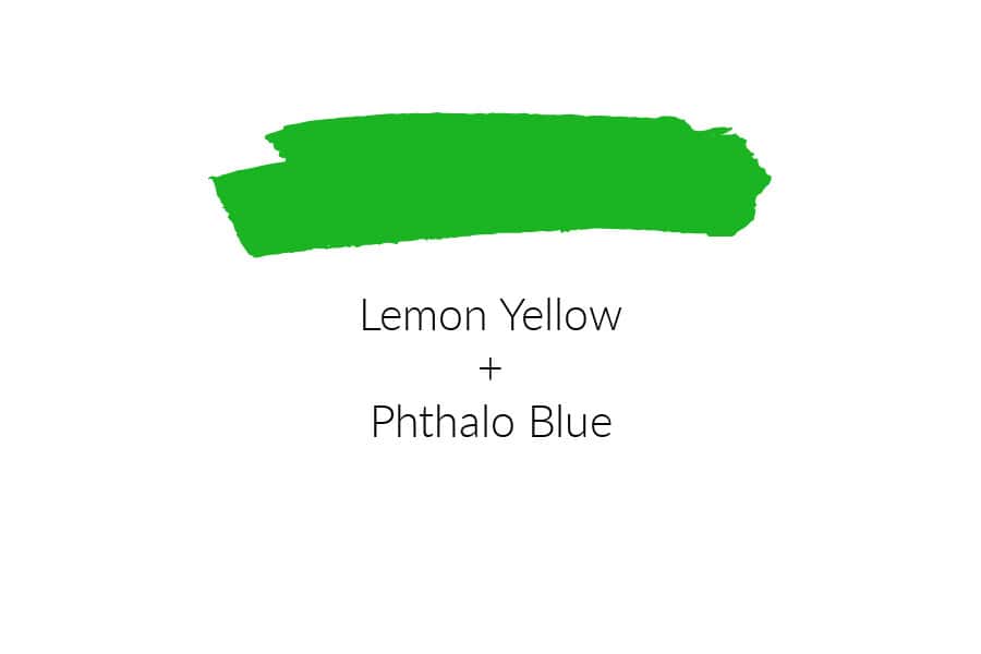
- Phthalo Blue (Green Shade)
- Lemon Yellow
Since both colours lean toward green, the result is a much cleaner, more vibrant green.
How to Tone Down Colours Without Making Mud
Sometimes you don’t want bright colours.
Nature is actually full of softer, muted colours.
The easiest way to reduce the intensity of a colour is to add its complement, the opposite colour on the colour wheel.

Examples include:
- Purple → add yellow
- Green → add red
- Orange → add blue
Add only a tiny amount at a time. A little complementary colour can create beautiful natural-looking shadows and muted tones, but too much quickly turns into mud.
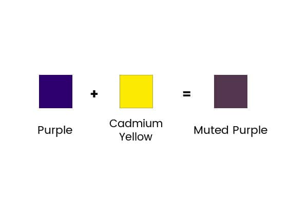
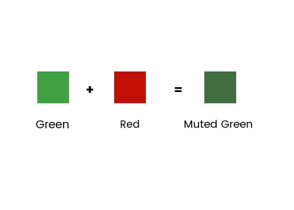
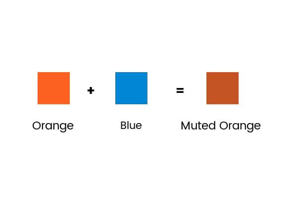
Tip: Keep a colour wheel beside your painting area. It’s one of the most useful tools a beginner can own.
2. Acrylic Paint Dries Faster Than You Think
One of the biggest frustrations for new acrylic painters is how quickly acrylic paint dries.
Because beginners naturally paint more slowly while learning, it’s common for paint to dry on the palette before you’re finished using it.
Fortunately, there are a few simple solutions.
Mist Your Palette
A small spray bottle filled with water is one of the most useful tools you can own.
Lightly mist:
- your paint palette
- your canvas (when appropriate)
- your paint every few minutes
This helps slow the drying process without affecting the paint.
Make an Inexpensive Stay-Wet Palette
You don’t need to buy an expensive commercial stay-wet palette.
You can make one yourself using:
- A plastic container with a tight-fitting lid
- Damp paper towels
- Palette paper, wax paper, or butcher paper
Here’s How:
- Cut several layers of paper towel and a sheet of palette paper or parchment paper to fit your container.
- Place the paper towel in the container and add enough water to wet the paper towel.
- Drain any excess water.
- Lay the palette paper on top.
- Add your paint.
- Close the lid when you’re finished painting.
- Your paint can stay usable for several days.

Acrylic Paint Dries Darker
Another surprise for beginners is that acrylic paint usually dries slightly darker than it appears when wet.
If you’re trying a new colour or mixing a custom colour, paint a small swatch first and let it dry before deciding whether it’s the shade you want.
Waiting just a few minutes can prevent a lot of unnecessary adjustments.
3. Know the Difference Between Transparent and Opaque Paint
Not all acrylic paints cover the same way.
Some are:
- Transparent
- Semi-transparent
- Opaque
Understanding the difference can save a lot of frustration.
How to Tell
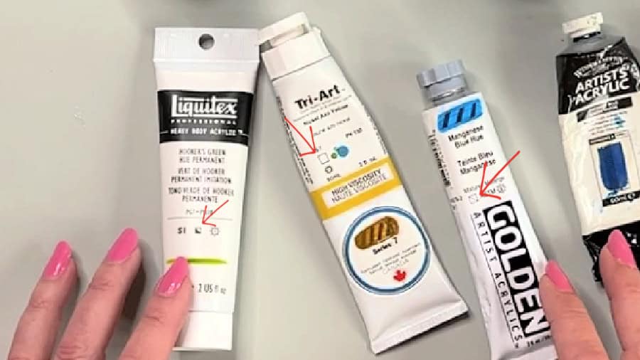
Most paint manufacturers print a small square somewhere on the tube.
Generally:
- □ Empty square = Transparent
- ◐ Half-filled square = Semi-transparent
- ■ Solid square = Opaque
Although the exact symbol may vary slightly between brands, most manufacturers use a similar system.
When to Use Transparent Paint
Transparent colours allow underlying colours and brushwork to show through.
They’re excellent for:
- glazing
- layering
- luminous effects
- realistic shadows
Examples include many Phthalo colours.
When to Use Opaque Paint
Opaque paints cover what’s underneath much more effectively.
They’re ideal for:
- highlights
- correcting mistakes
- painting light colours over dark ones
- creating strong coverage
Titanium White is one of the most opaque acrylic paints available.
Don’t Let These Small Things Discourage You
Many beginner artists become frustrated because no one has explained these simple concepts.
Once you understand:
- color bias
- complementary colours
- drying time
- paint opacity
acrylic painting suddenly becomes much easier and much more enjoyable.
Every experienced artist learned these lessons at some point. You’re simply learning the “why” behind what your paint is doing.
Stick with it, experiment with your colours, and don’t be afraid to make mistakes. Every painting teaches you something new.
Acrylic painting has a learning curve, but mastering a few basic concepts early can save you countless hours of frustration.
Remember these three beginner acrylic painting tips:
- Learn how colour bias affects colour mixing.
- Keep your acrylic paints workable by using a spray bottle or homemade stay-wet palette.
- Check whether your paints are transparent, semi-transparent, or opaque before you start painting.
These small changes can make a dramatic difference in your colour mixing, confidence, and overall painting experience.
Dear Marilyn, Once again you are so helpful and inspiring. (I am a nearly 80 yr. old beginner trying to learn on my own as none of this was ever explained in a year long course). Your tips were so clear and easy to understand.
Your painting is very beautiful and draws me into the Canadian landscape of my youth. Continue to paint and encourage other and to be in the best of health possible. Thanks so much for all your dedication.
Thank you so much!❤️
Marilyn, thank you so much for this important information!