At first glance, mixing gray paint seems simple: combine black and white in equal parts, adjust as needed, and you’re done. You might even say it’s black and white. (Sorry — I couldn’t resist.)
But gray is far more complex than that.
There are many shades of gray, and some of the most beautiful ones don’t use black paint at all. Gray can be mixed using primary colors, complementary colors, and subtle color adjustments that give your painting depth, realism, and atmosphere.
You can mix beautiful grays using complementary colors. A complementary color is a primary color such as blue and its opposite on the color wheel, in this case, orange. I have a post on complementary colors if you want to learn more about them.
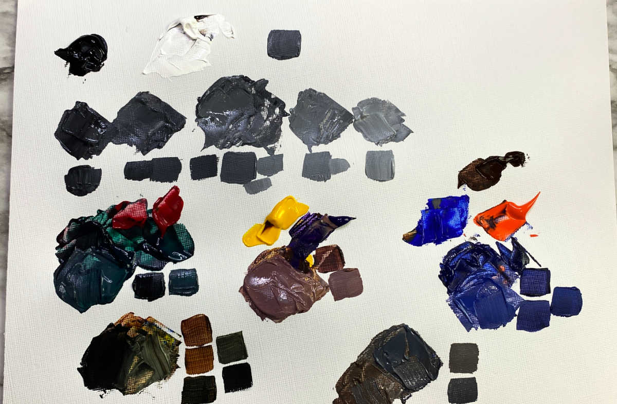
Gray might seem like a mix of black and white, but it actually has many different shades that artists can use. Shadows are not just a mix of black and white; they reflect the colors around them, so it’s important to learn to mix gray with other colors. This post will show you how to make different kinds of gray by mixing various amounts of black, white, and other colors.
I have included a printable color chart at the end of this post. You can save or print it to use as a guide when mixing gray colors.
A Quick Note Before You Start
Computer screens, phone displays, and printers don’t always show colors accurately. Paint pigments can also vary slightly between manufacturers.
For this reason, I strongly recommend making your own paint swatches using the colors you already have. Your personal color chart will always be more accurate than any printed or digital reference.
This post may contain affiliate links. If you click a link and buy, I may receive a small commission. Please see my full privacy policy for details.
Basic Gray Mix (Black and White)
The most straightforward way to mix gray is by combining black and white paint.
- Start with a 1:1 ratio for a neutral gray
- Add more white to lighten
- Add more black to darken
A little black goes a very long way, so always start with a tiny amount and increase gradually.
This method is quick and useful, but it often produces a flat gray that lacks depth, which is why many artists prefer alternatives.

How to Mix Gray Using Primary Colors
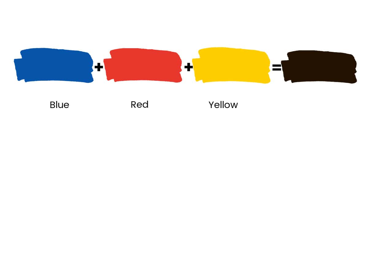
You can mix gray by combining the primary colors, red, blue, and yellow, in roughly equal amounts. This creates a neutralized color often called a primary gray.
Equal parts = flat, neutral gray
Add more red for warmth
Add more blue for coolness
Add white to adjust value
This type of gray tends to be softer and more natural than black-and-white gray, especially in paintings with rich color harmony.
white to lighten the color.
Mixing Gray With Complementary Colors
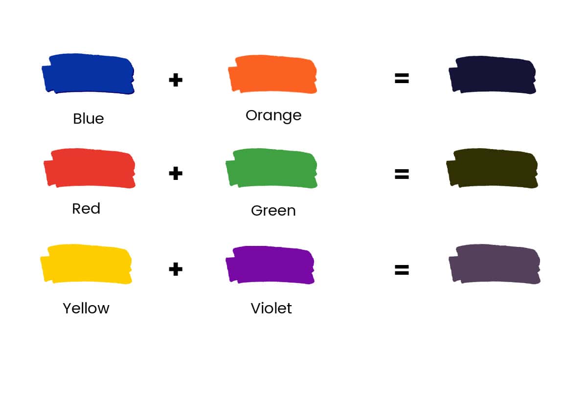
One of the most effective ways to mix interesting grays is by using complementary colors — colors that sit opposite each other on the color wheel.
When mixed together, complementary colors neutralize each other and create gray-based neutrals.
Common examples:
- Blue + Orange
- Red + Green
- Yellow + Purple
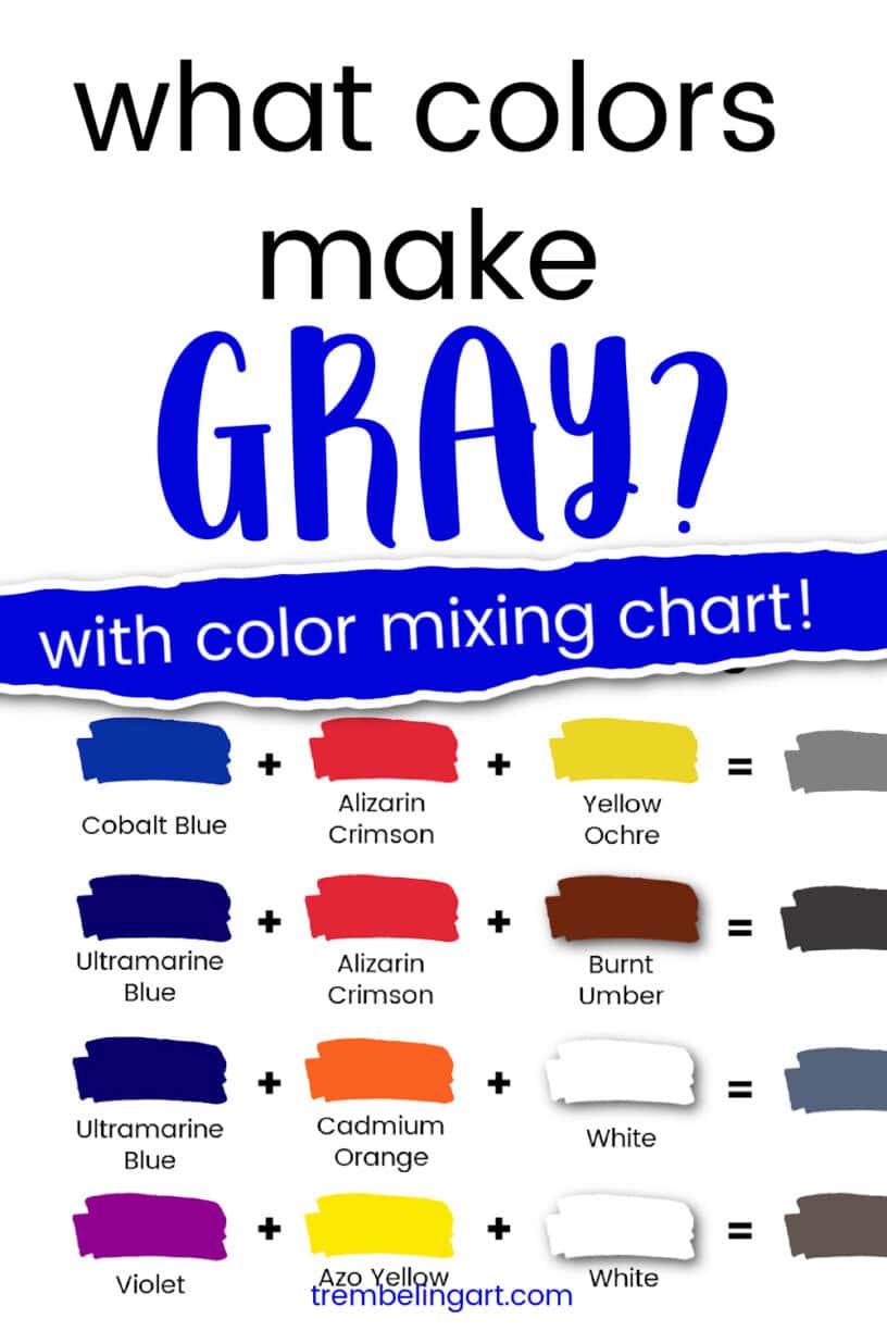
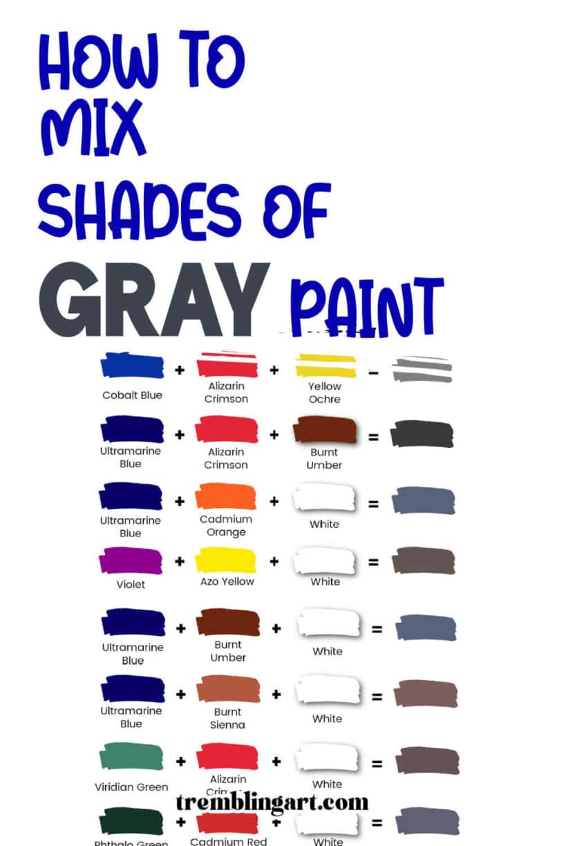
These mixtures often result in darker grays, so adding titanium white will help you reach the value you need.
A favorite combination of mine is Ultramarine Blue and Burnt Sienna, which produces a beautifully complex gray that feels natural rather than mechanical.
Warm Gray vs Cool Gray (Why It Matters)
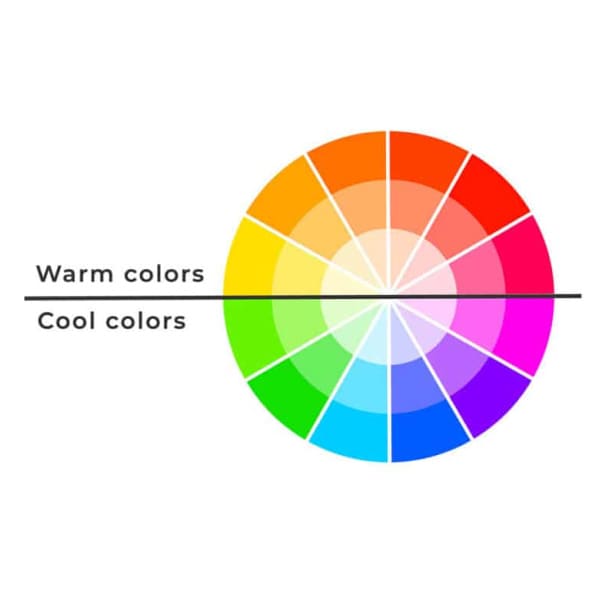
Gray isn’t just light or dark — it also has temperature.
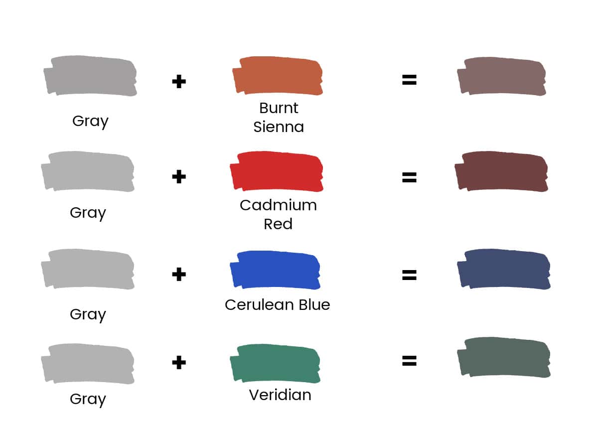
You can shift the temperature of any gray by adding a very small amount of color:
To Create Warm Grays
- Burnt Sienna
- Burnt Umber
- Cadmium Red (tiny amounts)
Warm grays feel closer and are excellent for sunlit areas, skin tones, and foreground elements.
To Create Cool Grays
- Cerulean Blue
- Viridian Green
- Ultramarine Blue (in some mixtures)
Cool grays are ideal for shadows, water, distance, and moonlit scenes.
Color temperature plays a major role in depth and mood. Warm colors tend to advance, while cool colors recede. Using warm and cool grays strategically can make a painting feel more realistic and spatially convincing.
You can learn more about color temperature from my post about warm and cool colors.
Using these temperatures strategically can add depth and realism to your work.
A note about Ultramarine Blue: It is often considered a warm blue because it leans towards purple, so it has some red in it. You will see the purple color if you add a little white to the Ultramarine.
However, I have found that adding Ultramarine to Burnt Umber or Burnt Sienna gives me a lovely cool gray.
Color can often be subjective, and I’m not sure how much Parkinson’s influences my color perception, so try it out yourself. I think this combination, mixed with white, gives me the best gray.
You can always add more Burnt Umber or Burnt Sienna to warm the color.
Common Mistakes When Mixing Gray Paint
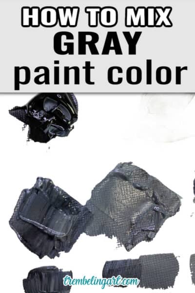
- Adding too much black too quickly
- Overmixing until the color becomes lifeless
- Ignoring color temperature
- Relying only on black and white
- Not testing the mix before applying it to the painting
Remember, there’s no single “correct” way to mix paint. Each artist’s approach is unique, just like their art. Embrace the process and experiment with the color mixtures. Keep a color-mixing “recipe book” that you can refer to at any time. A watercolor sketchbook would be a good book to use for this.
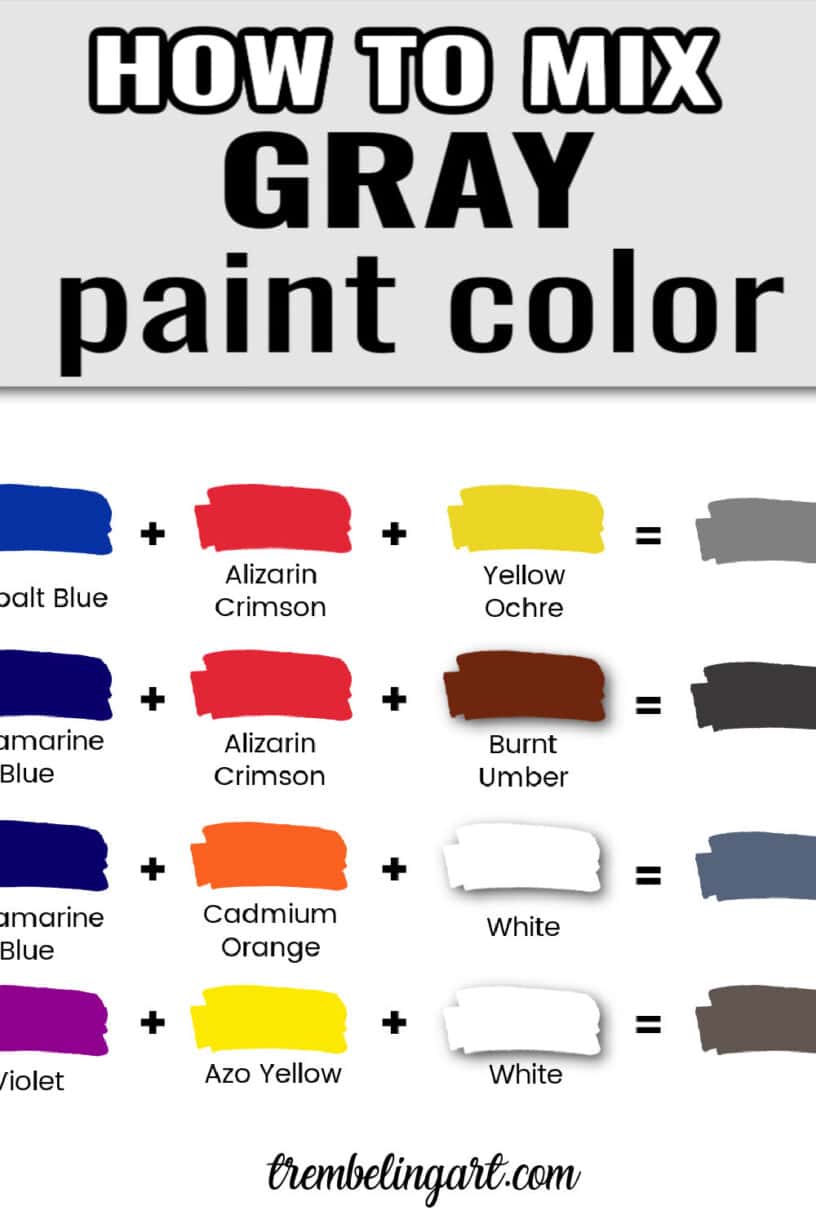
Here is a color chart you can download, save, or print for future reference. The colors are approximate since screens and printers can vary. Just click the image to download or print.



Great article and the best is the great approach you are doing towards the Parkinson’s desease. Your color mixing are helping me a lot. Thanks
I am so glad the articles are helpful. 😊
Have you tried a parasite cleanse and a heavy metal detox to help your Parkinson’s? There is evidence that Parkinson’s patients all have parasites. (We all do.) Eating organic, adding herbs, pure distilled water, no sugar or processed foods and focusing on just( local grass fed only ) meat and veggies are good places to start.