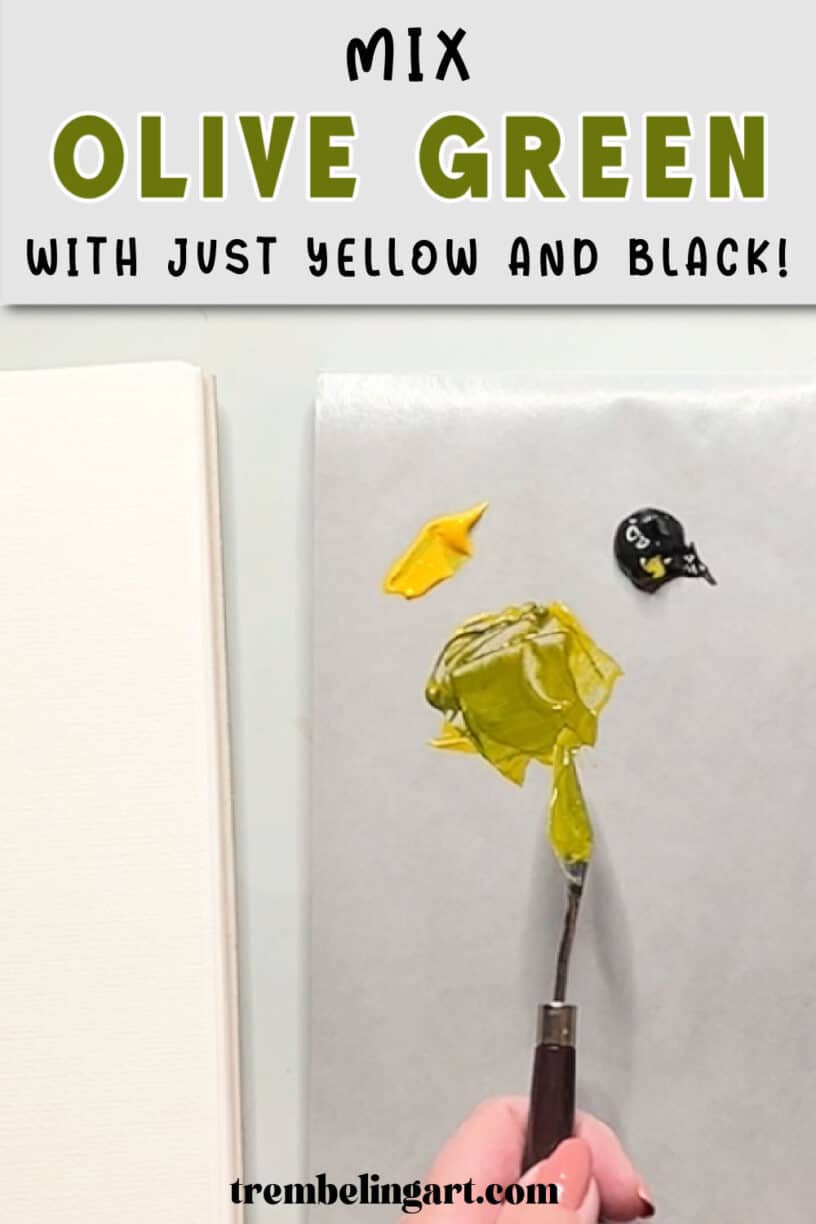
Olive green is a beautiful, earthy colour that is useful for painting landscapes, foliage, trees, and natural subjects. But did you know you can mix olive green paint using several different colour combinations, including yellow and black?
You don’t need to buy a separate tube of olive green acrylic paint. With a few basic colours you probably already have among your paints, you can mix a variety of olive greens, from light, muted greens to deep, rich shades.
In this tutorial, I’ll show you how to mix olive green acrylic paint using seven different colour combinations. I’ll also explain how to adjust your mixtures to make them warmer, cooler, lighter, or darker.
These methods are helpful for beginner artists who are working with a limited selection of paint colours.
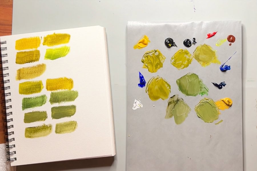
What Colours Make Olive Green?
Olive green is a muted, earthy green with yellow undertones. Unlike bright greens, olive green has a more subdued appearance, making it ideal for painting natural subjects and landscapes.
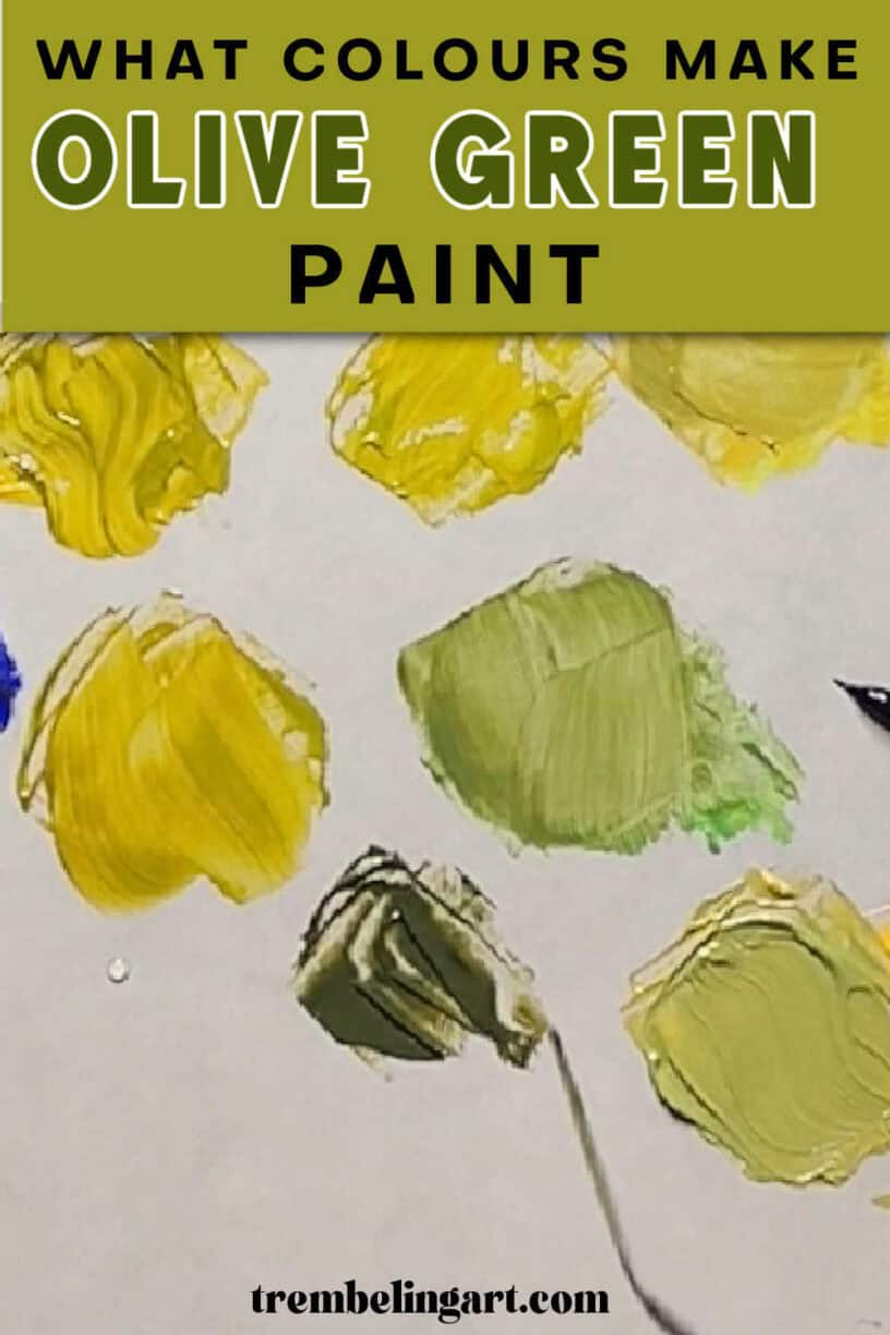
The easiest way to make olive green paint is to mix yellow with a small amount of ivory black.
It might sound strange that yellow and black can produce green, but some black pigments have a cool, bluish undertone that creates a muted green when mixed with yellow.
You can also make olive green by mixing yellow and blue to create a basic green, then adding a small amount of red or reddish brown to tone down its brightness.
The exact shade of olive green you get depends on the pigments you use and their proportions.
7 Ways to Mix Olive Green Acrylic Paint
There isn’t just one recipe for olive green. Different paint combinations produce slightly different colours, and that’s one of the things I enjoy about colour mixing.
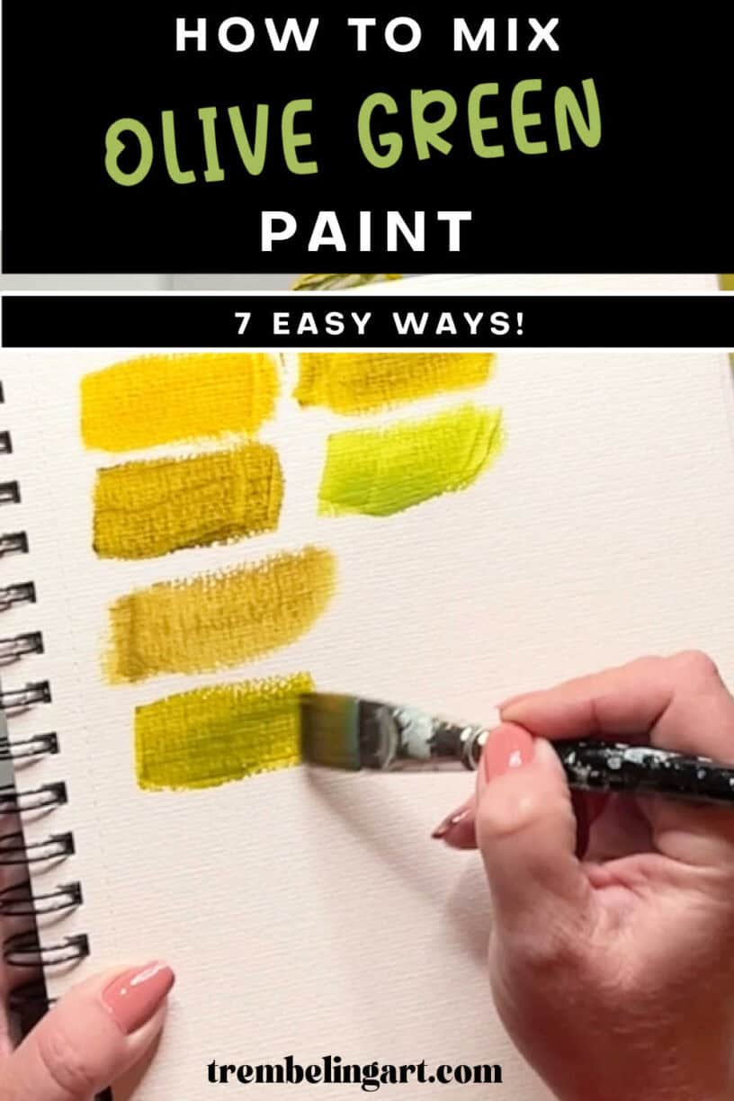
Here are seven combinations you can try.
1. Yellow and Ivory Black: The Easiest Way to Make Olive Green
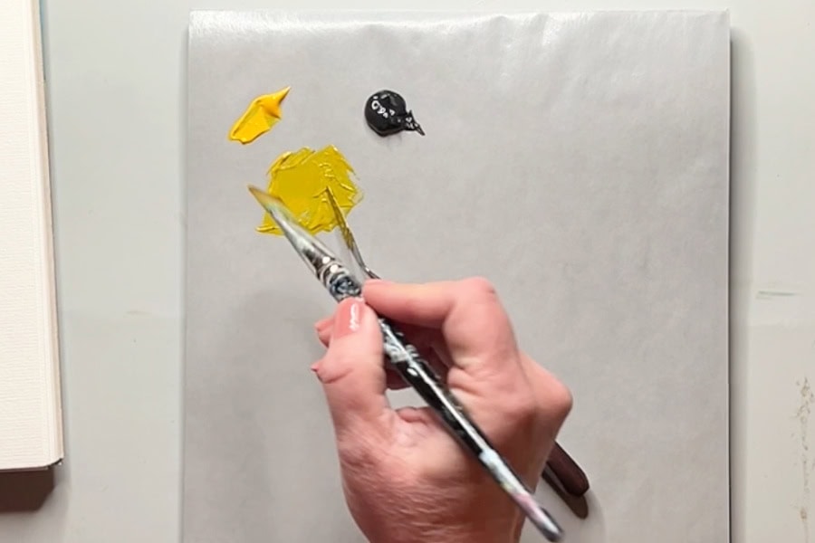
Colours needed:
- Yellow paint ( I used Cadmium Yellow Medium Hue )
- Ivory black
This is probably the simplest way to mix olive green.
Start by putting a small amount of yellow paint on your palette. Add a tiny amount of ivory black and mix thoroughly with a palette knife or brush.
You should begin to see the yellow change into a muted, earthy green.
If you want a darker olive green, gradually add more black until you reach the shade you want.
Be careful with the black. It has a strong tinting effect and can quickly overpower the yellow.
It’s much easier to darken a mixture gradually than to add too much black and then have to use a large amount of yellow to correct it.
Colour mixing tip: Always start with your lighter colour and add small amounts of the darker colour. This gives you better control over the mixture and helps prevent wasted paint.
2. Cadmium Yellow Medium and Payne’s Grey: A Warmer Olive Green
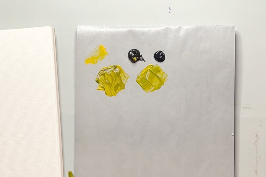
Colours needed:
- Cadmium yellow medium
- Payne’s grey
This is one of my favourite ways to mix olive green.
Payne’s grey is a dark, bluish grey that can produce beautiful, muted greens when mixed with yellow.
Start with cadmium yellow medium on your palette and gradually add small amounts of Payne’s grey.
Mix thoroughly after each addition.
The result is a warm, earthy olive green that is slightly different from the green produced by yellow and ivory black.
Cadmium yellow medium has a warmer appearance, which helps produce a warmer olive green.
You can make the colour darker by adding more Payne’s grey or lighter by increasing the proportion of yellow.
This is a lovely combination for painting natural foliage and muted greens in landscapes.
3. Lemon Yellow, Payne’s Grey, and Red: A Cooler Olive Green
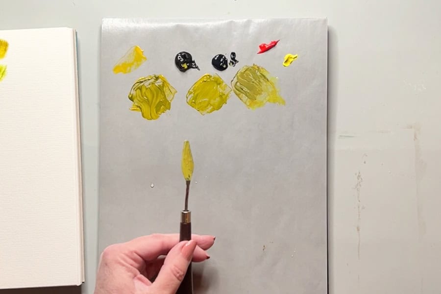
Colours needed:
- Lemon yellow
- Payne’s grey
- Cadmium red medium
If you prefer a cooler olive green, try using lemon yellow instead of cadmium yellow medium. Lemon yellow is a cooler yellow, so it produces a different green when mixed with Payne’s grey.
Start with lemon yellow and gradually mix in a little Payne’s grey.
This combination produces a fairly bright green. It’s a nice colour, but it may be too vibrant for the olive green we’re trying to achieve.
To tone it down, add a tiny amount of cadmium red medium. Red is the complementary colour of green, so adding a little red will reduce the green’s saturation and make it appear more muted.
Continue adjusting the mixture with small amounts of yellow, Payne’s grey, or red until you get the olive green you want.
Be careful not to add too much red. A small amount will neutralize the green, but too much can push the mixture toward a muddy brown or another unwanted colour.
4. Cadmium Yellow Medium, Ultramarine Blue, and Red
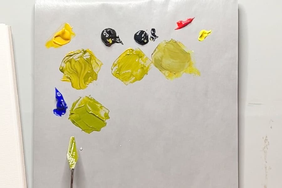
Colours needed:
- Cadmium yellow medium
- Ultramarine blue
- Cadmium red medium
This is a useful method if you already have yellow and ultramarine blue on your palette.
Start with cadmium yellow medium and add a small amount of ultramarine blue. Mix the two colours until you have a green.
Depending on the proportions, this combination may produce a green that is brighter than the olive shade you’re looking for.
To make it more muted, add a very small amount of cadmium red medium. The red will reduce the intensity of the green and move it closer to an earthy olive colour.
Add the red gradually, mixing thoroughly between additions.
This is a good example of how you can use complementary colours to control the brightness of your paint. You don’t always need to add black to darken or mute a colour. Sometimes a little of its complement is all you need.
5. Lemon Yellow, Phthalo Blue, and Burnt Sienna
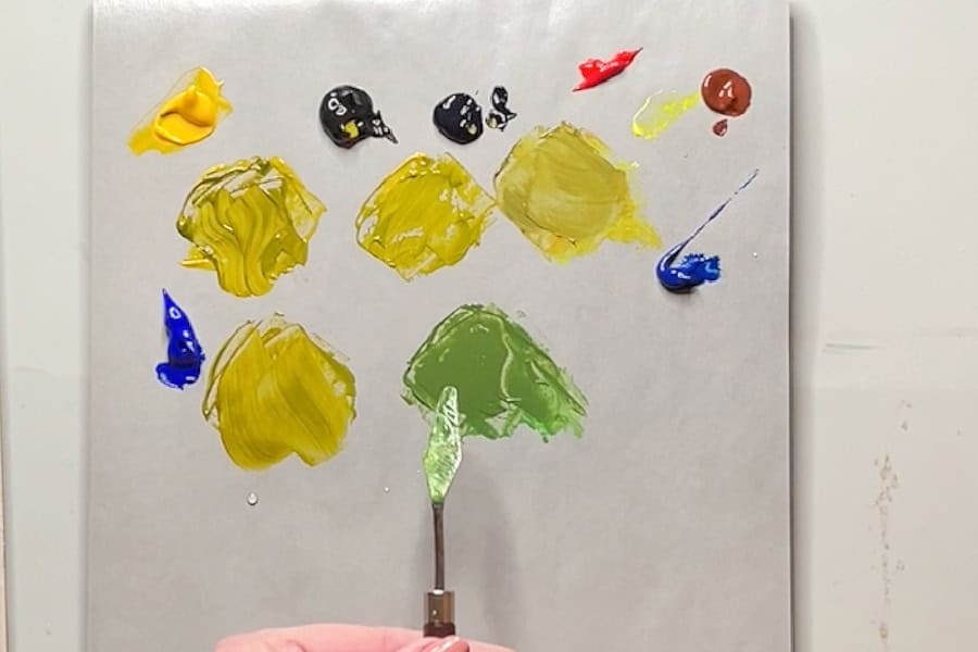
Colours needed:
- Lemon yellow
- Phthalo blue
- Burnt sienna
This combination starts with a much brighter green, but you can gradually turn it into a beautiful olive shade.
Begin by mixing lemon yellow with a tiny amount of phthalo blue. Phthalo blue is a very intense pigment, so use it sparingly.
You’ll notice that the mixture produces a bright, almost Christmas-like green. While this is a lovely colour for other painting projects, it’s usually too bright for a natural olive green.
To tone it down, add a little burnt sienna. Burnt sienna is a warm, reddish brown, so it helps neutralize the bright green without necessarily making it much darker.
Keep adding small amounts of burnt sienna until the green becomes more subdued and earthy. You may need to make several adjustments to get the exact shade you’re looking for.
Colour mixing tip: Don’t be discouraged if your first mixture isn’t quite right. Colour mixing is a process of making small adjustments until you achieve the colour you want.
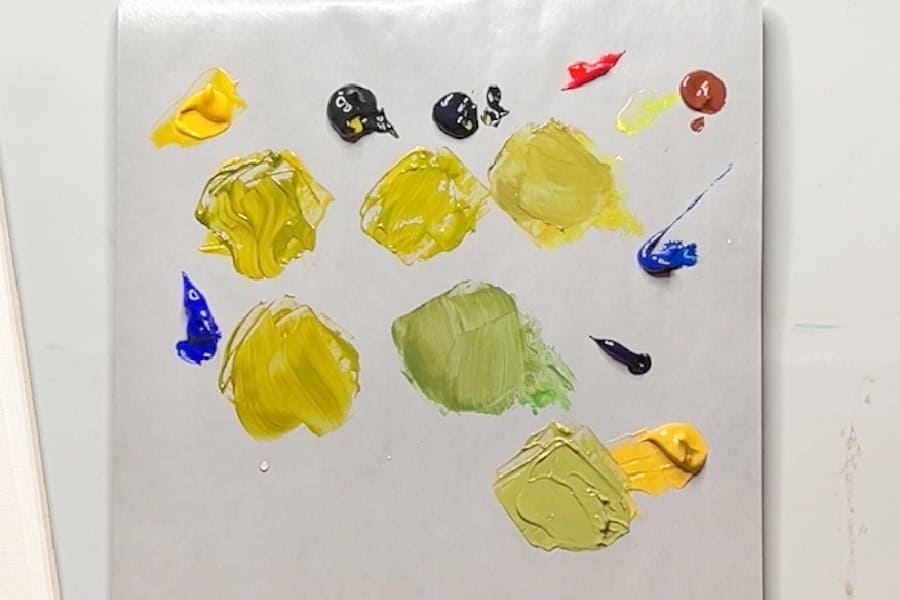
6. Yellow Ochre and Prussian Blue: An Earthy Olive Green
Colours needed:
- Yellow ochre
- Prussian blue
Yellow ochre is an earthy, muted yellow that works well for mixing natural-looking greens.
Prussian blue is a deep, intense blue with strong tinting strength.
Start with yellow ochre and add a very small amount of Prussian blue. Mix thoroughly and observe the colour.
This combination produces a muted, earthy green that can resemble an army green or olive green.
You can adjust the shade by adding more Prussian blue to deepen the mixture or more yellow ochre to make it lighter and warmer. Because Prussian blue is so intense, you only need a tiny amount.
One thing to keep in mind is that some yellow ochre paints can produce a slightly dull or chalky-looking mixture, depending on the pigments and formulation. This isn’t necessarily a bad thing, especially if you’re painting a muted landscape, but it’s something to watch for.
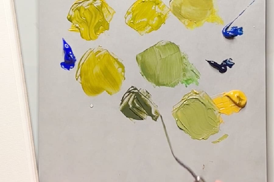
7. Raw Sienna and Prussian Blue: A Deep, Dark Olive Green
Colours needed:
- Raw sienna
- Prussian blue
For a deeper, darker olive green, try mixing raw sienna with Prussian blue. Raw sienna is an earthy yellow-brown that produces rich, natural-looking colours when mixed with blue.
Start with raw sienna and add a tiny amount of Prussian blue. Mix thoroughly.
This combination produces a deep, dark green that can be adjusted into a beautiful olive shade. If the colour is too dark, you can add a little white to lighten it.
However, be careful when adding white because it can sometimes make the mixture look chalky or less vibrant. You could also try adding a little cadmium yellow to lighten the colour, although this will change its temperature and appearance.
This dark olive green would be useful for painting shaded foliage, deep forest greens, and darker areas of a landscape.
Olive Green Colour Mixing Chart
Here’s a quick reference chart showing the seven combinations.
| Paint Colours | Result |
| Yellow + Ivory Black | Muted olive green; lighter or darker depending on proportions |
| Cadmium Yellow Medium + Payne’s Grey | Warm olive green |
| Lemon Yellow + Payne’s Grey + Red | Cooler, muted olive green |
| Cadmium Yellow Medium + Ultramarine Blue + Red | Natural, desaturated olive green |
| Lemon Yellow + Phthalo Blue + Burnt Sienna | Bright green adjusted to an earthy olive |
| Yellow Ochre + Prussian Blue | Muted, army-style olive green |
| Raw Sienna + Prussian Blue | Deep, dark olive green |
The exact results will vary depending on your paint brand, pigments, and mixing ratios.
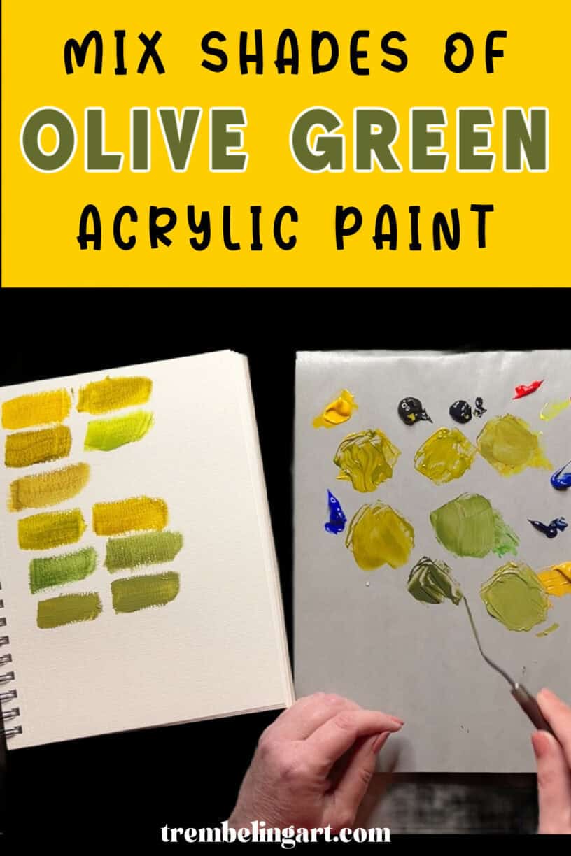
How to Adjust Olive Green Paint
Once you’ve mixed an olive green, you can make small adjustments to get exactly the colour you need for your painting.
How to Make Olive Green Darker
To make olive green darker, add a small amount of a dark colour already used in your mixture, such as ivory black, Payne’s grey, or Prussian blue.
Add it gradually because these colours can quickly overpower the mixture.
Using more of the dark blue or grey may also change the colour temperature, so pay attention to the overall appearance as you mix.
How to Make Olive Green Lighter
You can lighten olive green by adding more yellow or a small amount of white.
Adding yellow will generally make the colour warmer or brighter, while adding white will produce a lighter tint.
White can sometimes make a colour appear chalky, so I prefer to use as little as possible.
How to Make Olive Green More Muted
If your olive green is too bright, add a tiny amount of red or a reddish brown such as burnt sienna.
Because red and green are complementary colours, mixing them reduces the intensity of the green.
This is useful when you’re painting realistic foliage or natural landscapes where bright, saturated greens can sometimes look out of place.
How to Make Olive Green Warmer or Cooler
To make olive green warmer, try using a warm yellow such as cadmium yellow medium or adding a little more yellow to your mixture.
For a cooler olive green, experiment with lemon yellow and a blue-leaning dark colour such as Payne’s grey.
Remember that the exact results depend on the pigments in your paint.
Tips for Mixing Olive Green Acrylic Paint
There are a few things I’ve learned from mixing paint over the years that can make the process easier, especially for beginners.
Start with small amounts of paint. Acrylic paint can be expensive, and there’s no reason to waste large amounts while experimenting. Start with a small puddle of your lightest colour and gradually add the darker colours.
Mix thoroughly before making adjustments. Sometimes a colour looks too bright or too dark simply because the pigments haven’t been completely mixed.
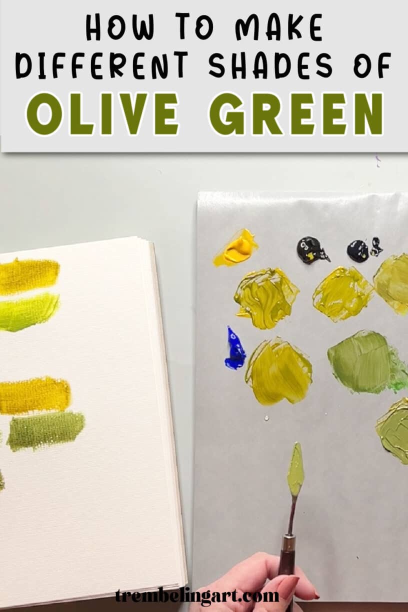
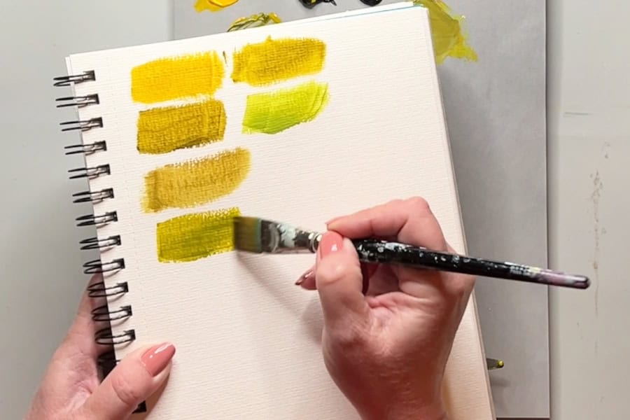
Make colour swatches. I like to swatch my mixtures in a cheap watercolour book so I can compare the different shades. This also helps me see the colour more clearly than I can on a crowded palette. I label the mix so I can come back to it later if I want to reproduce that colour.
Keep your acrylic paints from drying out. Acrylic paint dries quickly, particularly under bright studio lights. I use a small mister to give my paint an occasional light spray of water while I’m working.
You can also use a [homemade stay-wet palette](INSERT INTERNAL LINK) to keep your paints workable for longer.
Check the colour after it dries. Some acrylic paints dry darker than they appear when wet. The amount of colour shift depends on the paint brand and formulation, so it’s a good idea to let a swatch dry before deciding whether the colour is right.
Keep a record of your mixtures. If you find an olive green you particularly like, write down the colours you used and their approximate proportions. You’ll be glad you did when you want to mix it again.
What Can You Paint With Olive Green?
Olive green is a versatile colour that works well for natural subjects.
I find it helpful for painting trees, leaves, grasses, and other foliage, especially when I want a more realistic or subdued appearance.
Some ways to use olive green in your paintings include:
- Landscapes: Mix several shades of olive green for trees, hillsides, and grassy areas.
- Foliage: Use warmer and cooler olive greens to create variety in leaves and plants.
- Shadows: Dark olive green can be useful for shaded areas of trees and bushes.
- Botanical paintings: Muted greens work for stems, leaves, and dried botanical subjects.
- Autumn paintings: Combine olive green with yellow ochre, burnt sienna, and other earth colours for natural-looking autumn foliage.
Using several variations of olive green in the same painting can make your foliage look much more interesting than using one green straight from the tube.
Frequently Asked Questions About Mixing Olive Green
Can You Mix Olive Green With Just Two Colours?
Yes. Yellow and ivory black can produce olive green, as can cadmium yellow medium and Payne’s grey.
Yellow ochre and Prussian blue are another two-colour combination worth trying.
Why Is My Olive Green Too Bright?
Your mixture probably has too much saturation.
Try adding a tiny amount of red or burnt sienna to neutralize the green. Add it gradually so you don’t accidentally turn the mixture brown.
Why Does My Olive Green Look Brown?
You may have added too much red or another neutralizing colour.
Try adding a little more yellow or some of your original green mixture to bring it back toward olive green.
Is Olive Green a Warm or Cool Colour?
Olive green is generally considered a warm, yellow-leaning green, but you can mix warmer and cooler variations.
The temperature depends on the pigments you use and their proportions.
As you can see, there are plenty of ways to mix olive green acrylic paint, even if you only have a few basic colours. You don’t need to purchase every shade of green available. Learning how to mix your own colours gives you more control over your paintings and helps you understand how different pigments interact.
My personal favourite combination is cadmium yellow medium and Payne’s grey, but I encourage you to experiment with other mixtures too.
You might find one combination works better for landscapes, while another produces the exact shade you need for botanical painting or darker foliage. The important thing is to have fun experimenting and not worry about getting the perfect colour on your first try.
If you’d like to learn more about mixing acrylic paint colours, take a look at my colour mixing tutorials, where you’ll find more colour recipes, charts, and tips for beginners.
You can also watch my video below to see these olive green mixtures demonstrated step by step. https://youtu.be/KSkraET5RqA
Happy painting!