
If you’ve ever felt overwhelmed by too many paint choices or frustrated that your colours look muddy or disconnected, limiting your palette might be the answer. Many experienced artists intentionally use fewer colours, not more, because it simplifies the process and leads to a better painting.
A limited palette doesn’t restrict your creativity; it sharpens it.
What Is a Limited Palette?
A limited palette simply means working with a small selection of colours, often just 3 to 6 paints, rather than a full range straight from the tube. Instead of relying on pre-mixed colours, you mix most of your hues yourself.
The limited palette helps you to understand how colours relate to one another, rather than treating them as separate, isolated choices.

Why Limiting Your Palette Works
1. Stronger Colour Harmony
When your colours are mixed from the same few base paints, everything naturally “belongs” together. You avoid that patchy look where colours feel unrelated.
2. Better Colour Mixing Skills
The limited palette teaches you how colours interact. You learn how to tone down, brighten, or shift temperature.
3. Less Decision Fatigue
Fewer choices mean more focus on painting and avoiding decision fatigue. This is especially helpful if you find yourself second-guessing every colour decision.
4. More Control Over Values
With fewer pigments, you’re more likely to focus on light and dark (value), which is what really makes a painting work and is more important than the colour itself.
Examples of Simple Limited Palettes
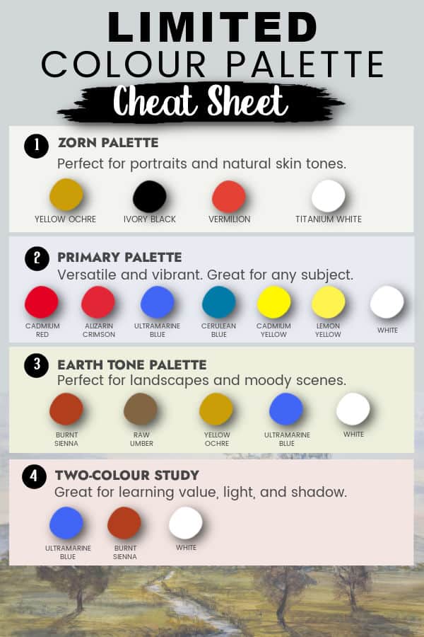
Here are a few simple palettes you can try:
1. Classic Primary Palette (Warm & Cool)

Warm Red (Cadmium Red or similar)
Cool Red (Alizarin Crimson)
Warm Blue (Ultramarine Blue)
Cool Blue (Cerulean Blue or Phthalo Blue)
Warm Yellow (Cadmium Yellow)
Cool Yellow (Lemon Yellow)
White
Why it works:
This gives you flexibility while still keeping things controlled. You can mix clean, vibrant colours and also create natural neutrals.
For a deeper dive into warm and cool colours, see my post Warm and Cool Colours and How to Tell the Difference.
2. Zorn Palette (Very Limited, Very Powerful)
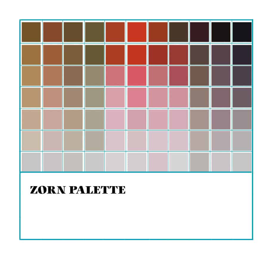
Yellow Ochre
Ivory Black
Vermilion (or Cadmium Red Light)
Titanium White
Why it works:
Used by Anders Zorn, this palette creates beautiful, natural skin tones and subtle harmonies. Ivory black acts like a blue, allowing for a surprising colour range with very few paints.
3. Earth Tone Palette (Great for Landscapes)
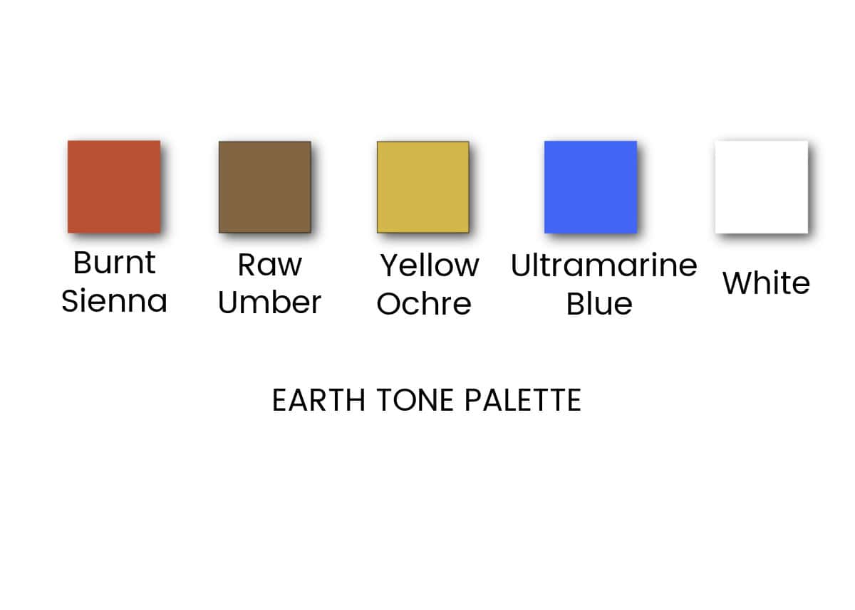
Burnt Sienna
Raw Umber
Yellow Ochre
Ultramarine Blue
White
Why it works:
This palette is great for landscapes and natural scenes. You’ll get rich neutrals and soft greens without harsh, artificial colours.
4. Two-Colour Study (Excellent Practice)
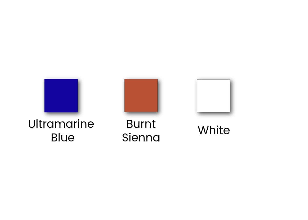
Ultramarine Blue
Burnt Sienna
White
Why it works:
This combination creates a full range of warm and cool greys. It’s one of the best exercises for learning value and temperature.
Famous Artists Who Used Limited Palettes
Many well-known artists relied on limited palettes to achieve their signature look:
Rembrandt – Used earthy, restrained colours to create dramatic light and shadow.

Rembrandt builds the entire painting around colours that would have originally come from natural pigments: ochres (yellow and red), Burnt sienna, Raw umber, deep browns, and muted golds.
Instead of using strong colour contrast, Rembrandt relies on value (light vs. dark) and temperature shifts (warm vs. slightly cooler browns). This keeps the painting cohesive and calm.
His use of light and shadow (often associated with Chiaroscuro) enhances the earthy palette. The dark background allows the warm tones to glow without the need for bright colours.
Johannes Vermeer – Known for subtle, harmonious colour relationships.
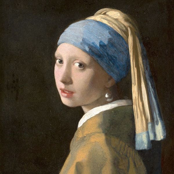
Vermeer keeps the palette extremely restrained:
- Soft yellows and warm ochres (skin tones and jacket)
- Deep, rich blue (the turban)
- Neutral browns and soft shadows
There are no harsh or competing colours. Everything feels intentionally chosen.
Claude Monet (early work) – Often worked with fewer pigments than people expect.
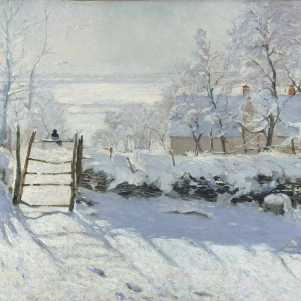
At first glance, the painting feels nearly monochromatic. Monet builds the entire scene from:
- Whites and off-whites (snow)
- Cool blues and blue-violets (shadows)
- Soft neutrals and muted browns (fence, tree, bird)
There’s no unnecessary colour. Everything serves the atmosphere.
Anders Zorn – Master of the four-colour palette.
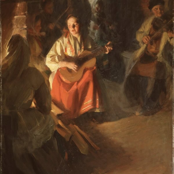
Skin tones are built from yellow ochre + red + white, cooled with black. The background and clothing stay in muted neutrals, letting the face stand out. Despite the limited palette, you still see a full range of warm and cool shifts
These artists weren’t limited by fewer colours. They used that limitation to create clarity and focus.
Common Pitfalls (and How to Avoid Them)
1. Muddy Colours
Why it happens: Overmixing or combining too many pigments
How to Fix: Mix using as few colours as possible. Add small amounts of one colour at a time until you achieve the hue you want. Don’t overmix.
2. Everything Looks the Same
Why it happens: Not enough contrast in value or temperature
How to Fix: Push your lights lighter and your darks darker. Also vary warm vs. cool mixes.
3. Fear of Not Having the “Right” Colour
Why it happens: Habit of relying on pre-mixed paints
How to Fix: Trust the process. Most colours can be mixed surprisingly well from a small palette.
4. Using Too Much White
Why it happens: Trying to lighten colours too quickly
How to Fix: Too much white will make your mixes cloudy. Try using yellow or transparent mixing whitento keep the vibrancy.
Tips for Getting Started with a Limited Palette
Start with just 3–4 colours plus white.
Pre-mix a few key colours before you begin painting.
Create a simple colour chart from your palette.
Do small studies instead of full paintings at first.
Focus on value first, colour second.
A Simple Exercise to Try
Choose:
Ultramarine Blue
Burnt Sienna
White
Paint a simple subject (like a cup or a landscape) using only these colours. Focus on light and shadow rather than colour accuracy. You’ll likely find the result feels more unified than expected.
A limited palette doesn’t restrict your creativity. When you remove excess choices, your painting decisions become more deliberate, and your results often become stronger.
If you’re feeling stuck, overwhelmed, or frustrated with colour mixing, this is one of the simplest ways to quickly improve your work.
And once you get comfortable with a limited palette, you can always expand it, but you’ll do so with a much deeper understanding of colour.
For more on colour mixing, see my post on colour mixing for beginners.