Orange is not a paint color you would think you would often use, especially bright, vivid orange. However, you would be surprised how often you actually use variations of orange acrylic paint in your work.
If you are a landscape artist, you already know the importance of various hues of orange paint in fall foliage or spring flowers.
Of course, a large amount of orange is also used in Halloween paintings. A blue or green pumpkin is artistic and beautiful, but little kids still want to see the spooky orange pumpkin with black eyes.
That’s it, right? Just leaves, flowers, and pumpkins? …. Not quite.

What about all of the variations of orange we see every day and don’t realize they started off as a bright, vibrant orange?
Take a look around the room you are in or outside your window. Can you identify anything that might have some orange in it?
How about the gold jewelry you wear, or that beautiful sunset, the dying embers of a campfire, or your red-haired friend sitting next to you?
All of these contain various strengths of orange. They are either warmed up, cooled down, or diluted to a certain degree to achieve the desired color.
Want to learn how to mix these various “orangy” paint colors? Keep reading, and hopefully, I can get you started with a whole new range of colors for your palette.
This post may contain affiliate links. If you click a link and buy, I may receive a small commission. Please see my full privacy policy for details.

The Color Wheel
To make mixing orange hues easier, you need to know a little about color theory and the color wheel. The color wheel is based on the three primary colors (red, blue, and yellow), the secondary colors (green, orange, and purple), and the various intermediate colors obtained by mixing primary and secondary colors together. As you can see, orange is a secondary color made by mixing the primary colors red and yellow together.

The Importance of Colour Bias
Everyone knows yellow and red make orange. But there is so much more to making orange acrylic paint than just mixing these two colors.
There are warm and cool yellows and warm and cool reds. Mixing warm colors will give you a bright, vibrant orange while mixing cool colors will give you a dull orange.
What’s warm and what’s cool? See my post on Warm and Cool Colors for more info.
Basically, if your red or yellow paint has a blue bias or blue undertone, it is a cool color. Lemon Yellow is a cool yellow, and Alizarin Crimson is a cool red.
If your yellow has a red bias, it is warm. If your red has a yellow bias, it is warm. Cadmium Yellow and Cadmium Red are warm.
Gamblin has a great color temperature and value chart on its site. It doesn’t list all colors, but it’s a great place to start. https://gamblincolors.com/color-temperature-list/
Color bias is a little confusing, I know, but it is important to understand color biases if you want to mix the right shade of orange.
How to Mix Vivid Orange Paint
To make bright, vivid orange paint, you need two primary colors, red and yellow, that don’t contain any blue.
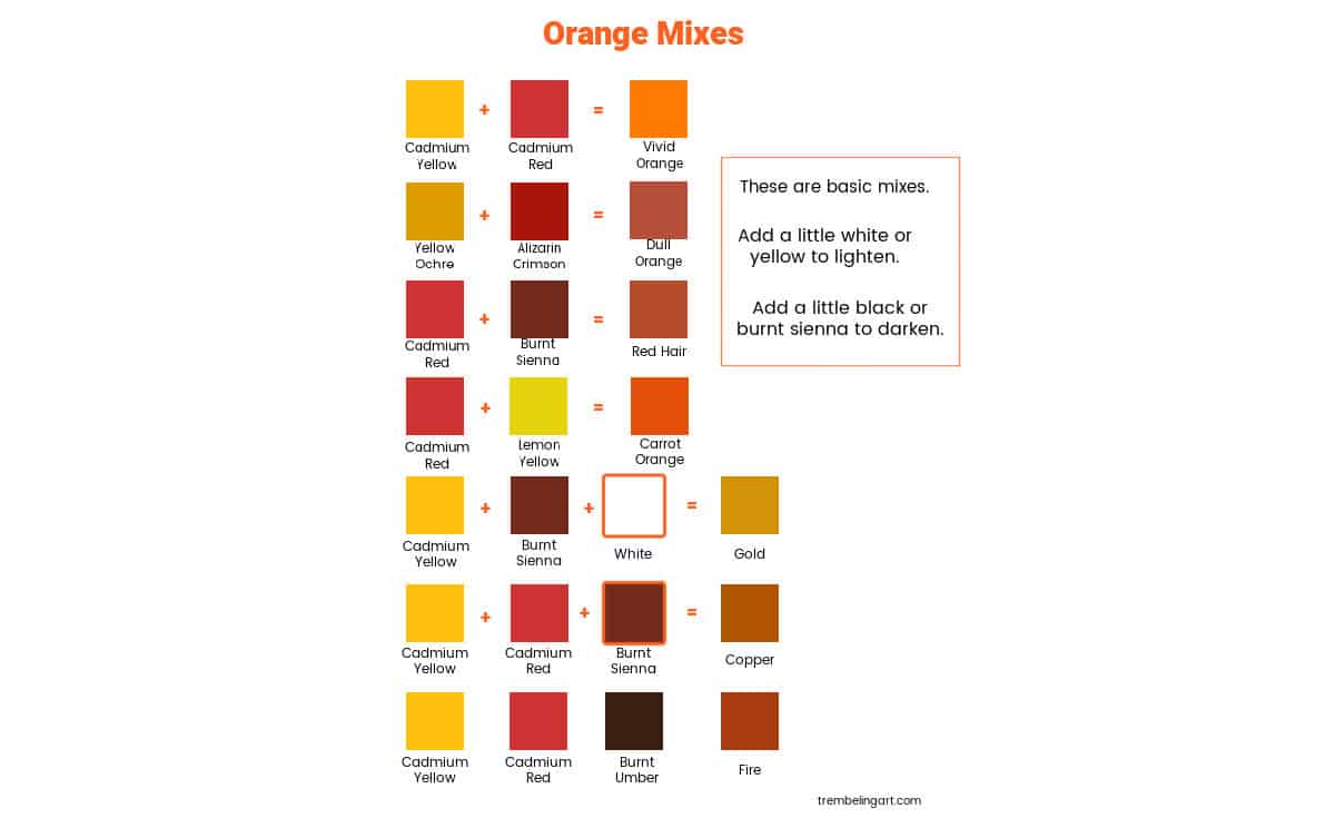
So, a warm yellow and a warm red will give you the most vivid orange. Cadmium Yellow + Cadmium Red = Vivid Orange.

You can add more red or more yellow to change the hue to suit your painting.
You can also buy a premixed tube of Cadmium Orange, which is a vivid orange, but if you don’t use vivid orange often, it is nice to know how to mix your own from the colors you already have.
How to Mix a Dull Orange Paint
To mix a dull orange, you will need at least one color with a slight blue bias.
So, a warm yellow and a cool red (blue bias) will give you a dull orange. Since you now have three primary colors, yellow, red, and blue, the color will be very dull.
Yellow Ochre + Alizarin Crimson = Dull Orange

Because red is such an intense color, it is easy to make mud if you add too much. It is best to add the red to the yellow in very tiny amounts until you get the color you want.
Other Orange Paint Colors
Here are a few paint recipes for some of the more common oranges. Some of them you may not have even thought of as containing orange.
Gold Jewelry
Cadmium Yellow Light + Burnt Sienna + White. Play around with the amount of Burnt Sienna. The more you add, the darker the gold will be.

Start with a very small amount of the Burnt Sienna color and gradually build to the color you want.
Copper
Cadmium Red + Cadmium Yellow + Burnt Sienna. This mixture gives you a rich, burnished copper. More yellow will give you a warm copper, and more Burnt Sienna will give you a darker orange.

Red Hair
Cadmium Red + Burnt Sienna + White or Cadmium Red + Burnt Umber + White.

Use a very tiny amount of white, or you will end up with pink hair. I found the best way to mix this is to add the tiny bit of white last and only if you think you need it.
You can also use a tiny bit of yellow instead of white to give the hair a more golden color.
Red hair has so many shades you may have to play around with the color mixes to get the right shade. Don’t forget to write down the ratios of your mix in case you have to mix more or want to save the formula for a future painting.
Fire
Cadmium Red + Cadmium Yellow in a 2-1 ratio will give you a bright orange fire. Add a little Burnt Umber to the mix to produce a color suitable for the dying embers or the deeper center of a campfire.

Orange Vegetation
Lemon Yellow + Cadmium Red or Cadmium Yellow + Cadmium Red. This mix will give you a brighter orange but start with a very tiny amount of Cadmium Red because it is a very intense color and can easily overwhelm the yellow.

You can play around with the color mixes, adding more yellow or more red until you get the color you want.

Helpful Hints
Here are a few additional hints to get the right orange for your painting.
If you need to darken your orange mix, add a tiny amount of purple or blue. This will give you a richer color than if you added black. Be careful of the amount you add. Start small and increase gradually.
A lot of painting is illusion. To make an orange appear more vivid, surround it with a dull blue. For example, bright orange leaves from a tree against a dull blue/grey sky.
Play around with the colors you have to see what mixes you can make. Keep notes on the colors and ratios you use. Make a color chart that you can keep for future reference.
I have a blank color mixing chart in my Resource Library that you can print off, laminate, or put behind glass to make your own chart for oranges (or any other color).
Remember that color mixing can be a bit of trial and error, especially if you’re aiming for a specific shade. Start with small amounts of paint and gradually add more as needed. Also, consider the characteristics of your acrylic paints, as different brands and pigments can behave slightly differently during mixing.
I hope this information was helpful and you have learned to mix a whole new range of colors for your palette. If you have any questions or suggestions, please leave a comment below. Happy painting!
Thanks for reading,
Dear Marilyn
I endorse what everyone says about how helpful your guides are. But at touching my 9th decade and a bit dyslexic to boot I need to be able to keep hard copy for reference so its a great disappointment that only the colour charts can be printed. Why so?
SM Anthony
Hi. I need hard copy to be able to refer to it as I go … I copy and paste onto a document which I save in their pertinent folders in my computer. along with the color charts.
Hello Marilyn,
I’ve been struggling for a week trying to paint a sunset from a reference photo, but wasn’t even close to the right color.
Now I have at least some idea of how to get there. I hope.
thanks,
Jim
Hi James,
Finding the right tint or tone can be a struggle for sure. Getting the right values (lights and darks) for your colors is important. Mixing the right color sometimes takes a little experimenting. It gets easier with practice. I am sure your painting will be beautiful. I am glad this post was helpful. Happy painting. 😊
Hi Marilyn,
Thank you so much for posting this. I am really learning a lot from you and I appreciate your detailing .
You are amazing teacher, regards from Roamania!
Valeria
Thank you. 😊